A practice targeting the high end
Condition 01 · The work
Twelve beautifully presented projects beat sixty uncurated thumbnails every time. If your work commands attention and deserves to be read as a narrative, there is something here to build.
Your work is one of a kind. Your site should be too.
A website for a high-end architecture practice has to reflect the caliber of its clientele. It should present your portfolio with uncompromising elegance (one curated idea at a time, at a pace you control) and be detailed the way you would design a bespoke residence: no structural compromises, no templated constraints, and an experience that feels effortless from the first second.
A-101.1 · The site
01 / 04
A-101.1 · 01 / 04
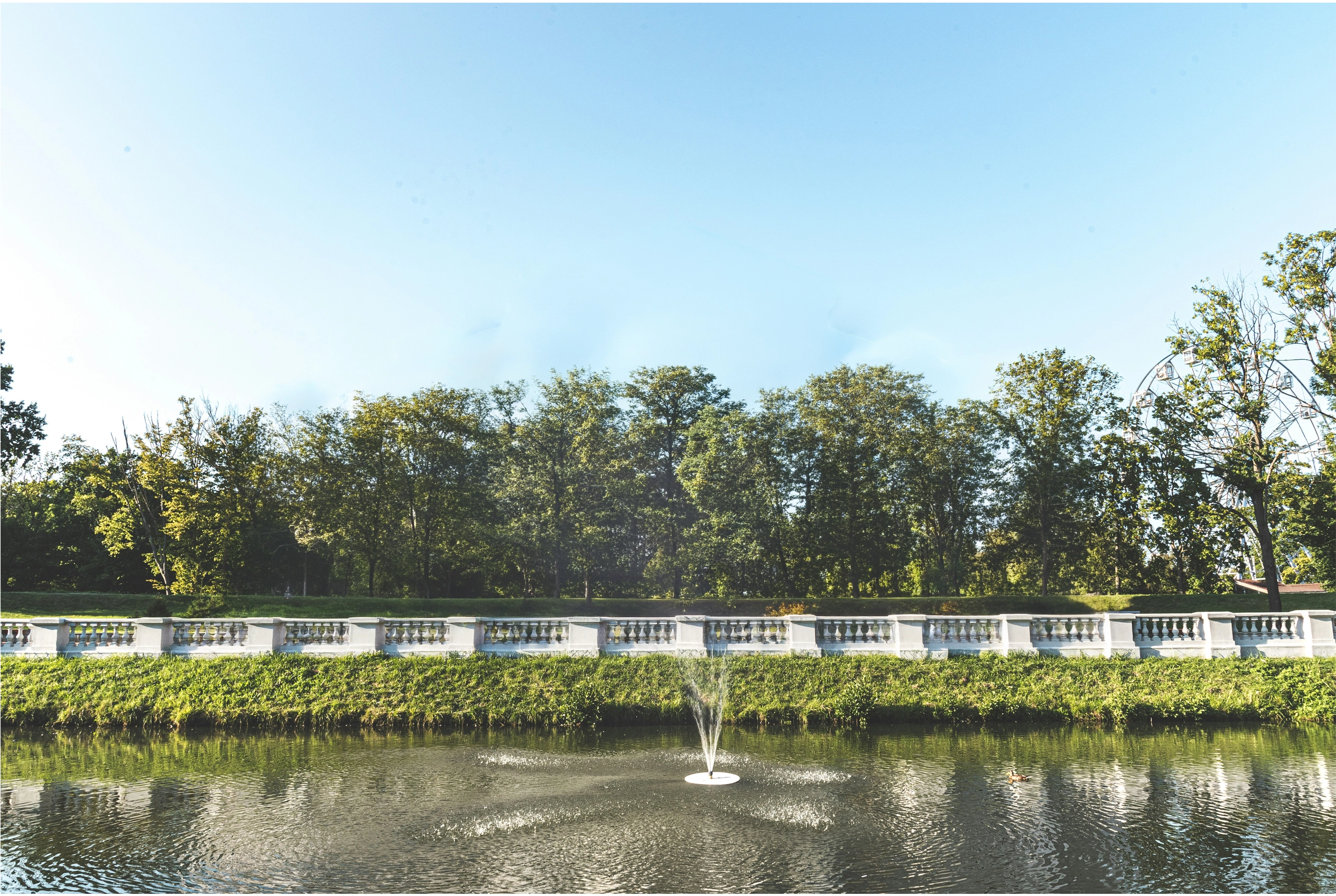
Your work is one of a kind, and your site should be too. Every project you take on begins the same way it did here, with a piece of ground and a client who wants something nobody else has. Nothing that follows is off the shelf. Nothing about the way you present it should be either.
A-101.1 · The drawing
02 / 04
A-101.1 · 02 / 04
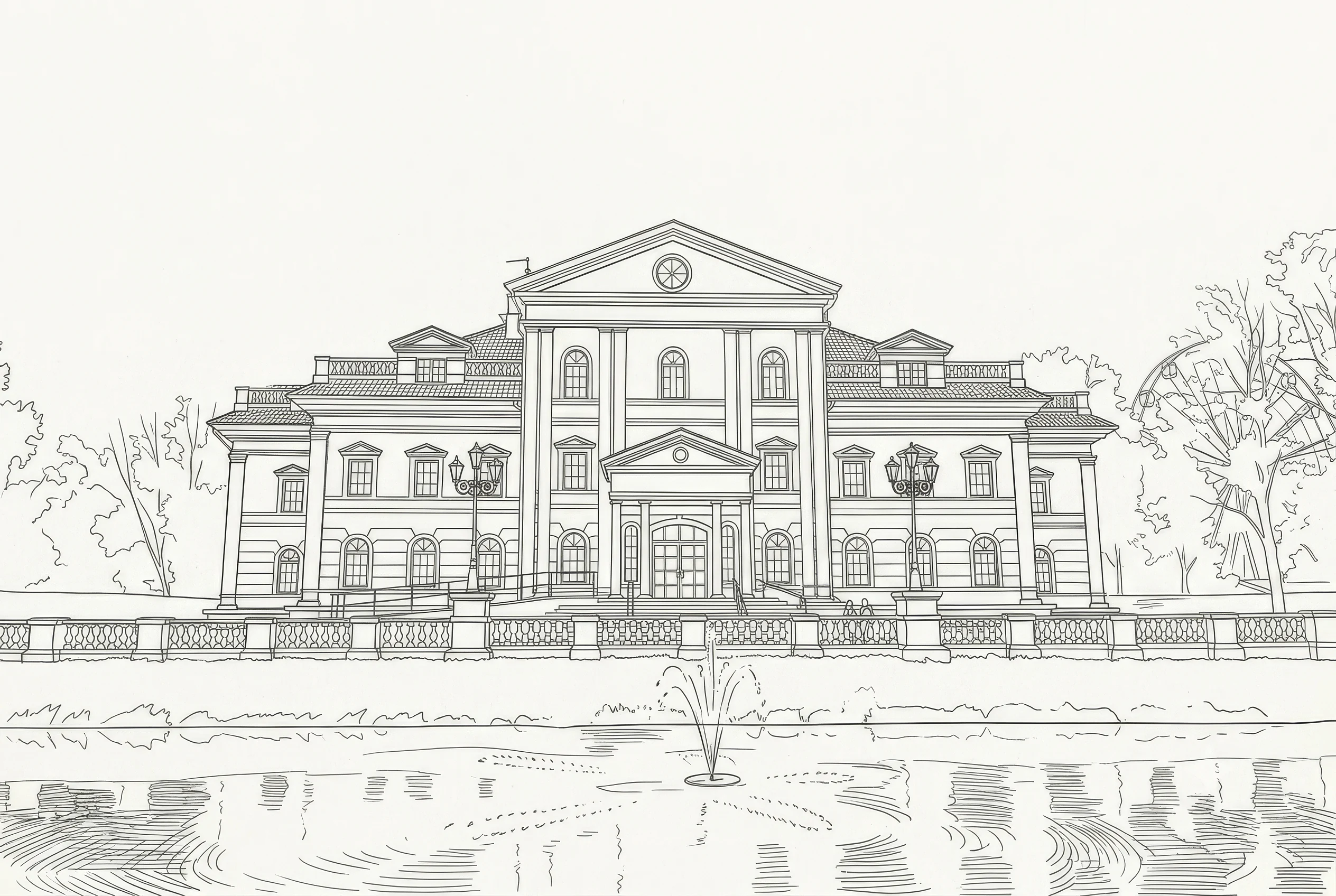
Every line is drawn on purpose. The proportion, the sequence, the order in which a visitor meets one idea and then the next: all of it is set out deliberately, long before anything is built.
A-101.1 · The rendering
03 / 04
A-101.1 · 03 / 04
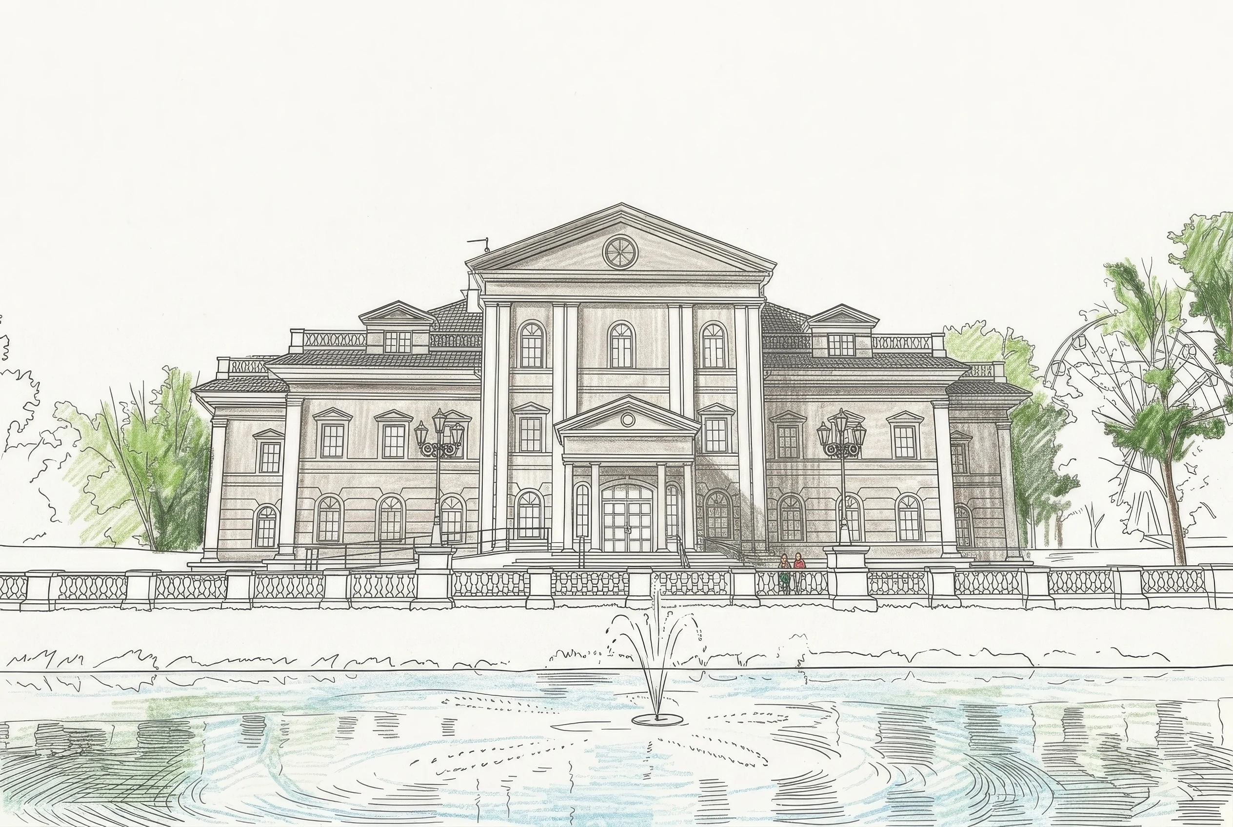
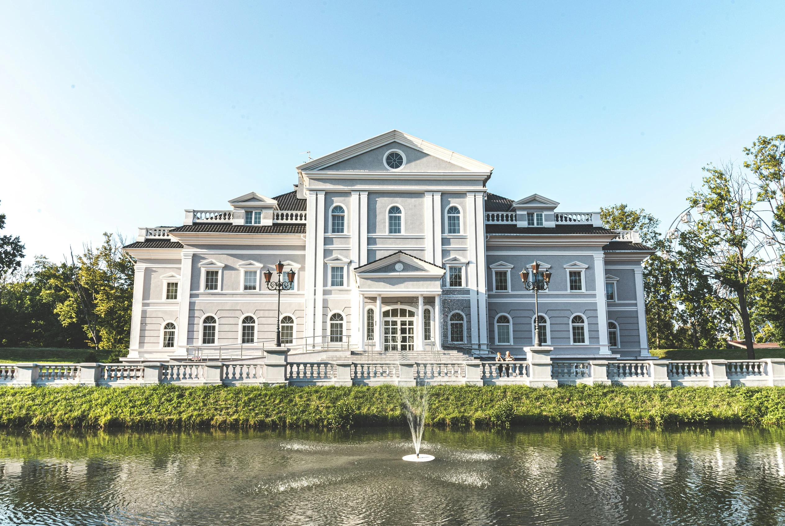
Drawings become buildings through craft. Material, light and detail are chosen by someone who has done it before and knows what will still be standing well in twenty years.
A-101.1 · As built
04 / 04
A-101.1 · 04 / 04
The finished work has to be beautiful and it has to perform. Your website is held to that same standard: elegant enough to do your portfolio justice, and quick enough that a prospective client never waits on it.
A-102 · Diagram 1
Four uncompromising standards. The rest of this set is how.
A-201 · The argument
You don't present a seven-figure build by throwing sixty thumbnails on a wall. You present it as an experience: the approach, the threshold, the section, where the light lands at four in the afternoon. A masonry grid of hero shots dilutes your brand equity and leaves a high-net-worth client to guess.
A bespoke, scroll-driven page gives the presentation back to you: one curated idea per screen, revealed smoothly as the reader moves. And it costs you nothing in visibility: every screen is a distinct page with its own URL, ready to be shared directly with prospects.
Friction: a page builder stacked with plugins is measured in seconds on a mobile device, and an affluent client evaluating a firm doesn't wait through them. Sameness: a template makes your practice look like every practice that bought the same template, the precise opposite of luxury. Invisible work: projects buried inside a script-driven lightbox are far harder for Google and modern AI answer engines to read, and are routinely missed altogether. Distraction: admin panels to patch and licenses to renew are wastes of your firm's billable time.
All four come standard with cheap software, which is why they read as normal. They aren't. A bespoke, hand-crafted site has no builder to outrun and no theme to inherit: the presentation is exactly what was designed, served instantly.
A-301 · Approach
You wouldn't specify a finish that degrades under use, or a cantilever you couldn't calculate. The same discipline applies to digital presentation. Every movement on this page is drawn by the browser itself as you scroll; there is no animation library running behind it, and nothing that has to finish loading before the page will respond to you.
That matters commercially, not just aesthetically. A prospective client reviewing your portfolio shouldn't have to wait for your practice to load while on a private flight or traveling internationally.
This page holds you in place exactly three times: on the cover, on the four frames that follow it, and again on the diagram above, because those are the moments worth holding. Every sheet after them scrolls the way you expect a document to. That restraint is the whole discipline: motion is a material, specified where it carries the reader through the work and left out everywhere else. Used without it, a page stops presenting and starts taking itself out of the reader's hands. The studio has written up the long version, including what it does to search visibility.
A-401 · Detail
Your portfolio is served instantly from the edge nearest to the client reading it, anywhere in the world.
Every signature project is a real page that can be indexed and sent directly to a prospect, not a pop-up slide.
Massive photography that stays razor-sharp, generated precisely for the screen it's viewed on, without dragging the page down.
Built structurally perfect so Google, ChatGPT, and Perplexity can quote your practice accurately instead of guessing.
Silky visual transitions and scrolling without stuttering, layout shifts, or dropped frames, on a phone as readily as a desktop.
If a visitor's device requests a calmer experience, the page adapts natively into a stunning, still document.
Spacing, type and rhythm set for your work specifically, the way a drawing set is detailed rather than dressed.
A-501 · Scope
Three conditions, stated clearly before the first conversation.
Condition 01 · The work
Twelve beautifully presented projects beat sixty uncurated thumbnails every time. If your work commands attention and deserves to be read as a narrative, there is something here to build.
Condition 02 · The engagement
You work directly with the person designing and building it. No account manager, no handoff to a production team, no brief passed down a chain until the intent is gone. Whoever you speak to on the first call is who does the work.
Condition 03 · The horizon
Every build is a bespoke engagement, scoped individually based on the complexity of your archive. You are purchasing a digital asset that doesn't break down, doesn't need constant plugin updates, and wholly belongs to you.
A-601 · Common questions
A luxury architecture website loads instantly, presents high-end residential or commercial projects as a curated narrative rather than a crowded grid, and keeps massive architectural photography perfectly sharp. It should be a bespoke, effortless experience that respects an affluent client's time, and above all it should showcase the work rather than overpower it. That is why a site for a firm starts quiet: muted color, minimalist styling, close to empty. Your work brings the color. My work brings it to life.
It depends entirely on the scope of the archive and the custom features required to present it. Every build is scoped as an individual engagement, not sold off a fixed-tier menu. Send your brief, and you will receive a considered estimate.
When the work demands to be read sequentially (a spatial progression, a before-and-after, a section revealed deliberately) yes, and it is worth holding the reader still to do it. The discipline is in how rarely you do so: a few deliberate moments carry the work, while movement applied to every screen becomes noise. The rules for elegant motion are short.
Only if you want to. Every build is custom to the practice it is for, and that extends to how the site takes edits and new pages. Some firms would rather send over new project photography and have it handled; others want to post their own updates. We settle which it is together, early.
By treating performance as a design requirement, not by using fewer photographs. Your work is the reason anyone is on the page, so the images are the point and the discipline is in how they arrive. Anything in view the moment the page loads is optimised and used sparingly, converted to a modern format and generated precisely for the screen viewing it. Everything past that first screen loads as you reach it. The photography stays large; the friction disappears.
Yes. While the studio is based in Raleigh, the work is universally remote. A bespoke digital engagement relies on reading your archive carefully and asking the right questions, regardless of the timezone.
A-701 · Contact
Tell me the practice, roughly how many signature projects you'd want online, and your target timeline. You'll receive a considered reply within two working days, directly from the designer who will execute the work.
The Better Website is a dedicated web design studio in Raleigh, NC, building bespoke, uncompromising digital portfolios for luxury practices nationwide.
PS · This theme is for sale
You're reading it. Daylight Study is one of our premium themes, and this page is the live demo: the drawing set, the daylight, the whole set of sheets. If it suits your practice it can be fitted to your brand and grown into your full site. Say so when you write and we'll start there.
The collection
Every theme in the collection is a complete, hand-coded design, licensed once and then fitted to your brand and grown into your full site. Same standards as the sheets above: written by hand, not built on WordPress, a page builder or a CMS. What a theme settles is the design phase: the work is fitting it to your practice.
Soft shadows, subtle gradients and no borders anywhere: a quiet surface built to sit underneath the work rather than beside it.
Frosted glass panels, an animated conic border and a light sweep that never quite stops moving, with a real light and dark mode.
Cursor-lit silver, engraved & sold
Realistic 3D silver type under a light that follows the cursor, with every shadow on the page answering to it. Sold, and shown as built.
See the full collection of premium themes, or tell me which one fits your practice.