Notes from the build

The Blog

Why this site scrolljacks and still ranks, what hand-coding actually buys you, and how the whole thing was built, written by the same person who wrote the code it describes. No ghostwriters, no filler.

Fourteen posts, one author

Read up

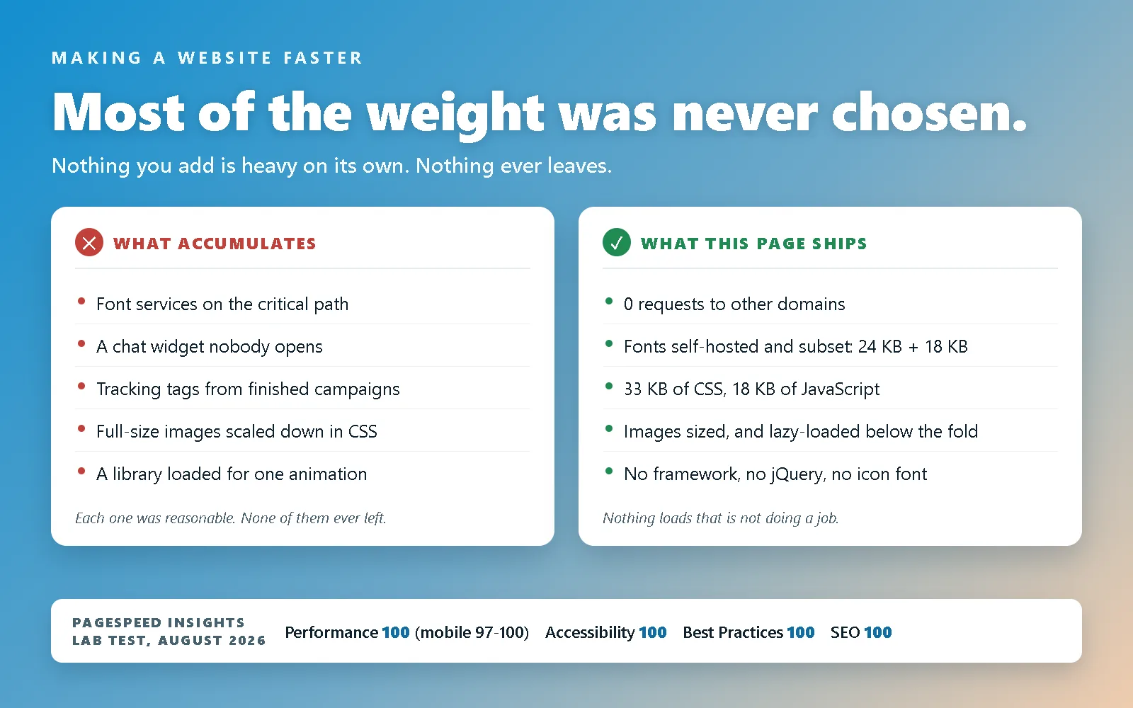
Diagram on a blue-to-tan gradient headed "Most of the weight was never chosen.", under a kicker reading "Making a website faster" and the line "Nothing you add is heavy on its own. Nothing ever leaves." Two white cards sit below. The left one, marked with a red cross and headed WHAT ACCUMULATES, lists font services on the critical path, a chat widget nobody opens, tracking tags from finished campaigns, full-size images scaled down in CSS, and a library loaded for one animation, footed by the note "Each one was reasonable. None of them ever left." The right one, ticked in green and headed WHAT THIS PAGE SHIPS, lists 0 requests to other domains, fonts self-hosted and subset at 24 KB plus 18 KB, 33 KB of CSS and 18 KB of JavaScript, images sized and lazy-loaded below the fold, and no framework, no jQuery, no icon font, footed by the note "Nothing loads that is not doing a job." A white strip along the bottom reads: PageSpeed Insights, lab test, August 2026, Performance 100 (mobile 97-100), Accessibility 100, Best Practices 100, SEO 100.

How Do I Make My Website Faster?

Most websites are not slow because of one big mistake. They are slow because nobody ever said no. The plain version first, then how far this site takes it: self-hosted subset fonts, no libraries at all, and nothing fetched from anybody else.

Read more — How Do I Make My Website Faster?
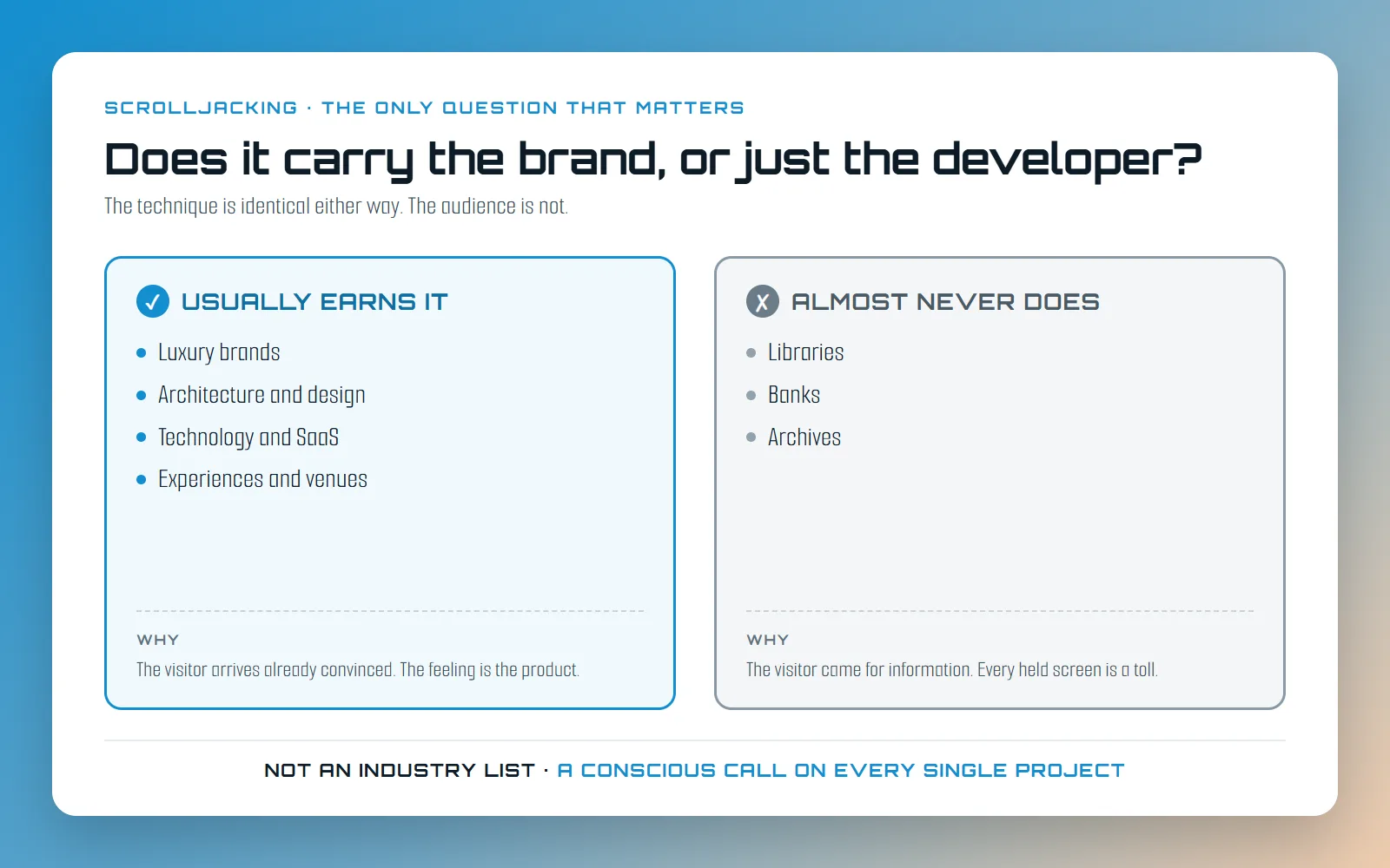
Diagram on a blue-to-tan gradient headed "Does it carry the brand, or just the developer?", over a kicker reading "Scrolljacking, the only question that matters" and the line "The technique is identical either way. The audience is not." Two bordered columns sit below. The left one, ticked and headed USUALLY EARNS IT, lists luxury brands, architecture and design, technology and SaaS, and experiences and venues, under a WHY note reading "The visitor arrives already convinced. The feeling is the product." The right one, crossed and headed ALMOST NEVER DOES, lists libraries, banks and archives, under a WHY note reading "The visitor came for information. Every held screen is a toll." A footer line reads: not an industry list, a conscious call on every single project.

Is Scrolljacking Bad for User Experience?

Yes, mostly, and I am not going to pretend otherwise. Scrolljacking is a brand decision rather than a technical one, and even inside the industries it suits it has to be judged brand by brand and audience by audience, one project at a time.

Read more — Is Scrolljacking Bad for User Experience?
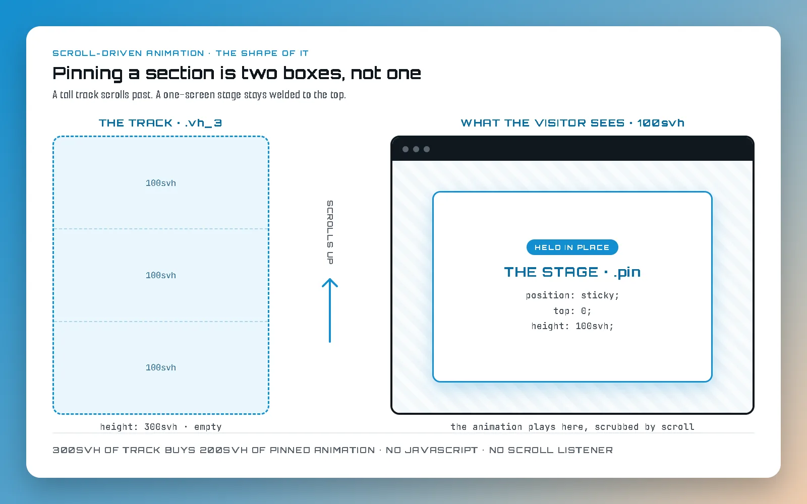
Diagram on a blue-to-tan gradient headed "Pinning a section is two boxes, not one". On the left a tall dashed box labelled THE TRACK, dot vh_3, is divided into three segments each marked 100svh, footed "height: 300svh, empty". An arrow between the columns reads "scrolls up". On the right, a browser window labelled "what the visitor sees, 100svh" holds a panel marked "Held in place", THE STAGE, dot pin, listing position: sticky, top: 0, height: 100svh. Footer: 300svh of track buys 200svh of pinned animation, no JavaScript, no scroll listener.

How to Pin a Section and Animate It on Scroll

The useful kind of scrolljacking, built from scratch: the two boxes that do the pinning, how to read and edit the vh timeline your keyframes are scrubbing, and the four shared classes that stop you writing it all again next section.

Read more — How to Pin a Section and Animate It on Scroll
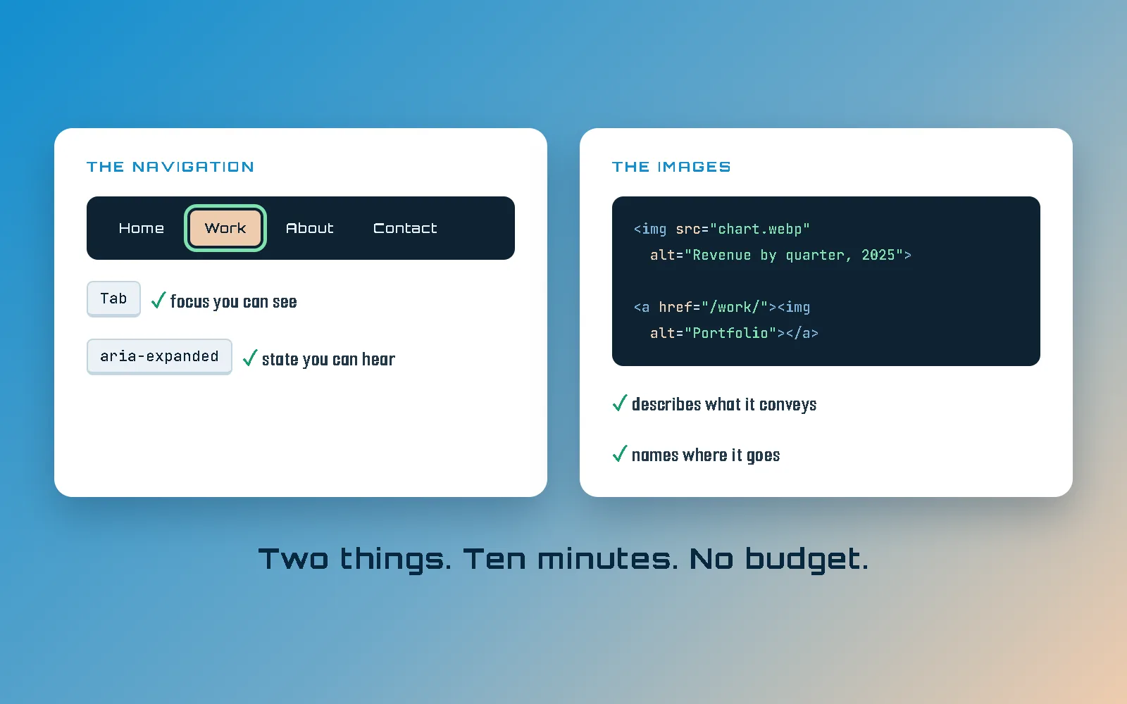
Illustration on a blue-to-tan gradient: two white cards. "The Navigation" shows a dark menu bar with a green focus ring around the Work link, noted "Tab — focus you can see" and "aria-expanded — state you can hear". "The Images" shows HTML for two images with their alt attributes filled in, noted "describes what it conveys" and "names where it goes". Caption: Two things. Ten minutes. No budget.

Website Accessibility Basics: The Nav and Your Images

The two things I find broken first on almost every site: a navigation you cannot use without a mouse, and images with the wrong alt text. The developer’s starting point, with the WCAG level each failure sits at.

Read more — Website Accessibility Basics: The Nav and Your Images
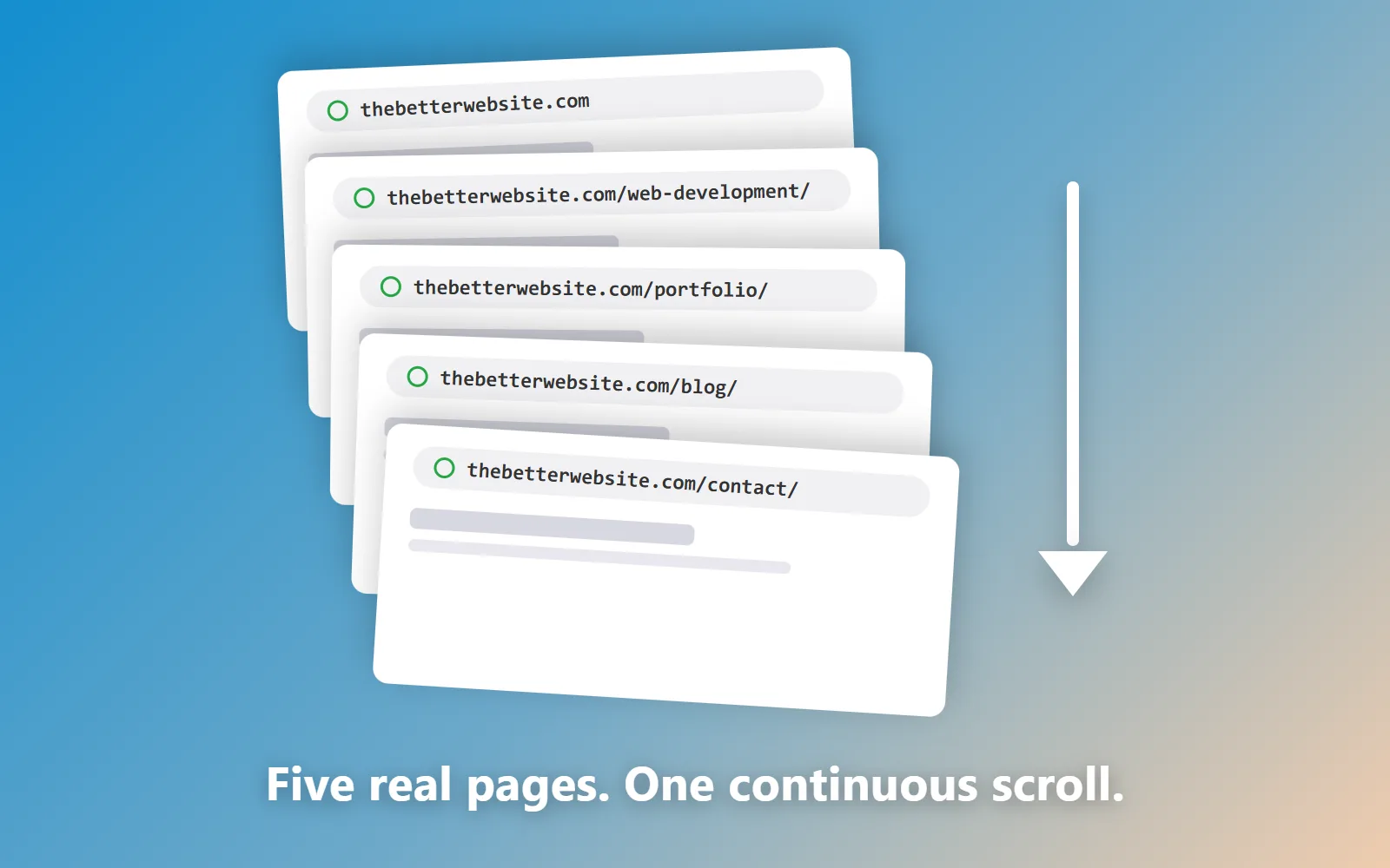
Illustration on a blue-to-tan gradient: five white cards fanned like a deck of slides, labeled with this site's real page URLs (home, /web-development/, /portfolio/, /blog/, /contact/), with a downward arrow beside them, captioned "Five real pages. One continuous scroll."

Building a Scroll-Driven Website: A Case Study

The whole story in order: a WordPress site I was done with, a CodePen animation worth keeping, and the chain of real pages it became: the architecture, the rules, what broke, and what shipped.

Read more — Building a Scroll-Driven Website: A Case Study
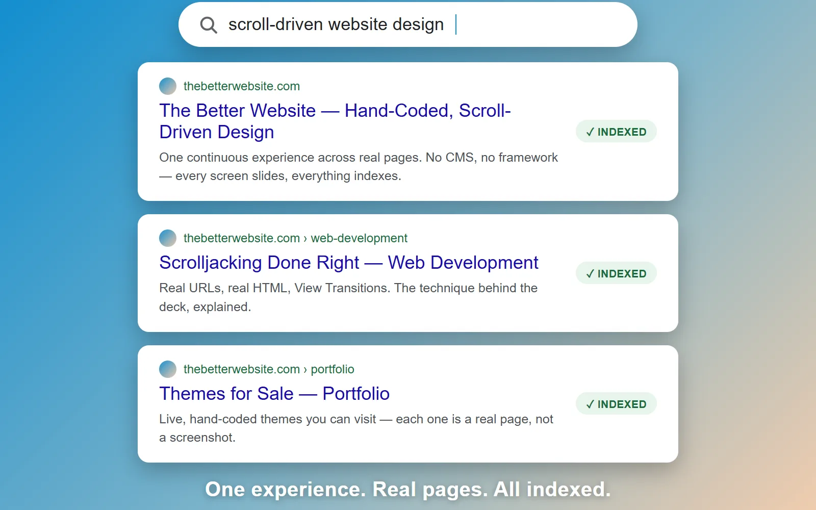
Illustration of a search results page on a blue-to-tan gradient: a white search bar reading "scroll-driven website design" above three white result cards for thebetterwebsite.com's home, web development, and portfolio pages, each marked with a green "Indexed" badge, captioned "One experience. Real pages. All indexed."

Does Scrolljacking Hurt SEO?

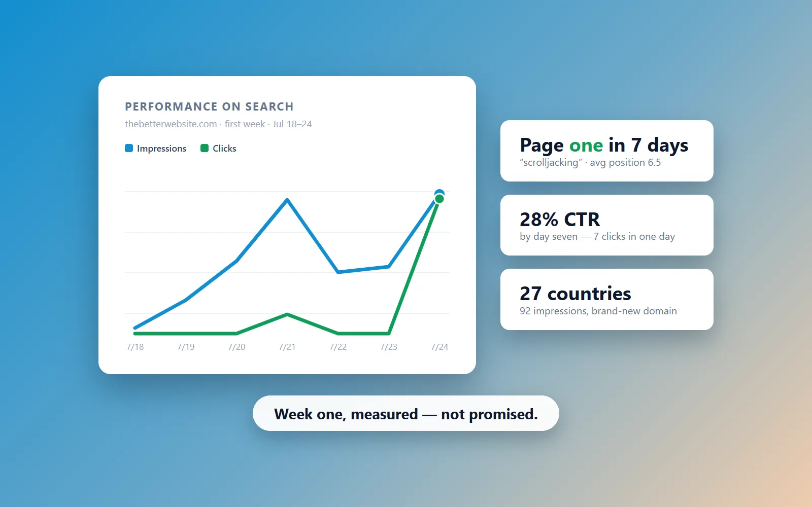
One URL, invisible content, heavy scripts: the classic scrolljacked site earns its bad rankings. But Google has no scrolljacking penalty. What actually hurts, and the architecture that fixes it.

Read more — Does Scrolljacking Hurt SEO?
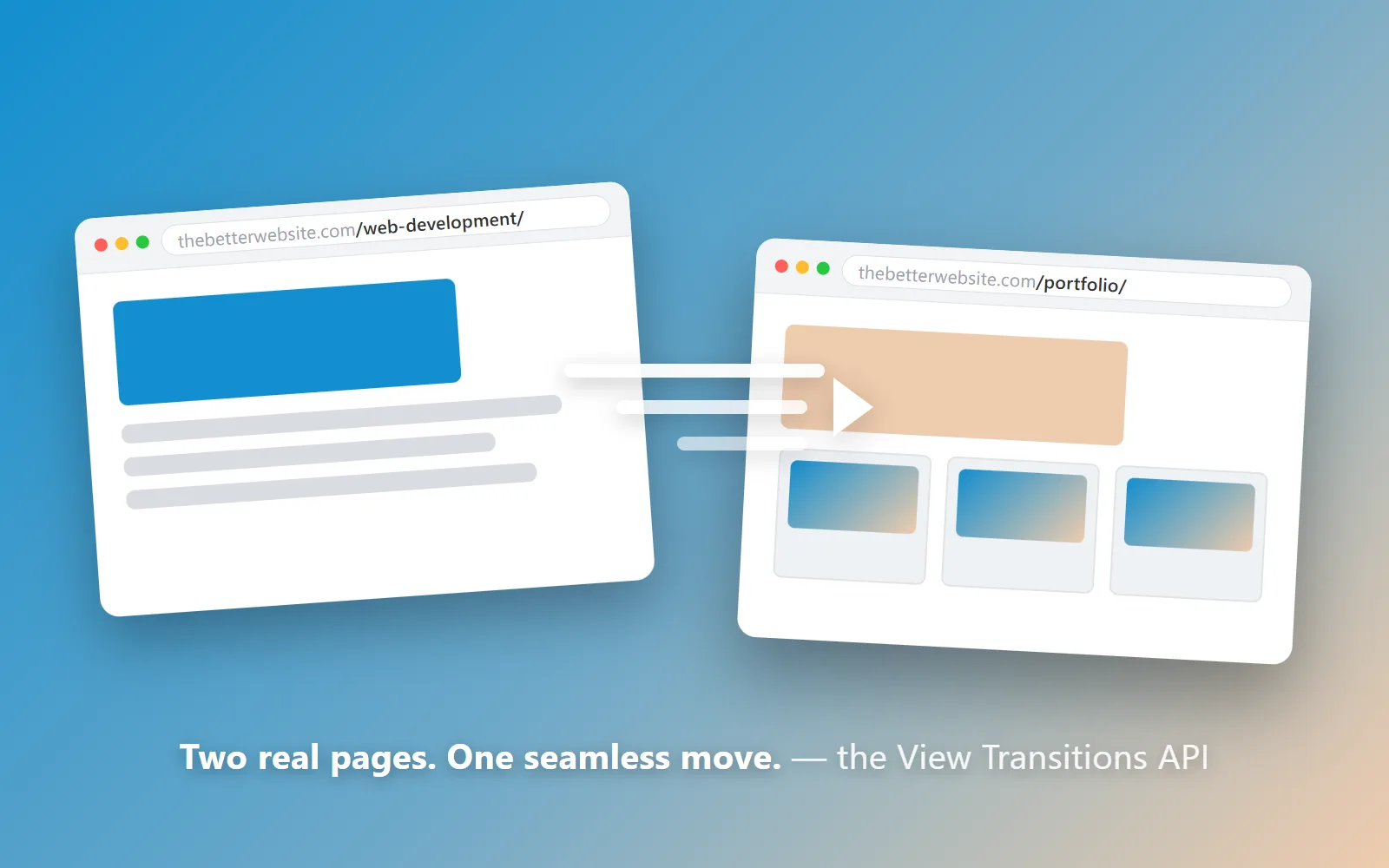
Illustration of two white browser windows on a blue-to-tan gradient, one showing thebetterwebsite.com/web-development/ and one showing thebetterwebsite.com/portfolio/, with white motion streaks and an arrow between them, captioned "Two real pages. One seamless move. — the View Transitions API"

The View Transitions API in Practice

For a decade, seamless page changes meant an SPA framework. Now the browser animates between real pages on its own: what the View Transitions API is for, and what shipping it taught me.

Read more — The View Transitions API in Practice
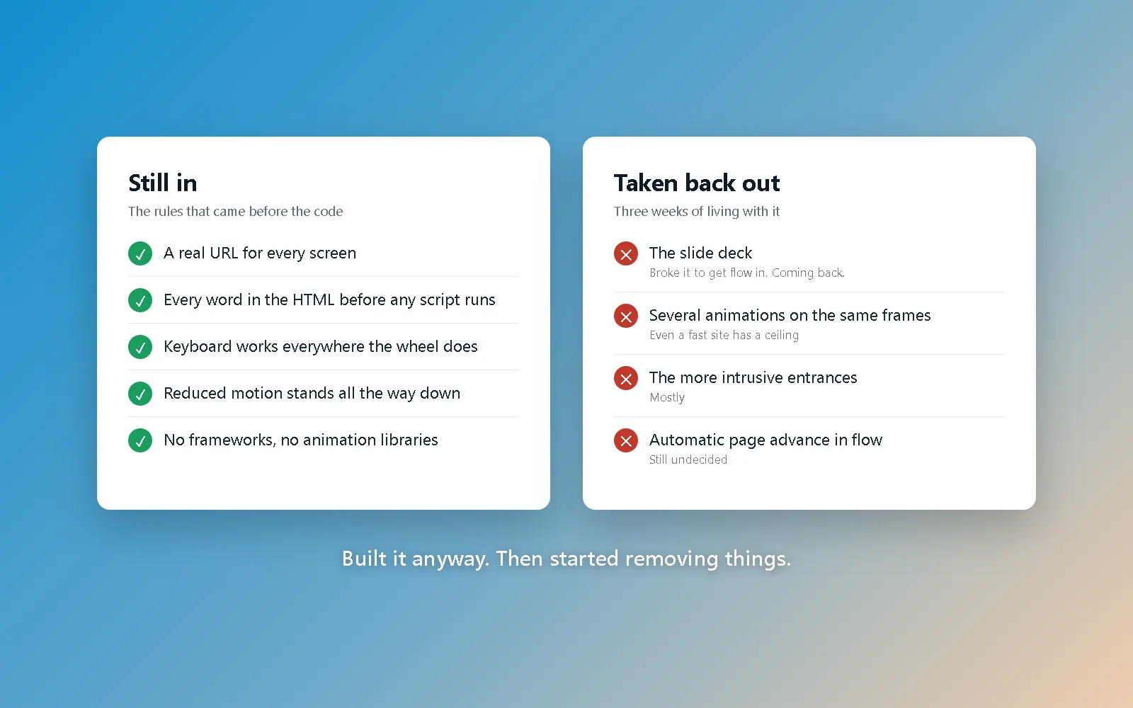
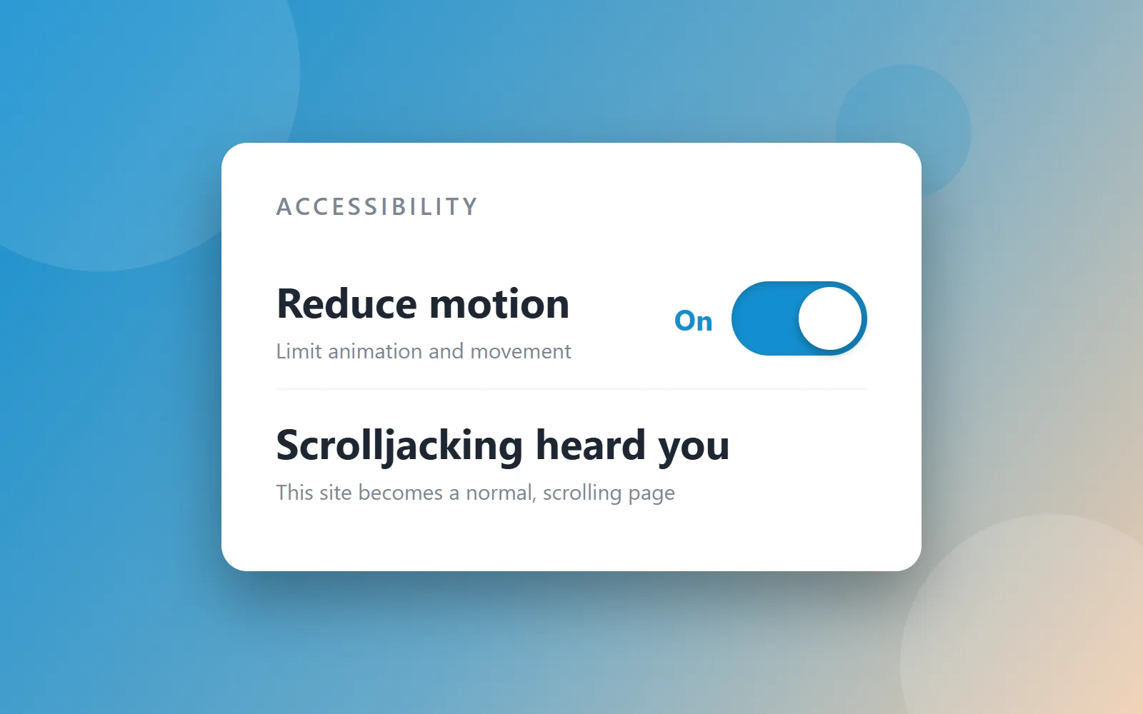
Illustration of an accessibility settings panel on a blue-to-tan gradient: a "Reduce motion" toggle switched on, above a line reading "Scrolljacking heard you — this site becomes a normal, scrolling page"

Is Scrolljacking Bad for Accessibility?

No, the technique is not the problem: four specific build decisions are, and every one is optional. The keyboard, reduced motion, focus order and the back button, what the ADA yardstick actually asks of each, and the four answers that fix them.

Read more — Is Scrolljacking Bad for Accessibility?
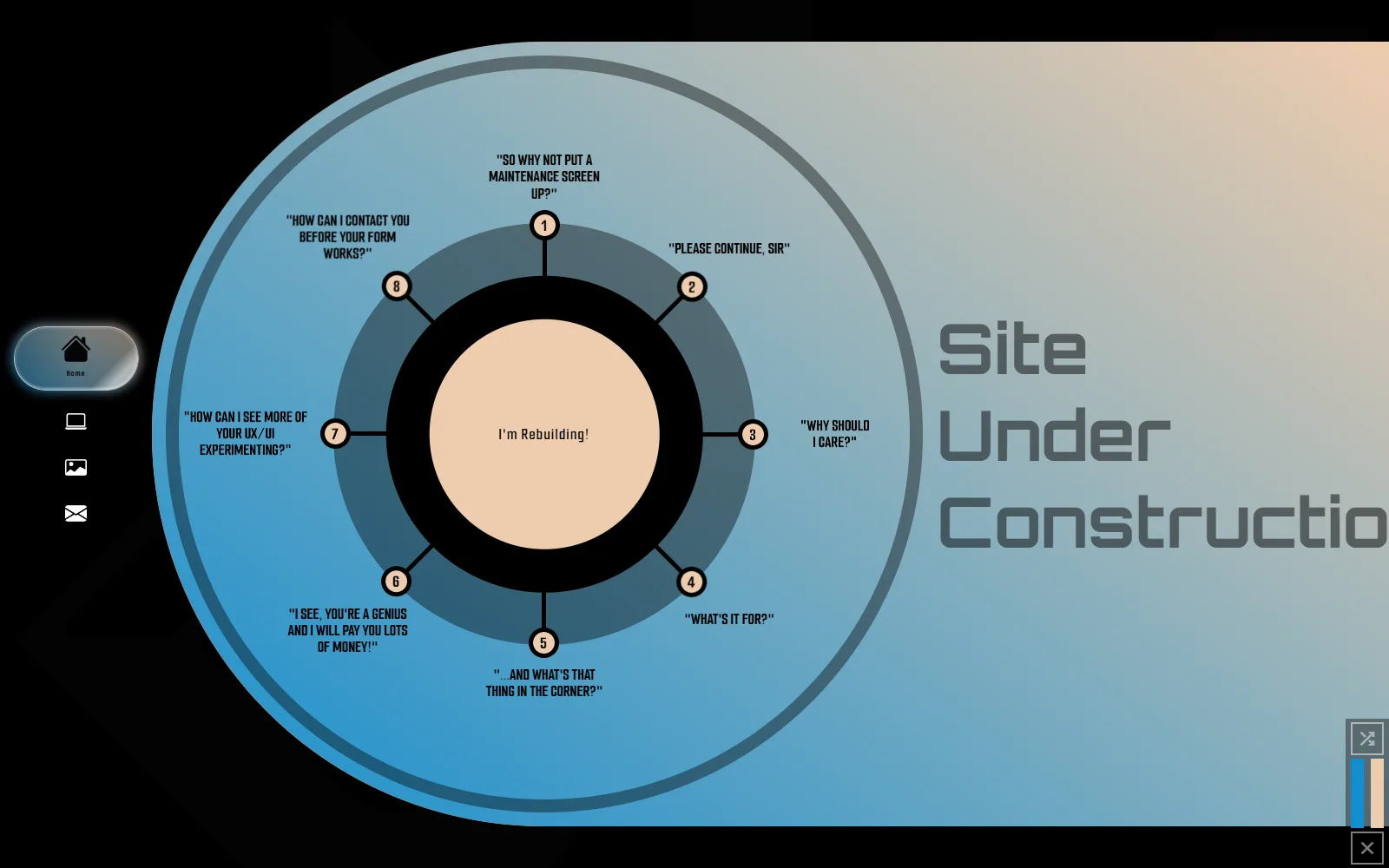
Screenshot of the circle-graphic Q&A widget on this hand-coded, scroll-driven homepage: a large blue-to-tan gradient circle with eight numbered question prompts radiating from a center reading "I'm Rebuilding!"

What Is Scrolljacking?

It earned a genuinely bad reputation: broken back buttons, locked-out keyboard users, motion nobody asked for. What it actually is, why it went wrong, and why the View Transitions API is bringing it back.

Read more — What Is Scrolljacking?
The same vintage wind-up toy robot from 2024: still here, still not taking my job

The AI Revolution, Revisited

Two years ago I asked whether AI would take my job. It didn’t. It made me a powerhouse. On AI-built websites, the “Elementor” symptom, and using the tool right.

Read more — The AI Revolution, Revisited
Vintage wind-up toy robot, a playful stand-in for artificial intelligence

AI. Am I Worried?

While AI has been a thing for many years, it’s only recently began to impact my life. Now, website page builders can generate content for you. Photo editors can change an entire photo based on what you type into an input field.

Read more — AI. Am I Worried?
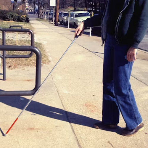
Person using a white cane while walking along a city sidewalk

Why Website Accessibility Matters

The people who can’t use your site don’t email you about it. They leave. What accessibility actually covers, what ADA compliance asks for, and the two offenders anyone can check.

Read more — Why Website Accessibility Matters

End of the shelf

Meet
the studio.

One person writes these posts and the same person writes the code they are about: that is the whole studio. If a search result dropped you here, the short version is on the method page, the proof is in the work, and the rest of me is over here. The FAQ covers what I get asked most and home is the full tour. Rather ask me directly? Do that. Or keep scrolling, you'll meet me next.

The Better Website

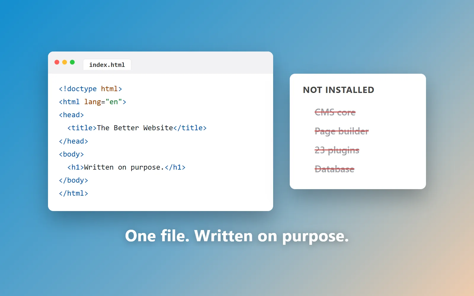
The Better Website is a one-person web design studio in Raleigh, NC, serving the Triangle and clients nationwide. Every site is hand-coded in plain HTML, CSS and JavaScript — not built on WordPress, a page builder or a CMS.

Up Next About