Why Website Accessibility Matters
Short answer: the people who can’t use your site don’t email you about it. They leave, and the legal exposure is only the part that makes the news. The rest of this post is the long answer: what accessibility actually covers, and where I’d start on your own site.
ADA compliance. Plenty of businesses that have had a website for a decade have never heard of it, and that’s a problem. The Americans with Disabilities Act has been law since 1990, and courts keep making it clearer that it applies to websites too. But the legal angle is honestly the least interesting thing about it. Accessibility isn’t a chore you bolt on at the end of a build. It’s what building a website properly looks like.
How I learned it
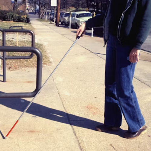
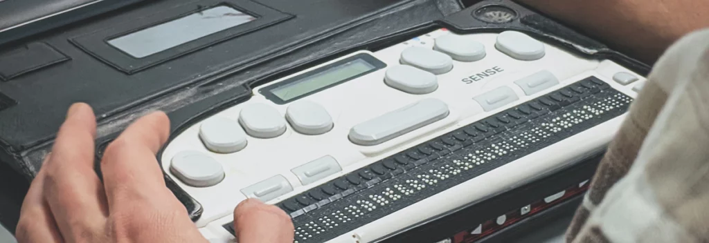
I got my education the honest way. A while back I built a website that existed specifically for people with visual impairments, working directly with a great guy, who is legally blind. Watching him use the web (really use it, at speed, with a screen reader doing the talking) taught me more than any compliance checklist ever could. It also permanently changed how I build.
Here’s the part I didn’t expect, and it’s the reason I still bring it up years later. He wasn’t slowed down by the web being a visual medium. He was slowed down by developers who had left things unnamed: buttons that announced themselves as “button,” links that announced themselves by reading out their own file path. Nothing exotic, nothing expensive. Nobody had checked.
What an accessible website actually does
Start with navigation, the big one. We’ve all met menus with dropdowns inside dropdowns, most of us hover or click and never think about it. Now take the mouse away. Plenty of menus simply cannot be worked without one, and the ways they fail are less obvious than you’d guess; that part is a build problem with a real answer, and it’s how a keyboard-operable menu is actually built. What matters here is the shape of it: the site works if you can point at it, and quietly stops working if you can’t.
Now take away the screen too. A screen reader is exactly what it sounds like: software that reads the page out loud. Which raises questions most sites never answer: how does the listener know a submenu just opened? That a button launches a popup? That anything changed at all? None of that is automatic. It lives in the markup, and it’s either built in or it isn’t.
The two I find first
If you want to check your own site this afternoon without learning a spec, start with the two offenders I hit most often. Neither needs a developer to spot.
Text you can’t read. Low-contrast type is the single most common failure in automated scans, and it’s almost always a design choice nobody stress-tested: gray on lighter gray, white on a pale photo, a placeholder so faint it looks disabled. The threshold is 4.5:1 for body text, and free checkers will tell you in seconds. It’s also the one that affects the most people, most of whom don’t use assistive technology at all. They’re just outdoors, or forty-five.
Forms with no labels. The pattern where the placeholder is the label looks clean and
breaks two ways: the hint disappears the moment somebody types, and a screen reader may announce
the field as nothing at all. Every input needs a real <label>. If the design
can’t spare the space, the label can be visually hidden and still do its job, but it
has to exist.
Those two plus the menu above will cover most of what’s actually wrong with most websites. The next layer down (how a keyboard-operable menu is built, and why a linked image’s alt text has to describe where it goes rather than what it shows) is website accessibility basics, which is the developer’s version of this post.
How I build for it
In my builds, every link and button carries a proper accessible name. Aria labels describe what a control does; aria-expanded tells a screen reader whether the menu it just pressed is open or closed. Images get real alt text, headings actually nest, and focus lands where a keyboard user expects it to. None of that is heroic. It’s just decided on rather than left to a plugin author.
I take this stuff seriously even when I’m joking about it. The scroll-driven motion on the main pages comes with a reduced-motion fallback: if your system asks for less animation, the whole site quietly becomes a normal, scrolling website. That’s a real surrender rather than a toned-down version. Accessibility isn’t the fallback here: it’s the design. Whether a site that moves that much can be accessible at all is a genuinely separate subject, and it has its own post: is scrolljacking bad for accessibility?
It’s also one of the reasons I hand-code as much as I possibly can. Partly because I have very specific visions that pre-built components can’t hit, and partly because I just like knowing I can control my own code. But mostly because too many plugins, page builders, and themes treat ADA standards as somebody else’s problem. When every element is yours, accessibility isn’t a feature you hope a plugin author cared about: it’s a decision you make on every line.
The business case, if you need one
The legal exposure is real: US courts keep siding with people who couldn’t use inaccessible sites, and the settlements aren’t small. The audience math is real too: millions of people browse with assistive tech, and an inaccessible site simply turns them away. Even the SEO angle holds up, because alt text, heading structure, and labeled controls are exactly what search engines use to understand a page. Accessible sites tend to rank like well-built sites, because that’s what they are.
But honestly? Build it because it’s the job. If you’ve read anything else on this site, you know I’m a perfectionist about my websites. A website part of your audience can’t use isn’t finished.
Where to start
Wondering where your own site stands? Start with your keyboard: put the mouse down and try to reach everything. Then run a free checker like WAVE or Lighthouse: they won’t catch everything, but they’ll catch plenty. And if what they tell you feels overwhelming, that’s what I’m here for.