Website Accessibility Basics: The Nav and Your Images
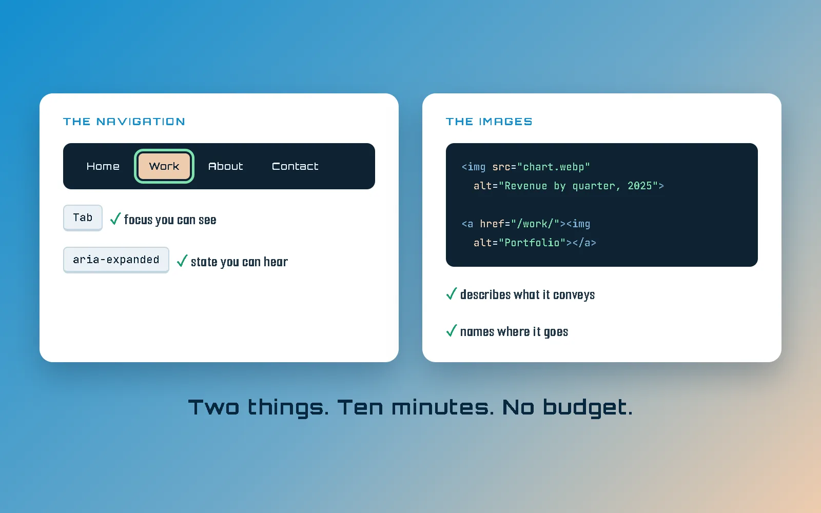
Start with two things: your navigation and your images. If you only ever fix two categories of accessibility problem, fix those. A menu that cannot be operated without a mouse and an image whose alt text is missing, wrong, or describing the wrong thing account for most of what actually gets in somebody’s way on a website. They are also the two easiest to check yourself, in about ten minutes, with no tools you do not already own.
This is not the complete guide to web accessibility. That document exists, it is called WCAG, and it is enormous. This is the developer’s starting point: the basics, and the two offenders I find first.
Why those two, and why I am confident about the order: I learned this working directly with a man who is legally blind, on a site built for people with visual impairments. What slowed him down was never that the web is visual. It was developers leaving things unnamed. That story, and the case for caring about any of this, is why website accessibility matters; this one is the how.
Offender one: a navigation you cannot use without a mouse
We have all met the menu with dropdowns inside dropdowns. With a mouse it is fine, because a mouse can point at anything. Now put the mouse down and try it: tab to the top-level link, open the submenu, move through it, close it, carry on.
When that goes wrong, it goes wrong in one of two opposite directions, and they need different fixes:
- The submenu is genuinely gone. If it sits at
display: noneorvisibility: hiddenuntil something hovers it, its links are not focusable at all, so tabbing skips the entire submenu. Whole sections of the site end up with no keyboard route to them from the menu. - The submenu is only visually hidden. Pushed off-screen, clipped, or
sitting at
opacity: 0, but still focusable. Now the opposite happens: tab order runs through every link in every dropdown, invisibly. Somebody presses Tab twenty times against a menu they cannot see, with no feedback about where they are or how much is left.
Both are real and I find both. The first hides your content from the keyboard; the second buries the keyboard in your content. Neither is visible in a screenshot, which is most of why they survive design review.
Now the part I want to be straight about, because overstating this is how accessibility writing loses the developers it is trying to reach. Somebody hitting a broken menu is not helpless. Keyboard and screen-reader users have real techniques and the experienced ones are fast with them: jumping between landmarks, pulling up a list of the page’s headings or links, VoiceOver’s rotor, find-as-you-type, or simply going at the URL directly. Somebody who works this way every day will often route around your menu quicker than you could.
That does not get you off the hook, and it is worth being exact about why. The workaround belongs to the user, not to you. It costs them effort you chose to impose, it assumes assistive tech and fluency that not everybody has, and (the part that matters if the site is ever assessed) it changes nothing about the requirements. WCAG 2.1.1 asks whether the functionality is operable from a keyboard. It does not ask whether a sufficiently expert visitor could compensate for it not being. “They found another way in” has never been a defense, legally or otherwise.
So, what a keyboard-operable menu owes the person using it:
- Every item is reachable, and only when it should be. A submenu has to
open on focus or on a real button press. And while it is closed its links have to be genuinely
inert (
display: none,visibility: hidden, or theinertattribute), not merely invisible. Half-hiding it is the second failure above. - The thing that opens a submenu is a
button. Not adivwith a click handler. Not an anchor pointing at#. A real button is focusable, announces itself as a button, and fires on both Enter and Space for free; every one of those is work you would otherwise do by hand and get subtly wrong. - It carries
aria-expanded. This is the one almost everybody misses.aria-expanded="false"flipping to"true"is the only way a screen reader knows the menu it just pressed opened at all. Without it, the listener presses a button and is told nothing whatsoever happened. - Escape closes it, and focus returns to the button that opened it. Leave focus stranded inside a menu that is no longer visible and the next tab press lands somewhere nobody can see.
- The focus ring is visible. Which brings us to the single most common accessibility bug on the web.
That bug is outline: none. Somebody did not like the ring, deleted it, never replaced it,
and now a keyboard user has no idea where they are on the page. If the browser default clashes with
your design, restyle it; :focus-visible exists precisely so you can give focus a
look that suits your site without taking it away. Deleting it outright is not a design decision. It
is a bug you shipped on purpose.
One more piece of furniture, and it is about four lines of code: a skip link. A single link at the very top of the document, ahead of the navigation, that jumps straight to the main content. It is the cheapest item on this whole page, and it is what stops a working menu from becoming its own obstacle: twenty links is not a problem you solve by making them focusable, it is one you solve by offering a way past them.
This site has one. If you want to see it: reload this page and press Tab before you click anything. It is the first thing that takes focus, and it is parked off-screen until it does. That caveat is not me hedging: it is how focus works. Tab moves from wherever focus currently is, so the moment you have clicked or tabbed anywhere on the page, the skip link is behind you and no amount of tabbing brings it back. Worth knowing before you go testing your own and conclude it is broken.
The success criteria a broken menu tends to fail, by number, because “make the nav accessible” is too vague to act on:
- 2.1.1 Keyboard (Level A): all functionality is available from a keyboard.
- 2.4.3 Focus Order (Level A): focus moves through the page in an order that preserves meaning.
- 2.4.1 Bypass Blocks (Level A): the skip link, essentially.
- 4.1.2 Name, Role, Value (Level A):
aria-expandedand the rest of the state you owe assistive tech. - 2.4.7 Focus Visible (Level AA): the ring you deleted.
Four of those five are Level A, which is the lowest tier the guidelines have. This is not the advanced material. This is the floor.
Offender two: your images, which break in two unrelated ways
Images are where I find the most damage, and it is worth splitting the two failures apart, because from a distance they both look like “bad alt text” and they are not the same problem at all.
Can an image be a link?
Yes, and that is the trap. The moment you wrap an image in an anchor, its alt text
stops describing the picture and becomes the link’s accessible name. It is now the
label on a control. So a thumbnail grid linking to your portfolio with
alt="A grid of thumbnails" announces itself as “link, a grid of
thumbnails,” which tells the listener nothing about where it goes.
On a linked image, the alt text describes the destination, not the photograph.
alt="Portfolio" is better there than any careful description of the artwork, because the
question being answered changed. It is no longer “what is this picture” but “where
does this take me.”
The worse version is the icon-only link with no name at all: an inline SVG, or an
<img alt="">, inside an anchor with no text beside it. That is a link with no
accessible name, so the screen reader falls back to reading the URL out loud, one path segment at a
time. If you have ever wondered what your social icons sound like: they sound like that.
And the one nobody expects. An image and the caption underneath it both linking to the same place is
two adjacent links to one destination, which somebody tabbing through has to pass twice for no
reason. Either wrap them together in a single anchor, or give the image an empty
alt and let the text link carry the name.
Does every image need alt text?
Every image needs an alt attribute. Not every image needs a description.
That distinction is the whole answer, and having it backwards is how well-meaning sites end up worse
off for trying.
An image that carries meaning gets a description. An image that is decoration (a texture, a
flourish, a divider, an icon sitting beside text that already says the same thing) gets an
empty alt, deliberately. That empty string is not laziness, it is an instruction:
skip this, it adds nothing, do not interrupt. A screen reader honors it and moves on.
What you must not do is leave the attribute off altogether. A missing alt is not
the same as an empty one. Handed an image with no alt at all, a screen
reader reads the file name, because the file name is the only text available to it. Somewhere out
there, a listener is being told
“hero final v3 USE THIS dot jpeg.” Empty means “nothing to say here.”
Missing means “nobody told me,” and the software guesses.
When an image does need a description, the rule is: describe what it conveys in context, not what sits in the frame. The same photograph earns different alt text on different pages, because what it is doing on the page is different. Beyond that, five things I would put on a card above the desk:
- Do not open with “image of” or “photo of.” The screen reader already announced that it is an image. You are making the listener sit through it twice.
- Do not repeat the caption. If a
figcaptionalready says it, the alt text either adds something or stays empty. Otherwise the same sentence is read out twice in a row. - Do not stuff keywords into it. Alt text is a real SEO signal, which is exactly why people ruin it. It is read aloud to a human being. Write it for them and the search benefit follows anyway; write it for a crawler and you have put spam in somebody’s ear.
- Charts, diagrams and screenshots need more room than an attribute. If the image contains data, put the actual content on the page (a caption, a table, a paragraph) and keep the alt short. “Bar chart of 2025 revenue by quarter” names the thing. It does not communicate it.
- Look at the image before you write it. Obvious, routinely skipped. I have a standing rule on this site that nobody writes alt text from the file name or from what they assume the picture shows; you open the file and look at it. That rule exists because of a photo on the post on why website accessibility matters, which spent a while described as “a screen reader.” It is not one. A screen reader is software; that photo is a refreshable braille display. Wrong, on a page about accessibility, written by the guy telling you to check. Hence the rule.
The criteria images tend to fail: 1.1.1 Non-text Content (Level A), 2.4.4 Link Purpose In Context (Level A), and 4.1.2 Name, Role, Value (Level A). Level A again, all three.
How do I test my own site?
Three passes, in this order, because each one finds things the next cannot:
- Unplug your mouse. Literally unplug it. Then try to do the main thing your site exists for: read a post, submit the form, get through the menu to a product. Ten minutes, nothing to install, and it finds more genuine problems than any scanner will.
- Run an automated checker. WAVE and Lighthouse are both free and both genuinely useful. They are also not sufficient: automated tools catch the machine-checkable subset: missing attributes, contrast ratios, unlabeled controls. They cannot tell you that your alt text describes the wrong thing, or that your focus order stopped making sense halfway down. People like to quote a percentage here. I will just say the part a tool cannot check is the part that needs judgment, and that is the part this post is about.
- Turn on a screen reader. VoiceOver ships on every Mac, Narrator on every Windows machine. Both free, both already installed. You will be bad at it and it will be uncomfortable, and that discomfort is most of the lesson.
Is this the same thing as ADA compliance?
Related, not identical. The Americans with Disabilities Act says nothing about alt text; the practical yardstick a website gets measured against is WCAG, which is where all those numbered criteria come from. Which is why I have quoted levels the whole way through: nearly everything above is Level A, the floor rather than the ceiling, and the cheapest fixes on the list are also the first ones an audit looks at. I am a developer and not a lawyer, so none of this is legal advice.
Scroll-driven sites are the interesting exception here, because they can fail criteria an ordinary site passes without trying, and they are the ones people actually ask about. If that is your question, whether scrolljacking is bad for ADA compliance takes the statute, the DOJ’s 2024 rule and the five criteria a scrolljacked build tends to trip, one at a time. That is the specialist case. This post is the part that applies to every website, scroll-driven or not.
Where to start tomorrow morning
Put the mouse down and tab through your own home page. Then open your five most important pages and
read every alt attribute out loud. That is one morning, it needs no budget and no
vendor, and it will find things.
This is also a decent part of why I hand-code every site I
build. Plugins, page builders and themes treat accessibility as somebody else’s problem, and
you inherit whatever the author of each one felt like doing, which is usually a
div wearing a button costume. You cannot reliably fix what you did not write.
Hand-coding is not the only route there; it is just the one where I can promise it. The
full breakdown of how this site is built is on the web development
page.
And if what your checker told you feels overwhelming, that is genuinely what I am here for.