Is Scrolljacking Bad for Accessibility?
No. Scrolljacking itself has no negative impact on accessibility. The problems show up when it is built badly, which is almost every time you have met it, and that is a different claim entirely. Hand somebody a hammer, tell them to unclog a toilet with it, and they will come away convinced the hammer is a bad tool.
Ask Google this question today and you get a flat yes. That answer is describing a decade of bad implementations rather than the technique, and the difference matters, because every one of those failures has a fix. Here is the part that never gets said plainly: no accessibility guideline prohibits a page that moves. There is no criterion anywhere in WCAG that says do not animate on scroll. The one criterion written for this kind of motion, 2.3.3, asks that the motion can be turned off. Not that it cannot exist.
So why does scrolljacking have the reputation? Because of what usually ships alongside it. The damage is real, it is just never the scrolljack itself. It comes from four specific build decisions, and every one of them is optional.
I build scrolljacked websites. I also spent a chunk of my career doing ADA compliance work, and I have written separately about why website accessibility matters at all. Depending on who you ask, that makes me either a hypocrite or exactly the right person to write this post.
One signpost before we start, because two different questions get asked with nearly the same words. This post is about the accessibility of scrolljacking specifically. If what you actually need is the ordinary version of the subject (keyboard-operable menus, images used as links, alt text that says the right thing) that is website accessibility basics, and it applies to every site whether it hijacks a scroll or not. And if the question underneath yours is really whether the technique is worth using at all, that is is scrolljacking bad for user experience, a question about the brand and the audience rather than about compliance.
Does scrolljacking hurt accessibility? Four mistakes, and none of them is the scroll
The critics of scrolljacking (the usability researchers who’ve spent a decade calling it scroll hijacking) are not wrong about what they have seen. The list is fair, and it is worth being exact about it, because “it’s bad for accessibility” is too vague to fix. Four decisions do the damage, and notice as you read them that each one is something a developer chose, not something the animation did:
- Taking control away from the person holding the mouse. You push the wheel a known amount and the page moves some other amount, decided by someone who has never met you.
- Animating at people whose operating system is explicitly asking it not to. For someone with a vestibular disorder, unwanted motion isn’t an annoyance, it’s nausea, and they already told their computer that.
- Stranding keyboard users by letting the tab order stop matching what’s on screen, or letting focus land inside a section the page has decided isn’t visible yet.
- Breaking the back button by building five screens that pretend to be five pages but share one URL, so the browser has nothing to go back to.
Every one of those failures is real, and I’ve seen every one of them shipped. Each has a direct answer, and this site (the one you’re reading right now) is where I prove it. (If you want the definition-level version first, start with What Is Scrolljacking?, or the full guide to scrolljacking for the technique end to end.)
Is scrolljacking bad for ADA compliance?
Not the technique, no. What can put you out of compliance is a specific build, and the useful version of this answer is which parts of it. Start with what the law actually says, because it says nothing about scrolling. The Americans with Disabilities Act has been law since 1990, it predates the commercial web by years, and it contains no clause about scroll behavior, motion or animation. Title III is the part that reaches a private business: places of public accommodation cannot discriminate. Courts have spent two decades deciding that a website counts, and not one of those decisions turns on how a page moves.
What a site actually gets measured against is WCAG, which is where all those numbered criteria come from. WCAG 2.2 is the current version. The Department of Justice’s 2024 rule adopted 2.1 Level AA outright for state and local government, and while that rule does not bind a private business, AA is the number a plaintiff’s expert, a remediation vendor and your own audit will all reach for anyway. So the useful question is not whether scroll hijacking is legal. It is which criteria a scrolljacked build tends to fail that an ordinary website passes without trying.
There are five worth knowing by number, and the first four are all Level A: the floor, not the ceiling.
- 2.1.1 Keyboard (Level A). Everything the page does has to be operable from a keyboard. If your sections only advance on a wheel event, the arrow keys do nothing and Tab either does nothing or does something worse. This is the most common scrolljacking failure there is, and it is a miss at the most basic tier the guidelines have.
- 2.4.3 Focus Order (Level A). Tab has to move through the page in an order that preserves meaning. A deck that hides sections while leaving their links in the tab order sends focus to things nobody can see, and then scrolls to an element the visitor was never shown.
- 1.3.2 Meaningful Sequence (Level A). The reading order has to survive being read linearly. This is the one people miss, because it fails invisibly: a build that arranges its screens with transforms can look completely correct and still hand a screen reader the content in an order that makes no argument at all.
- 2.4.7 Focus Visible (Level A). The keyboard focus indicator has to be visible. On a page that is mid-animation, a focus ring drawn on an element that is being transformed, or on one parked off screen waiting its turn, is not visible in any sense a visitor can use.
- 2.3.3 Animation from Interactions (Level AAA). Motion triggered by interaction, which is exactly what scroll-driven animation is, must be able to be turned off. This is the criterion written for this technique.
That last one earns its own paragraph, because it ships with an exception and the exception is where people talk themselves into trouble. The motion is allowed to stay if it is essential to the content, and “essential” is a narrower word than it looks. A chart that animates to show a change over time may genuinely qualify. A landing page that slides because sliding looks expensive does not, however central it feels to the design, and “the motion is our brand” is not the argument anybody thinks it is. Here is the test: if you cannot name the information a visitor loses when the animation stops, it was never essential, and 2.3.3 is talking about you.
It is worth sitting with the fact that 2.3.3 is AAA rather than AA, which means honoring reduced motion sits above the line most audits bother to draw. Do it anyway. It is the cheapest thing on this list and the one that matters most to the person it affects.
None of that is legal advice, and I’m a developer rather than a lawyer. But it is the shape of the risk, and the shape is specific: a site that keeps the keyboard, keeps focus order and reading order intact, and stands down completely for reduced motion is not the site anyone builds an ADA complaint around. The four answers below are how you get there.
Answer one: surrender completely to reduced motion
Every modern operating system has a “reduce motion” setting, and every browser passes it
to your CSS as prefers-reduced-motion. Most animated sites that bother to check it just
tone things down: shorter durations, smaller slides. That misses the point. The person who
flipped that switch doesn’t want less of the ride. They want off.
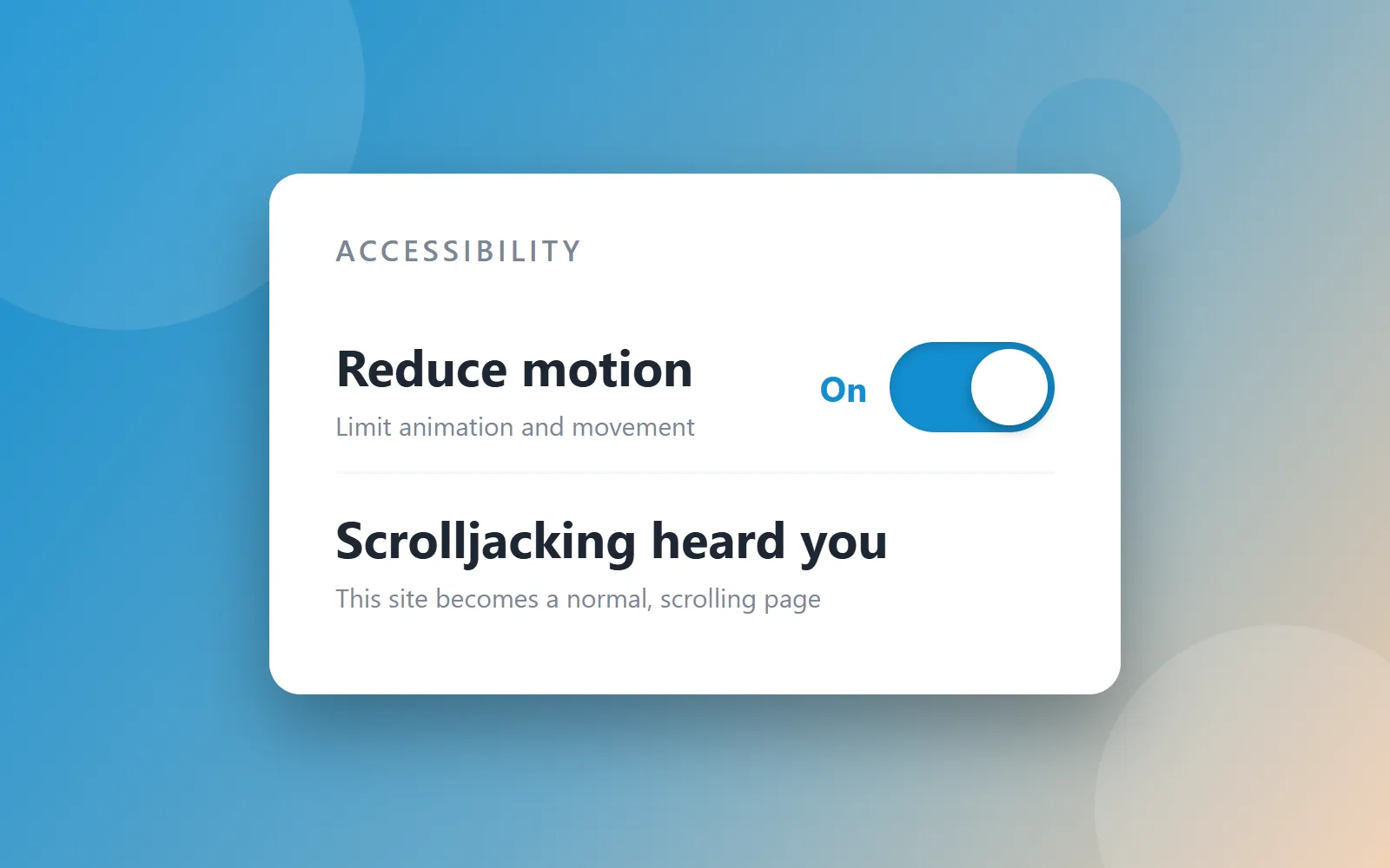
So this site surrenders completely. Reduced motion on means no scroll interception, no scrubbed runways, no animation at all: you get a normal, scrolling website, because that’s what was asked for. There’s nothing to opt out of when nothing forces itself on you.
And since plenty of people want off without knowing their operating system has a switch for it, the site puts the switch on screen. A selector in the corner lists the ways to experience this site (the scroll-driven flow you’re reading in now, reduced motion, a classic slide deck, and a plain standard version still on its way) as first-class choices, remembered between visits. That’s the generalization of the whole answer: reduced motion isn’t a fallback buried in a settings menu. It’s on the menu.
Answer two: keep the web’s furniture
The classic scrolljacked site is one enormous page pretending to be five, which is why the back button dies. This one is the opposite: seven real pages pretending to be one. Every screen that matters is a real URL: you can bookmark it, share it, land on it from a search result, and hit back and end up exactly where back should take you. Google indexes pages, not animations, so the search engine sees a perfectly ordinary website. The trick is that moving between those real pages is animated to feel identical to moving within one.
The part that gets left out of this argument is what fake screens do to a screen reader. Five sections stacked in one document are all still in that document, so the reader has five screens worth of content in front of it and no idea which one you are looking at. Announce a heading and it might be four screens away. Move focus and the page lurches somewhere the listener never asked to go. That is 1.3.2 Meaningful Sequence failing quietly, and it does not show up in a screenshot. Splitting the screens into actual documents solves it by not creating the problem: one page, one reading order, and the order is the one you wrote.
Answer three: the keyboard is a first-class citizen
Arrow keys move the page the same way a scroll wheel does. Tab order follows the visual order, there’s a skip link before the navigation, and nothing traps focus inside a section. If you navigate by keyboard, or your screen reader does, the page underneath the motion is honest (real headings, real landmarks, real links) because it’s a real page.
The detail that decides this one is how you hide a section that is off screen. If you hide it by
moving it, with a transform or an offset, it is still in the tab order: focus goes to it, the
browser scrolls to find it, and a keyboard visitor is now looking at a screen they did not ask
for with a focus ring they cannot see. Two things actually remove an element from the tab order.
display: none takes it out of the layout entirely, which is what this site uses when a
section is genuinely not part of the page yet. inert leaves it visible but makes it and
everything inside it unreachable, which is the right tool when a section is fading out and still on
screen. What does not work is opacity: 0, or a parent that is merely scrolled past. An
invisible link is still a link as far as Tab is concerned.
None of that is theoretical, and it is why the test at the bottom of this post starts with the keyboard rather than a scanner. An automated audit will pass a page whose focus order is nonsense, because every criterion it can check mechanically is satisfied.
Answer four: let the browser drive
The old jank came from JavaScript arm-wrestling the browser’s scroll thread. The View Transitions API ends the fight: the browser’s own compositor runs the animation, which is why the motion here feels native instead of faked. I break down the full mechanics on the web development page if you want to see how the engine works.
That is usually filed under performance, and it belongs here instead. Motion that runs on the main thread degrades on exactly the devices that people with disabilities are most likely to be using: older phones, budget hardware, a machine already spending its cycles on a screen reader or a magnifier. Animation the CPU cannot keep up with does not become slightly less pleasant. It becomes a page that stutters, jumps position mid-gesture and drops the thing you were reading somewhere off screen. Handing the work to the compositor is the difference between a site that behaves the same on a four-year-old Android as it does on a new laptop and one that only works on the machine it was built on.
Test any scroll-driven site in ten minutes
This is the test I would give any scroll-driven site, including mine. It needs no tooling, no budget and no spec knowledge, and it finds more than an automated scan will:
- Turn on reduce motion and reload. It is in Settings under Accessibility on every operating system: Display on macOS and iOS, Visual effects on Windows, Accessibility on Android. If the page still animates at you, that is 2.3.3, and it is the failure that makes somebody physically unwell.
- Put the mouse down and go front to back on the keyboard. Tab, Shift-Tab, arrow keys, Enter. If you cannot reach every link and advance every screen, that is 2.1.1 at Level A.
- Watch where the focus ring goes, not just whether it moves. If it vanishes, or the page jumps to a screen you were not shown, that is 2.4.3 and 2.4.7 together, and it is the single most common thing a scanner misses.
- Hit the back button. One press should take you back one screen. If it throws you off the site entirely, those screens were never pages.
- Copy a URL from the middle of the journey and open it in a new window. If you land at the top of the site instead of on the thing you copied, nobody can share it, bookmark it or arrive from a search result, and neither can a crawler.
So: is scrolljacking bad for accessibility?
No, and now you can say exactly why. Built the usual way it is inaccessible, and the people saying so have been right for a decade about the sites they were looking at. Built with the keyboard left alone, real URLs underneath, and a complete surrender to reduced motion, it is a normal accessible website that happens to move, and the same four decisions that get it there are the ones that make it indexable, which is not a coincidence. Crawlers and assistive technology want the same thing from a page: for the content to actually be in it.
If a site survives all five of those checks, the motion was a choice. If it doesn’t, the motion was the site. Accessibility isn’t the tax you pay for the fancy scroll: it’s the thing that makes the fancy scroll defensible.