Is Scrolljacking Bad for User Experience?
Yes. Generally, it is.
I am not going to quote study after study at you, because on this one the research and I disagree about what I wish were true, and the research wins. Taking somebody’s scroll away is a cost. It is a real one, it is measurable, and pretending otherwise would make the rest of this post worthless.
So here is the honest version from somebody who builds scrolljacked websites for a living. As a developer, and as someone who works on the web every single day, I think scrolljacking is genuinely impressive when it is done well, and I enjoy it, partly because I understand what it took to build. What I do not enjoy is watching it used blindly, on a site whose visitors never asked for it and whose brand gains nothing from it.
It is a brand decision, not a technical one
What it all really boils down to is the target market.
Look at my main site. I like flashy animation, it suits my brand, and a studio that cannot demonstrate the thing it sells has a credibility problem. It fits here. That is not an accident and it is not me getting away with something.
Now look at the rest of my work. I have built a website whose target market was blind users. I have built for an audience I will describe, as kindly as I can manage, as people who have done the same thing the same way for fifty years and would very much like it to keep working. I have built small town mom and pop. I have built “business happens here”. I have built sites where the information was the only thing any visitor wanted, and every extra element on the screen was in the way of it.
Scrolljacking on any of those would not just be off brand and pointless. It would be intrusive, because it takes control away from somebody who is relying on that site being predictable, or relying on it being reliable, and neither of those people arrived hoping to be impressed.
That is why scrolljacking is a horrible decision and an impactful one, and which of the two it turns out to be depends entirely on where you point it. So I treat it as a brand tool rather than a technical one. It goes in when it carries the brand and the message, and it stays out when it does not. Like any other user experience decision, it has nothing to do with what the developers and designers are capable of, and nothing to do with their opinion of it. It is about what the audience of that site wants to see, and what actually drives the goals of the site.
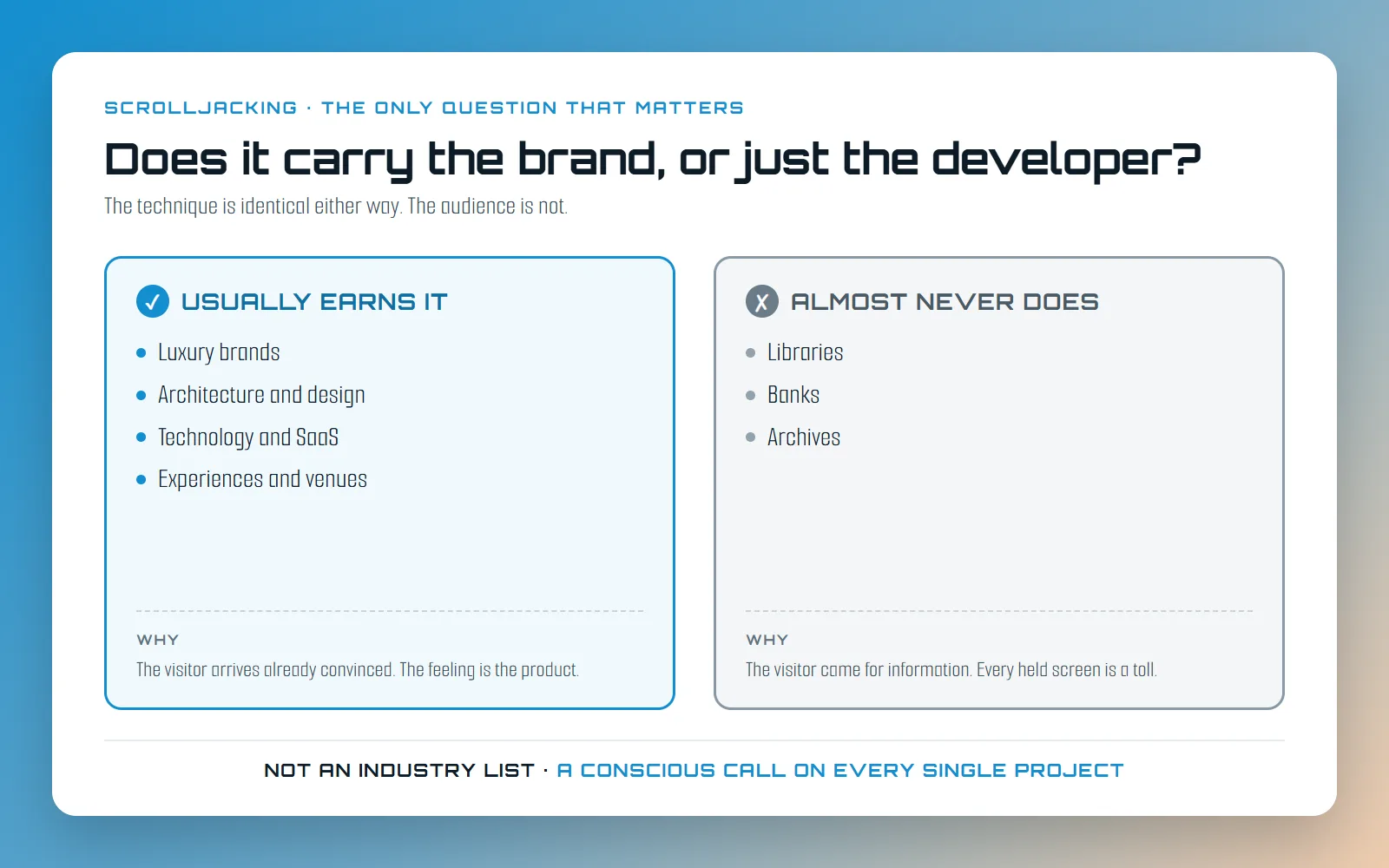
Where it usually earns its place
There is a pattern to the ones where it works, and the pattern is not really the industry. It is what the visitor arrived believing.
Luxury. When the price is not the argument, the feeling is. A brand that sells on desire cannot afford a website that behaves exactly like every other website, because a product presented like every other product reads as every other product.
Architecture and design. The work is spatial and sequential. You experience a building by moving through it, one view at a time, in an order somebody chose for you, and a page that reveals one thing at a time is closer to the truth of that than a grid of thumbnails is.
Technology and software. Not the product, the pitch around it. A company whose entire claim is that it is doing something nobody has done before gets to prove that in how the page behaves, and the further out the idea, the more the site is expected to look like it came from there.
Experiences and venues. The clearest case there is, and the site makes the full argument for it on the scrolljacking page. An advertisement for an experience is not supposed to be comfortable. It is supposed to hand you a sample of the feeling you are being asked to pay for.
What those share is that they need to convey top quality, they are usually bold enough to take a risk, and their customers tend to arrive already convinced. There is a blunter way to put that, and it is closer to how I say it out loud: these are brands that do not have to worry much about user experience, because comfort is not what is being shopped for. Optimise a site like that for comfort and you have optimised it for the wrong thing.
Where the answer is almost always no
Libraries. The widest possible audience, a public duty to serve all of it, and a visitor who came to find one specific thing.
Banks. Trust in a financial institution is built out of nothing unexpected ever happening. Every surprising movement on a page about somebody’s money is a small withdrawal from the only account that matters.
Archives. The entire product is retrieval. Anything you place between the query and the record is damage, however beautifully it animates.
If the honest description of your audience is “they came to look something up”, you already have your answer, and it does not change because the animation is good.
None of that is a permission slip
This is the part I actually care about, and it is why I keep both of those lists short and general. They are a starting point for a conversation, not a verdict. Taking an industry off a list and building it a scrolljacked website is the same blind usage I complained about at the top of this post, just with better taste.
Two architecture practices can need opposite websites. One chases cultural work and competition entries, and its audience expects to be moved before it is informed. The other does school extensions and church halls in one county, and its audience is a facilities manager with a budget and a deadline. Same industry, same services, same list. I would build the first so the motion carries the story, and the second as fast, plain and skimmable as I can make it. Nothing about the word “architecture” told me which was which. The brand and the audience did, and only after I asked.
It runs the same way on the other side of the line. No is the right default for a bank or an archive, and I would need a lot of convincing to move off it, but it is still a default, and the thing holding it up is the audience rather than the sector.
So it gets evaluated brand by brand and audience by audience, and it has to be a conscious decision on every single project. Every time. Not something inherited from the last site I built, not something a client picked up from a competitor, and not something taken off a list on somebody’s blog, this one included.
One thing that is not up for discussion at any point in that conversation: a brand earning the friction does not earn a broken keyboard, a stranded screen reader or a page that ignores somebody’s reduced motion setting. Those are four separate build decisions, all of them optional, and not one of them is the scrolljack.
The question to ask before you ship it
When you are deciding whether to include a more intrusive animation or technique, the only useful question is whether it is worth it, and that splits in two.
Does the brand actually gain from it? Not does it look good, because it will, and not are you proud of it, because you should be. Does the brand gain. And second: will this audience be fine with a bit of technology taking some control away from them? Picture the real visitor. On a phone, on a train, one hand, fourth tab open, six minutes to decide whether you are worth a phone call. If either answer is no, the answer is no, and it does not matter how good the section was.
Or you can do it my way, which is a lot more work
The other option is the one I took, which is to stop treating it as a single decision, and the page you are on is the first half of that.
I keep my blog posts standard, for the most part, because conveying information is the goal here and not one word of it is served by holding you still. No pinned sections, no hijacked wheel, nothing between you and the next paragraph. Occasionally a post breaks that deliberately, when the thing being explained is the motion itself, but that is a call made once per post rather than a house style. This is the same brand you would meet anywhere else on the site, behaving completely differently, because you came here to read something. That is this entire post applied to my own work.
Then visit the main site and you will see the other half. I spent a stupid amount of time building different versions of those pages, because I wanted to go a little crazy with the technique and I still wanted the site to be, or to become, as accessible as it possibly can be. So the navigation over there carries a control that changes what kind of website you are on. The standing version pins and animates sections as you scroll while your scroll bar stays yours the whole time. The slide deck, one full screen per gesture, is a mode you can switch on if you want it. And a reduced motion setting turns the whole thing into a plain, still, ordinary page, which is also what you get automatically if your operating system has already asked for that on your behalf.
Separate products rather than one hybrid, and I am not going to pretend that is cheap. It is the most expensive answer on this page. It is also the only one that lets a site be bold for the people who want bold and quiet for the people who do not, which beats picking a side and losing half the room. If you want the longer account of what came out of this site while I was working that out, that is a whole post of its own.
Doing it right on the other side, too
Choosing the right brand is half of it. The other half is that a site with this much motion in it still has to be a good website underneath, and that part is not a matter of taste.
Every word on this site is in the HTML on arrival, not injected by JavaScript after the fact, so search engines and the AI assistants people now ask instead of searching can both read it. Every section has a real URL. The structured data and the plain text summary at /llms.txt are there so that a model quoting this site quotes it correctly. And the accessibility work is not a pass at the end, it is the reason the reduced motion version exists at all. Those scores matter to me exactly as much as picking the right brand does, and I would not trust the brand argument from anybody who could not produce them.
None of that is theoretical. This site went from nothing to page one for its target term in a week, and I wrote down exactly what I did, motion and all.
So: is scrolljacking bad for user experience? Usually, yes. For a small set of brands, pointed carefully, chosen one project at a time, and built so that nobody gets locked out of the result, it is the most effective thing you can put on a page. If you want to know honestly which of those two your business is, here is how I build, and I will tell you straight, even when the answer is that you should not be doing this at all.