What I’ve Learned Building a Scrolljacking Website
Three weeks ago I published the case study for this site: what I set out to build, the rules I made myself follow, what broke, and what shipped. This is the follow-up, and I think it is the more useful of the two. A case study gets written at the moment you are proudest. A follow-up gets written after the thing has been live long enough to argue back.
I went into this knowing that scrolljacking is bad for UX by default, and that bad UX drags a long tail of other things down with it: accessibility, performance, search, plain comprehension. I built one anyway, for two reasons. The first is that I am a UX and UI designer as well as the developer, and I am not willing to throw a tool out of the box because most people swing it badly. The second is less noble. I like scrolljacking. Done well it is the top end of what CSS animation can do to a page, and nothing else on the web lands quite as hard.
Why it has the reputation
None of the complaints are fashion. Every one of them is something a real build actually gets wrong:
- It takes the scroll away. The visitor has one input they trust completely, and the site overrides it. When the override is even slightly off, wrong speed, wrong distance, a swallowed keypress, the page stops feeling designed and starts feeling broken.
- It hides content from search. The usual build is one URL with everything stacked behind JavaScript, so there is nothing to index and nothing to link to. That is the real SEO problem, and it is a structural choice rather than a property of the animation.
- It locks out the keyboard and anyone who needs less motion. Whether scrolljacking is bad for accessibility comes down to omissions: no keyboard parity, no reduced-motion path, focus landing on things nobody can see.
- It is heavy. Libraries, listeners firing on every pixel of scroll, layout thrash. The page picks a fight with the browser over the one thing browsers are best at.
- It spends the visitor’s time before earning it. Three seconds of animation before a sentence appears is three seconds of somebody deciding whether to leave.
What we did so those tradeoffs are not here
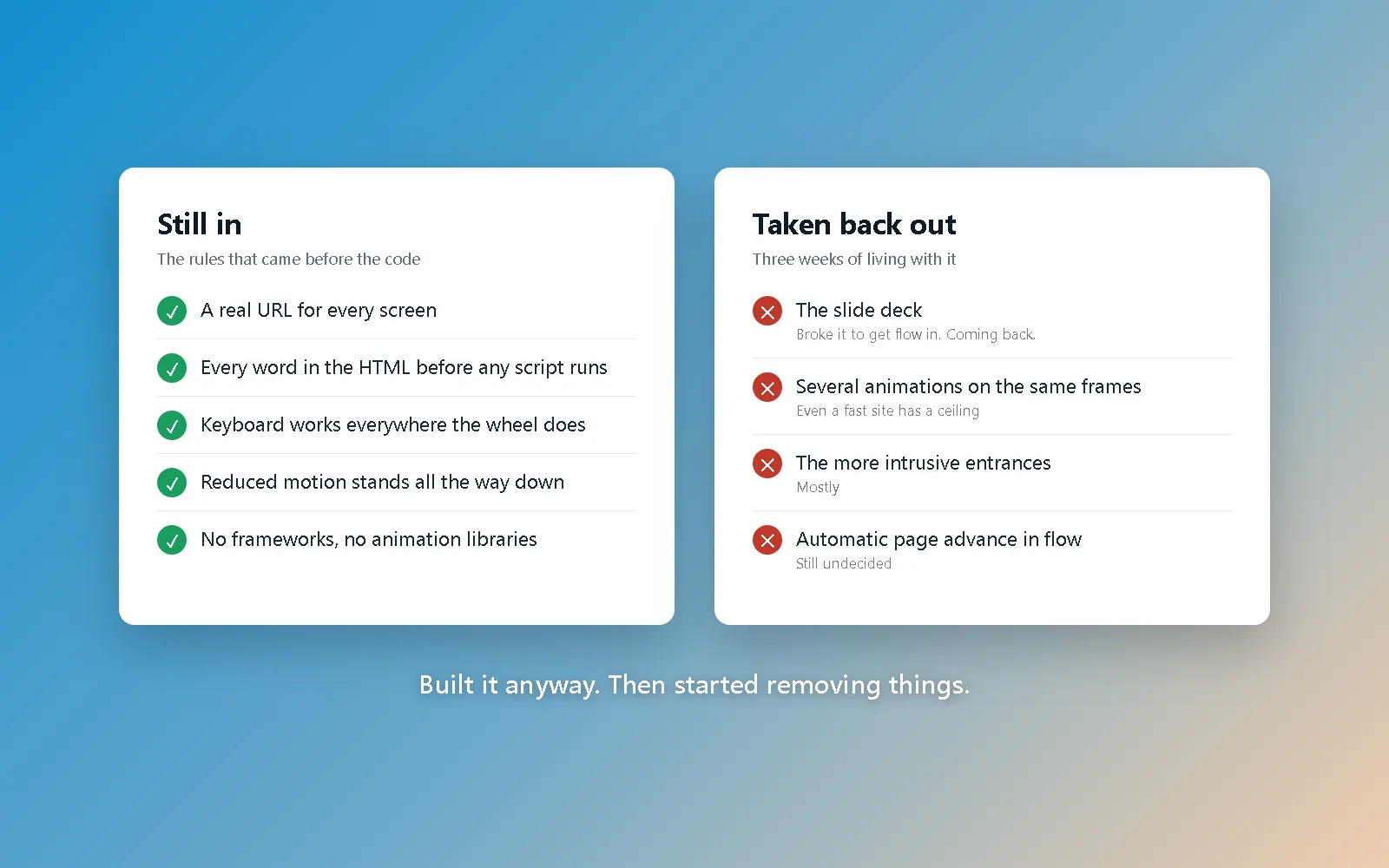
The rules came before the code, and each one answers a complaint above. Every screen has a real URL, so nothing is trapped behind a scroll position. Every word is in the HTML before any script runs, so the page reads fine with JavaScript off and reads fine to a crawler. Keyboard input works everywhere the wheel does. If your system asks for reduced motion, the site stands down completely and becomes an ordinary scrolling page, which is the full surrender rather than a gentler animation. And there are no frameworks and no animation libraries anywhere in it: one stylesheet and a few small scripts, written from a blank file, which is what hand-coding a website means.
The one I would add to that list today is the experience selector in the corner. Reduced motion used to be something the site read off your operating system and nothing more. Now it is also a choice you can make on the page, on any page, and it sticks. The general version of that idea: if your motion is any good, it survives being optional.
Where the site actually is today
Honestly, it needs to tone it down, and I am the one saying so.
The first version of this site was a slide deck. Every section was exactly one screen, the wheel moved you exactly one section, and page changes were animated across a real navigation so the seam never showed. It was the thing I was proudest of in the case study. It was switched off for a while, and it sat in the experience selector marked coming soon.
I want to be precise about why, because “we improved it” would be a nicer sentence and a false one. I had to break the slide deck to get the "flow state" in place. The two grammars want opposite things from the same markup. The deck needs to lock most of the content in place to maintain the slide deck illusion and work with the view transitions. The scrubbed animations that flow runs on need a genuinely scrolling page, with sections that can run longer than the viewport. Rebuilding around the second left the first in pieces, so rather than ship a half-working option I marked it coming soon and rebuilt it properly. Several of the more intrusive animations came out in the same pass... Mostly.
Scrolljacking is an amplifier, not a feature
If I could keep only one lesson from all of this, it is this one. Scrolljacking does not make a site good. It multiplies whatever the site already is.
On a site that is fast, coherent and properly designed, it reads as confidence. On a disjointed site it makes the disjointedness impossible to miss, because now the seams are moving. If your site is slow, scrolljacking will show every visitor exactly how slow, in a way a static page politely hides. It has to be an extension of quality that is already there. It cannot be the thing that supplies it.
Even a fast site has a ceiling
I did not expect this one. Every animation here is hand-written CSS, with no libraries anywhere in the stack, and it still hits a wall when several of them run at the same moment. Not one expensive animation. Several cheap ones, overlapping. A pinned section scrubbing, a card grid assembling, a headline blurring past the camera, all on the same frames, and a mid-range laptop starts dropping them.
The fix is nearly always removal rather than tuning, which is the same lesson the minimalist theme is built on, arriving from the opposite direction. A good site is not about what you can add. It is about what you should.
The transitions between pages are the hard part
Animating inside a page is a solved problem now. Animating between two real pages without the result feeling janky is not, at least not for me yet.
Two things I learned the hard way. The first is that a page transition does not stop the visitor’s hands. The momentum from the flick that left the last page carries straight into the next one, so the new page was already a quarter of the way into its opening animation before it had painted. It is fixed now with a very short window on arrival where the site ignores input.
The second is less comfortable. An automatic page change can be exactly as intrusive as a broken site. Scrolling past the bottom of a page and being carried to the next one is a wonderful trick in a deck, where the entire premise is that you are being moved through something. In flow, where you have spent two minutes reading at your own pace, the same move can feel like the site took the wheel out of your hands. I have not settled this. I may end up reserving automatic advance for the slide deck and letting flow pages simply end. Saying that a decision is still open seems more useful than pretending the version currently live is the final answer.
Some developers will hate it regardless
Worth knowing before you spend a month on it. No matter how carefully it is built, how much of it is keyboard-operable, or how completely it stands down under reduced motion, the developers who cannot or will not do this kind of work react to seeing it the same way every time. I take the accessibility and performance criticism seriously; most of this site’s rules exist because of it, and the accessibility post is me agreeing with the critics in detail. But “scrolljacking is always wrong” and “I have never built a scroll animation I was proud of” tend to arrive in the same conversation.
The brand has to be right, and most brands are not
This technique suits a narrow set of businesses. Technology, fashion, architecture, hospitality and lifestyle. Anybody whose product is partly an experience, and anybody who would rather their website make a statement than be one of the millions that do not. For those brands, used tastefully and in the right place, it can be exactly what the site needed to land the message.
For everybody else it is a liability, and the reason is not really about scrolljacking at all. A SaaS company should not get the same site as a law firm. An architecture practice certainly does not want to look like a real estate portal, and those two get confused constantly. A website is an argument for one specific business, and a technique that flatters one of them is actively working against the other.
The single place on this site where I let the technique run at full strength is the haunted attraction theme, and that is deliberate. An advertisement for an experience is not supposed to be comfortable. It hands you a sample of the feeling you are being asked to pay for. That is the narrowest case I can make for the full version, and I would rather state it narrowly than pretend it generalises.
The real lesson: build it for the audience
All of the above collapses into this. A good digital marketing decision is made for the audience. Not for the developer, and not, uncomfortably, for the client. I have watched clients lose traffic they already had by building the website they personally wanted to look at.
The pattern never changes. Your audience is not on your site every day. Most of them will be on it once, briefly, and you get one chance to be worth their attention. A homepage five miles long because everything the business is proud of had to go somewhere does not convert anybody; it buries the one thing that would have. Motion works the same way. An animation that still delights you on the fifteenth pass is an animation your visitor is seeing once, while trying to work out whether you can help them.
There is a whole post coming about the pitfalls to avoid when you are having a site built. This is the first of them.
The uncomfortable part: it is already working
The site is not finished. There is still a maintenance notice on the home page. People are reading these posts anyway: the cluster reached page one for its target term inside a week, on a domain Google had barely met, while the thing it describes was being rebuilt underneath it.
I find that funny and also instructive. The SEO and AEO work paid off before the design did, which tells you which of the two a search engine was in a position to evaluate. It also means the honesty in these posts is not optional. Somebody is reading this on a site whose slide deck I broke on purpose.
The whole website is the process
I built this as a learning exercise more than a finished product, and I will keep saying so for as long as it is true. Every rule on the web development page is there because something here broke first, and the scrolljacking page is the argument in full, updated whenever I change my mind about part of it.
If you want a site that uses this well, or a site that looks nothing like this one and is built with the same care, that is a conversation. And if you want to watch me revise any of the above, check back. That is rather the point of doing it in public.