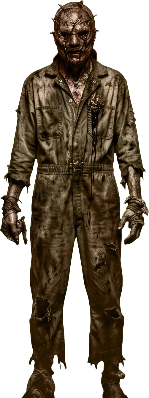
01 · Haunted attraction websites
Your website is the first room of the haunt.
Animations like the one you just scrolled through are statistically proven to be bad for user experience, but that is kind of your whole thing, right?
We take care of the important stuff. Anyone who asks for an uninterrupted experience gets exactly what they asked for, every time. But we believe a bit of scrolljacking can land in a way a “user friendly” site can't, if you have got the brand for it. You do.
You spend nine months on the build. Sets, actors, timing, the one hallway that gets them every time. Then the whole thing is sold on a page with a cheerful orange banner, a stock jack-o'-lantern and a ticket button borrowed from a template that also sells pumpkin patches and wedding venues.
That gap is the pitch. A haunted attraction is not selling information, it is selling fear, so why build your site the same as an office building or a lawfirm?
And then, below the fold, it becomes an ordinary, fast, accessible website that tells people the dates, the age guidance and where to park, because the second job is just as important as the first.
02 · The technique
Scrolljacking is a bad idea. This is the exception, and it is not a small one.
Taking over someone's scroll is the most disliked technique on the web, and it deserves most of what it gets. On a business site it makes people feel handled. It slows down a reader who came for one fact. It is usually built on one URL with the content locked inside JavaScript, which is why the pages that do it tend to rank badly. That is the honest case, and it is made in full over on the scrolljacking page.
The objection is about comfort. Some businesses are not selling comfort. An advertisement for a horror attraction is not supposed to feel easy. It is supposed to make you slightly reluctant to keep going and then make you keep going anyway, which is the exact sensation on the ticket. A page that takes the wheel, holds you at a door and makes you walk through it is not a usability failure here. It is the product, demonstrated, for free, before anyone commits.
There is a wider version of this. The businesses that can afford to break the rules are the ones whose customers arrive already convinced, the same way a genuinely established name does not have to fight for a search term, because people type the name. An experience business is in that position more often than it realises: nobody researches four haunted houses on a comparison chart. They pick the one that made them feel something. Comfort is not what they are shopping for, so a site optimised for comfort is optimised for the wrong thing.
That is the entire argument for the full-strength version, and it is narrow on purpose. If your visitor's goal is to find a phone number, none of this applies and I will tell you so.
Where it earns it
The experience is the product
Haunted attractions, haunted trails, scream parks, immersive theatre, escape rooms, horror festivals, nightclubs, themed bars. Anywhere the thing being sold is a feeling, the site is allowed to be a small sample of it rather than a brochure about it.
Where it does not
The visitor came for a fact
Opening times. Ticket prices. Whether it is suitable for a nine-year-old. Directions. On this build every one of those is plain, fast, linkable content below the film, never inside it. Selling the fear and hiding the parking information are two different decisions, and only one of them is a good idea.
The part nobody skips
Anyone can decline the ride
Every animation on this page is off for a visitor whose device asks for reduced motion, and what is left is a readable page with the same content in the same order. That is not a footnote: it is the difference between a technique and an accessibility problem. How that is done.
03 · The season
A year of work, sold in about six weekends.
Very few businesses have a revenue window this sharp. The site is quiet for ten months, then carries the entire year in the space of a few weeks, usually while a competitor twenty minutes away is running the same dates, the same prices and, more often than not, the same template.
Two things follow from that, and they pull in the same direction.
The site has to be genuinely fast, on a phone, in a field. Your traffic peaks on a Friday night from people standing in a car park deciding between you and somewhere else, frequently on one bar of signal. A page carrying a builder runtime, six plugins and a hero video is a page that does not finish loading before they give up. This one has no framework, no plugin stack and no third-party script on load; the whole opening film is CSS and a canvas.
And it has to be found in September. Every screen of this page is real text on one real URL, so a search engine reads it the way you do, which is the specific thing most scrolljacked sites get wrong and the reason they earned the reputation. The full version of that argument is on the blog.
Off-season
The ten quiet months still work
Recruitment for actors and volunteers, the group and corporate booking enquiry, last year's photo and video reel, press coverage, and the mailing list that makes opening weekend sell itself. A site that only exists in October is a site doing a third of its job.
Peak
Dates and sold-out nights, without a rebuild
The handful of things that actually change through a season (nights, times, what is sold out, this weekend's warnings) are built to be changed quickly and safely. How that works for you is settled in the scope, not assumed: see the questions below.
04 · The build
What actually goes on a haunted attraction website
A haunted attraction website has two jobs that pull against each other: sell the fear, and answer the questions. The film at the top of this page is the first job. Everything under it is the second, and the second is where most of the money is won or lost: a visitor who cannot find the age guidance or the parking does not email you, they book somewhere else.
So the sections a haunt build almost always needs, in roughly the order people look for them:
- TicketsOne unmistakable action, on every screen, going straight to whatever ticketing platform you already use.
- Dates & hoursThe single most-visited thing on the site. Its own URL, readable in two seconds, with sold-out nights marked.
- Intensity & age guidanceWhat happens inside, how frightening it actually is, whether anyone touches you, and the honest lower age bound. Parents look for this first.
- Access & content warningsStrobe lighting, fog, loud noise, confined spaces, step-free routes. It is the right thing to publish and it prevents refunds.
- Getting thereAddress, map, parking, queue location, what the walk from the car is like in the dark.
- Groups & season passesThe higher-margin sale, usually buried three clicks deep on a template site.
- The reelPhoto and video from last season, sized and served so it stays sharp without costing the page its speed.
- Casting & volunteersThe page that carries the off-season, and the reason your best actors come back.
- Press & local listingsA page a local paper can lift dates and a photograph from without emailing you.
This page, checkable
What it ships
No framework and no page-builder runtime. One stylesheet, written for this page. No third-party script on load: analytics runs only if you accept cookies. No cross-origin requests: every asset is served from this domain. No webfont for any of the text you are reading. The opening film is CSS, one image and a canvas.
The horror problem
Dark themes are where contrast dies
Black-on-black is the entire aesthetic and it is also the fastest way to build a page nobody can read. The deep red in this design is a surface colour and never a text colour, for exactly that reason; the red you can read is a lighter one, measured. Atmosphere and legibility are not actually in tension; it just takes someone checking.
05 · Fit
Who this is for, and who it is wrong for
Best fit
Live horror, sold by feel
Haunted houses, haunted trails and hayrides, scream parks, escape rooms, immersive and site-specific theatre, horror film festivals, themed bars and late-night venues. Anywhere a customer is buying an hour of being somewhere, and choosing between you and one other place on a Friday night.
How it starts
The theme, or an empty file
You can start from Theirs (this page is it, running live) and have it fitted to your attraction and grown into the full site. Or we start from nothing and design it around your story, which is usually the better answer if your haunt has one. What a theme settles is the design phase; the build is the same work either way, and it is the same person doing it. See the collection.
Honest answer
When this is the wrong call
If most of your traffic is people checking whether you are open tonight, the film is in their way and you should not buy it. Family-friendly attractions are a harder fit than they look: the register here is genuinely unpleasant, and "spooky but fun" is a different design. And if you are somewhere the first question is always price, lead with price. I would rather build the right thing than the atmospheric one.
06 · Questions
Questions people actually ask
Won't scrolljacking hurt my search rankings?
Not the way this is built, and that distinction is the whole thing. What hurts rankings is the usual implementation: one URL, content that only exists once JavaScript has run, and nothing for a crawler to read. Every word on this page is real text in the HTML, the sections that matter get their own real URLs, and the motion is CSS driven by scroll position rather than a script intercepting it. Google has no scrolljacking penalty; it has a penalty for pages it cannot read. The long version.
What about visitors who get motion sick?
They get a still page. Every browser exposes an operating-system setting for reduced motion, this site reads it before the first pixel is painted, and when it is on the film does not play at all: the same content, in the same order, with nothing moving. It is also worth saying plainly: an attraction whose site carries strobe, fog and confined-space warnings has customers who care about this, and doing it properly reads as competence rather than compliance.
Can it work on a phone?
It has to: that is where nearly all of the traffic is, often on bad signal in a car park. The film runs on a phone, the layout below it is built for one first, and the page carries no framework, no plugin stack and no third-party script on load, which is most of what makes a typical seasonal site slow. Load it on your own phone before you decide anything else about it.
Do we update the dates ourselves when the season changes?
Only if you want to. Every build is custom, so this gets settled with the scope. Some attractions want to post their own updates through the season; others would rather send them over and have it handled, and on a six-week season, a same-day change is usually what actually matters. We settle that together, early. Either way the domain and the content are yours, and if you ever leave you get a copy of the files any developer can host.
Does it plug into my ticketing?
Yes, and it should stay yours. Whatever you already sell through keeps handling the money, the capacity and the timed slots; the site's job is to get people to that button faster and in the right frame of mind. Replacing a working ticketing platform is rarely the improvement, and a site that tries to own the checkout is a site you cannot leave.
What does it cost to start from the theme?
A theme is licensed once and then fitted to you. It costs roughly what starting from scratch costs, and the honest reason is that fitting it to your attraction and growing it into the full site is the actual work: what a theme settles is the design phase, not the build. Tell me the scope and you will get a real number rather than a range.
07 · Contact
Tell me what is behind your door.
What the attraction is, how many nights you run, and what you are using now. You will get a considered reply within two working days, from the person who would design and build it, because there is only one.
If you are reading this between February and August, that is the right time. A haunt site built in September is a haunt site built in a hurry.
The Better Website is a one-person studio in Raleigh, North Carolina, serving the Triangle and clients nationwide. Every site is hand-coded in plain HTML, CSS and JavaScript.
PS · This theme is for sale
You have already been through it. Theirs is one of our premium themes and this page is the live demo: the door, the hallway, the thing at the end of it, and the burial. If it suits your attraction it can be fitted to your brand and grown into your full site. Say so when you write and we will start there.
The collection
Like this theme? You might also like:
Every theme in the collection is a complete, hand-coded design, licensed once and then fitted to your brand and grown into your full site. Same standards as everything above: written by hand, not built on WordPress, a page builder or a CMS. What a theme settles is the design phase: the work is fitting it to you.
Rain on brick, a buzzing neon sign and fog rolling low: the same weather as this page, pointed at last orders instead of a locked door.
Cards that lean back into the dark while wireframe icons blink to life like projectors starting up. Another dark theme, another kind of unease.
Drawing sheets pinned to a wall where scroll position is the time of day: the wall shifts colour and every shadow swings with the sun. The opposite of this page in every respect.
See the full collection of premium themes, or tell me which one fits your business.