Building a Scroll-Driven Website: A Case Study
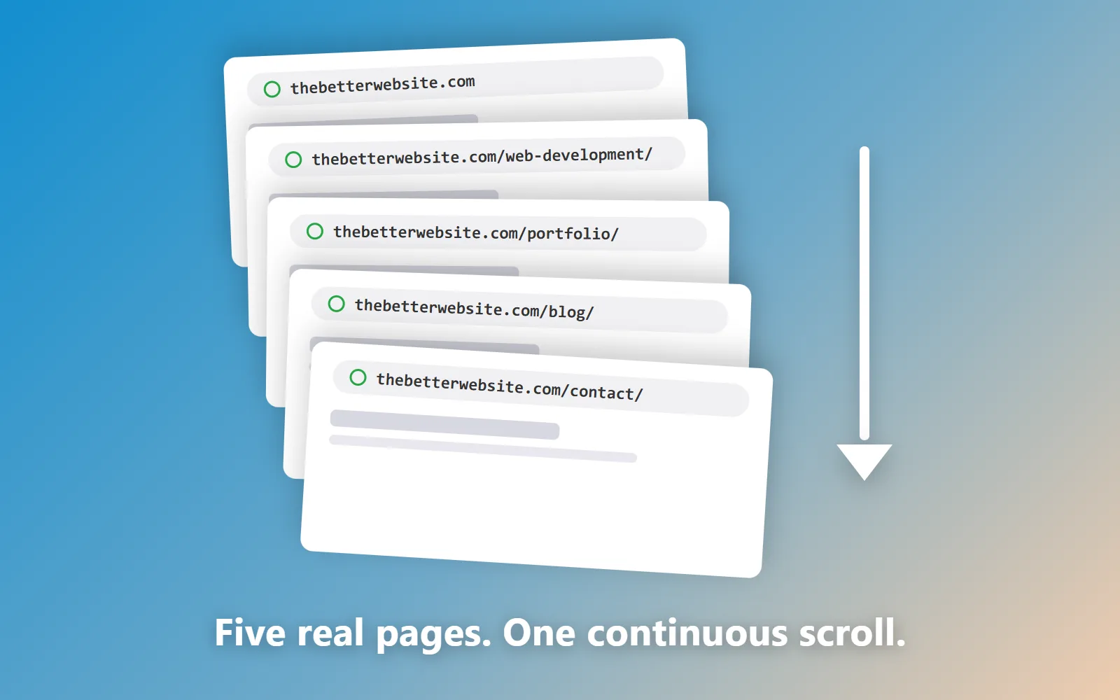
Every post on this blog so far has explained a piece of this site: what scrolljacking is, whether scrolljacking is bad for accessibility, whether it hurts SEO, the API that animates it. This one is the whole story in order: what I set out to build, the rules I made myself follow, what broke, and what shipped. Consider it the case study for the site you’re currently scrolling.
The brief
I had a WordPress agency site, and I was done with it: done with the plugin treadmill, done with pages I didn’t fully own. The replacement had one job beyond replacing it: the site itself had to be the pitch. I sell a way of building websites; the only honest portfolio for that is a site built that way, where anything I claim on a page is being demonstrated by the page. Which meant no safe, ordinary rebuild. It had to do something you don’t see every day, without breaking any of the things ordinary sites do right.
The spark
The motion came from CodePen: a one-page navigation demo by hrtzt where the whole screen slides sideways, one panel per input, with a little overshoot as each panel’s content lands. It’s the kind of motion that makes you grin. It’s also, structurally, a single page, and a single page was exactly what I couldn’t ship. So the real project became: keep that exact feel, but spread it across a real, multi-page website. Original code, borrowed soul.
The architecture: a deck of real pages
The concept I landed on was a deck. Every section of every page was exactly one screen tall. Window scrolling was switched off; the wheel, the arrow keys, and touch swipes each advanced exactly one section, animated by the browser’s View Transitions API. So far, standard scrolljacking.
Two things have changed since I wrote this, and they change how you should read the rest. The first: the deck is not what this site does any more. What you are scrolling right now is flow. The page scrolls the way any page scrolls, and your scroll position drives the animation rather than the navigation: sections pin themselves, panels assemble, a headline flies past the camera.
The second, and I would rather say it plainly than let this post quietly go out of date: I broke the slide deck myself to get flow in place, and it is now rebuilt and back on the menu. The two grammars want opposite things from the same markup, so rebuilding around one left the other in pieces for a while. It is a live choice in the experience selector today, sitting alongside flow and reduced motion, and remembered between visits. Flow is what you get unless you pick otherwise, so that is almost certainly the mode you are reading in. The architecture described below is still what everything here is built on. The full accounting of that rebuild, including what else came back out, is in what I have learned building a scrolljacking website.
The trick is at the edges, and this part survived the rebuild. Scroll past the bottom of a page and the site doesn’t stop: it navigates, a real page load to the next URL in the chain, and a cross-document view transition plays the same slide animation across the boundary. Same keyframes, same easing, same duration. You can’t see the seam, and that’s the whole point: the visitor experiences one continuous site, while Google (and your back button, and your bookmarks) see ordinary pages. The one sneaky bit is a direction flag passed between pages, stamped before the first paint, so the incoming page knows whether to slide forward or backward. The rest is CSS.
The rules
Before writing it, I wrote rules, because scrolljacking has a deserved reputation and each rule answers one of the ways it usually goes wrong. Every screen gets a real URL. Every word lives in the HTML before any script runs. Keyboard input works everywhere the wheel does. And if your system asks for reduced motion, the whole thing stands down and the site becomes a normal, scrolling website: the full accessibility surrender, not a toned-down animation. No frameworks, no libraries: one CSS file, two small scripts, hand-written from a blank file.
What broke
A case study that skips this section is an ad, so: things broke. The one that earned a permanent rule I now check on every build is the white flash. The site’s glass-look buttons are translucent layers that read dark because of what’s behind them, and when the View Transitions API snapshots an element, the snapshot has no behind. Rendered alone, the glass is suddenly white, and for a split second every page change strobed. It regressed three separate times before the fix became law: the page background lives on the root element, and glass never gets its own snapshot without a dark base baked in.
The blog nearly broke the concept itself. A deck wants every section one screen tall; a blog index wants to grow forever. The answer at the time was a hybrid: a deck section that scrolled inside itself, holding the deck in place until you reached its edge, then handing the scroll back. That mechanism is what let a blog index sit inside the deck at all. The index is a normally scrolling page of its own now, which is a much duller solution and a better one, and the post you are reading was always a plain, normally-scrolling page. Old-fashioned reading didn’t need reinventing.
What shipped
A chain of real pages, a blog hanging off the side, zero JavaScript libraries, one CSS file, and motion that survives every input method I can throw at it. The architecture became a template, the template became themes I sell, and this post is me eating my own cooking one more time: a scroll-driven website, documented on itself.
The deeper technical walkthrough lives on the web development page, which runs every one of these ideas on itself. And if you want a site that works like this (or looks nothing like this but is built with the same care), the contact page is a few screens away. You could walk there from here.