Is Scrolljacking Bad for Accessibility?
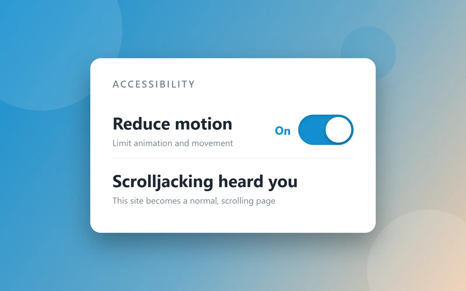
Yes — the way it is almost always built. Scrolljacking is bad for accessibility when it overrides the keyboard, ignores the visitor’s reduced-motion setting and breaks the back button, which describes most of the scrolljacked sites you have met. It is not bad for accessibility because a page moves. The damage comes from four specific implementation choices, each of which has a direct, buildable answer, and a site that makes the other four choices is perfectly usable by keyboard, by screen reader, and by someone who gets motion sick.
I build scrolljacked websites. I also spent a chunk of my career doing ADA compliance work, and I have written separately about why website accessibility matters at all. Depending on who you ask, that makes me either a hypocrite or exactly the right person to write this post.
One signpost before we start, because two different questions get asked with nearly the same words. This post is about the accessibility of scrolljacking specifically. If what you actually need is the ordinary version of the subject — keyboard-operable menus, images used as links, alt text that says the right thing — that is website accessibility basics, and it applies to every site whether it hijacks a scroll or not.
Does scrolljacking hurt accessibility? Four ways, specifically
The critics of scrolljacking — the usability researchers who’ve spent a decade calling it scroll hijacking — are not wrong. Their list of charges is fair, and it is worth being exact about it, because “it’s bad for accessibility” is too vague to fix:
- It takes control away from the person holding the mouse. You push the wheel a known amount and the page moves some other amount, decided by someone who has never met you.
- It keeps animating at people whose operating system is explicitly asking it not to. For someone with a vestibular disorder, unwanted motion isn’t an annoyance, it’s nausea — and they already told their computer that.
- It strands keyboard users when the tab order stops matching what’s on screen, or when focus lands inside a section the page has decided isn’t visible yet.
- It breaks the back button, because five screens pretending to be five pages are really one URL, and the browser has nothing to go back to.
Every one of those failures is real, and I’ve seen every one of them shipped. Here’s the part I’d push back on: none of it is the technique. It’s the implementation. Each charge has a direct answer, and this site — the one you’re reading right now — is where I prove it. (If you want the definition-level version first, start with What Is Scrolljacking?, or the full guide to scrolljacking for the technique end to end.)
Is scroll hijacking bad for ADA compliance?
It can be, and the honest version is more useful than a yes or a no. The ADA itself contains no line about scroll behavior. What it says is that places of public accommodation can’t discriminate, and the practical yardstick everyone — plaintiffs, the DOJ, and every remediation vendor — has settled on for websites is WCAG. The DOJ’s 2024 rule for state and local government adopted WCAG 2.1 Level AA outright; for a private business it is not law in the same way, but it is the standard your site will be measured against if anyone ever measures it.
So the useful question is which success criteria a scrolljacked build tends to fail, and there are three worth knowing by number:
- 2.1.1 Keyboard (Level A). Everything the page does has to be operable from a keyboard. If your sections only advance on a wheel event, arrow keys do nothing and you have failed a Level A criterion — the most basic tier there is.
- 2.4.3 Focus Order (Level A). Tab has to move through the page in an order that preserves meaning. A deck that hides sections while keeping their links focusable sends focus to things nobody can see.
- 2.3.3 Animation from Interactions (Level AAA). Motion triggered by interaction — which is exactly what scroll-driven animation is — must be able to be disabled unless it is essential to the content. This is the one written for this technique, and it is worth noting it is AAA rather than AA: honoring reduced motion is above the line most audits draw. Do it anyway. It is the single cheapest thing on this list and the one that matters most to the person it affects.
None of that is legal advice, and I’m a developer rather than a lawyer. But it is the shape of the risk: a scrolljacked site that keeps the keyboard, keeps focus order sane and stands down for reduced motion is not the site anyone builds an ADA complaint around. The four answers below are how you get there.
Answer one: surrender completely to reduced motion
Every modern operating system has a “reduce motion” setting, and every browser passes it
to your CSS as prefers-reduced-motion. Most animated sites that bother to check it just
tone things down — shorter durations, smaller slides. That misses the point. The person who
flipped that switch doesn’t want less of the ride. They want off.
So this site surrenders completely. Reduced motion on means no scroll interception, no scrubbed runways, no animation at all — you get a normal, scrolling website, because that’s what was asked for. There’s nothing to opt out of when nothing forces itself on you.
And since plenty of people want off without knowing their operating system has a switch for it, the site puts the switch on screen. A selector in the corner lists the ways to experience this site — the scroll-driven flow you’re reading in now, reduced motion, and a classic slide deck and a plain standard version still on their way — as first-class choices, remembered between visits. That’s the generalization of the whole answer: reduced motion isn’t a fallback buried in a settings menu. It’s on the menu.
Answer two: keep the web’s furniture
The classic scrolljacked site is one enormous page pretending to be five, which is why the back button dies. This one is the opposite: seven real pages pretending to be one. Every screen that matters is a real URL — you can bookmark it, share it, land on it from a search result, and hit back and end up exactly where back should take you. Google indexes pages, not animations, so the search engine sees a perfectly ordinary website. The trick is that moving between those real pages is animated to feel identical to moving within one.
Answer three: the keyboard is a first-class citizen
Arrow keys move the page the same way a scroll wheel does. Tab order follows the visual order, there’s a skip link before the navigation, and nothing traps focus inside a section. If you navigate by keyboard, or your screen reader does, the page underneath the motion is honest — real headings, real landmarks, real links — because it’s a real page.
Answer four: let the browser drive
The old jank came from JavaScript arm-wrestling the browser’s scroll thread. The View Transitions API ends the fight: the browser’s own compositor runs the animation, which is why the motion here feels native instead of faked. I break down the full mechanics on the web development page if you want to see how the engine works.
So: is scrolljacking bad for accessibility?
Built the usual way, yes, and the people saying so have been right for a decade. Built with the keyboard left alone, real URLs underneath, and a complete surrender to reduced motion, no — and the same four decisions that make it accessible are the ones that make it indexable, which is not a coincidence. Crawlers and assistive technology want the same thing from a page: for the content to actually be in it.
Here’s the test I’d give any scroll-driven site, including mine: turn on reduce motion. Unplug your mouse. Hit the back button. If it survives all three, the motion was a choice. If it doesn’t, the motion was the site. Accessibility isn’t the tax you pay for the fancy scroll — it’s the thing that makes the fancy scroll defensible.