How to Make Scroll-Driven CSS Animations
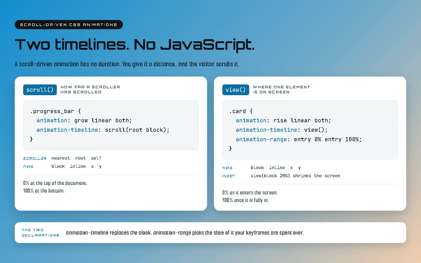
You want something on the page to move as a visitor scrolls, and you would rather not ship a library to do it. Good news: you no longer have to.
A scroll-driven CSS animation is an ordinary @keyframes animation with its
clock swapped out for a scroll position. Two declarations do it.
animation-timeline says which scroll position to read, and
animation-range says which slice of it the keyframes get spent over. No listener,
no library, no JavaScript at all.
This post starts with the simplest useful example and gets more ambitious a section at a time: one element fading in, then the same element leaving again, then the whole document. Nothing here pins a section or takes the scroll away from anybody. If you want that version, it is the next post up and it is built out of everything below.
Start with a reveal
Here is the whole thing. A card that fades in and rises into place as it arrives on screen, which is the effect most people are actually asking for when they ask about this.
.reveal {
  animation: rise linear both;
  animation-timeline: view();
  animation-range: entry 10% entry 90%;
}

@keyframes rise {
  from { opacity: 0; translate: 0 2rem; }
  to   { opacity: 1; translate: 0 0; }
}
Paste that, put class="reveal" on something, and it works. It is worth being
precise about which parts are new, because only two of those lines are.
The @keyframes block is exactly what you have always written. So is
animation: rise linear both, give or take the values. The two new lines are
animation-timeline: view(), which tells the animation to read this element’s
own passage across the screen instead of a clock, and animation-range, which says
to spend the keyframes between a tenth and nine tenths of the way through its arrival.
Two of the old values are doing more work than usual, though. linear matters
because easing is applied between keyframes, and a scrub that speeds up and slows down under a
steady finger feels broken rather than smooth. both is the fill mode, and it holds
the from-state before the range starts and the to-state after it ends, which is what stops the
card flickering to full opacity before its turn. Remember that one. It comes back later as the
worst trap in the whole feature.
What is actually happening
One idea underneath all of this, and the rest is detail. A normal CSS animation runs on a clock: you give it half a second and the browser plays it. A scroll-driven animation has no clock and no duration. If you set one it is ignored. What it has instead is a distance, and the visitor moves along that distance by scrolling.
Forwards, backwards, fast, slow, or dragged halfway and left there. It is not a playback, it is
a scrub, and that is why it goes into reverse correctly on the way back up without you writing
anything to handle it. It is also why animation-delay and
animation-duration stop being the dials you reach for, and
animation-range becomes the only one you will really spend time on.
The measurements: where entry, contain and exit actually are
So the range is the dial, which makes it worth knowing exactly what it is measuring. A
view() timeline tracks one element crossing the screen, and that crossing has four
moments in it. Everything you will ever write is a percentage of the distance between two of
them.
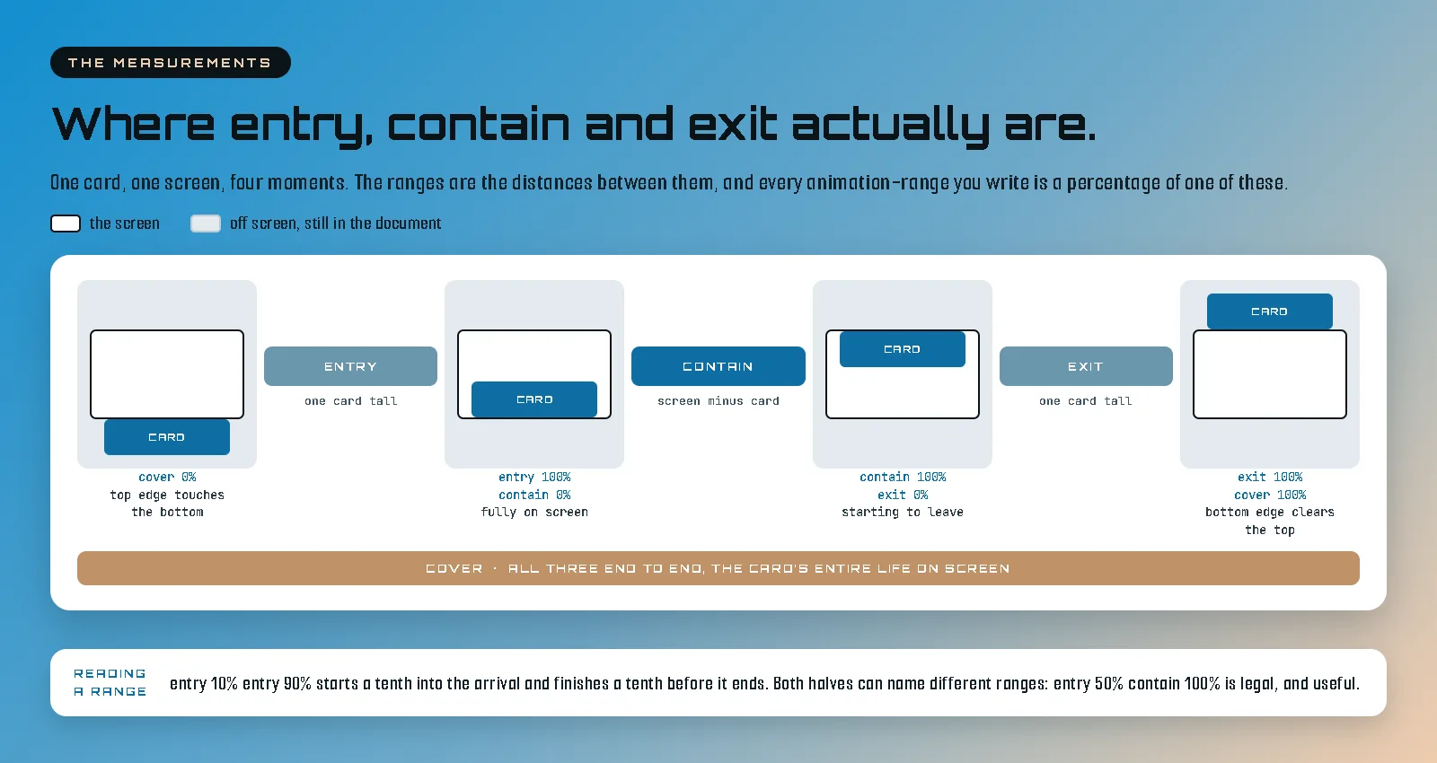
- entry is the arrival, from the element first appearing at the bottom edge to it being fully on screen. The right range for anything that should be finished by the time somebody is looking at it, which is why the reveal above uses it.
- contain is the middle, while the whole element sits inside the screen.
- exit is the departure, from the element starting to leave until the last of it goes.
- cover is all three end to end, its entire life on screen. Good for parallax, and a
trap when you meant
entry, because a cover-ranged animation is already well underway before the element is fully visible.
Editing a range is four moves and nothing else. Move the first number to change when a
beat starts. Move the second number to change when it finishes, and bringing it in early
is how you buy a pause: an animation that ends at entry 70% leaves the rest of the
arrival as a held frame. Stagger the same range across siblings, three or four points
apart, to make a group cascade instead of landing as a slab. And both halves can name
different ranges, which is the bit nobody explains: entry 50% contain 100%
means begin halfway through the arrival and finish as the element starts to leave. There are
also animation-range-start and animation-range-end if a shared class
sets one and a variant overrides the other, and you can use lengths instead of percentages if
you would rather think in pixels.
One more dial, which is the second argument to view() itself. An inset shrinks the
box the timeline is measured against, so view(block 20%) pulls both ends of the
screen in by a fifth and the reveal starts later and finishes earlier without you touching the
range. One value does both ends, two values set them separately, and a negative value grows the
box instead. It is the cleanest way to say “do not start counting until it is properly on
screen”.
The one gotcha worth carrying with you: what contain means flips depending on whether the
element is shorter or taller than the screen. Shorter, and it is the span where the whole
element sits inside the viewport, as above. Taller, and it is the span where the element
completely covers the viewport, which is the pinned span of a tall section. Same word, opposite
geometry, and it is why a range that behaved impeccably on a card does something baffling on a
full-height section. There are two further names, entry-crossing and
exit-crossing, which measure edges crossing edges rather than containment; for
anything shorter than the screen they are identical to entry and
exit, which is why most people never meet them.
Now let it leave again
The reveal spends its keyframes inside one range, which is the common case and also the boring one. The question that turns up immediately afterwards is what to do when you want the thing to arrive and leave. There are two answers and they are not equivalent.
The first is two animations on one element, each with its own range. All three of these properties take a comma-separated list, and the lists line up position by position.
.reveal {
  animation: rise linear backwards, fall linear forwards;
  animation-timeline: view(), view();
  animation-range: entry 10% entry 90%, exit 10% exit 90%;
}

@keyframes rise {
  from { opacity: 0; translate: 0 2rem; }
  to   { opacity: 1; translate: 0 0; }
}

@keyframes fall {
  from { opacity: 1; translate: 0 0; }
  to   { opacity: 0; translate: 0 -2rem; }
}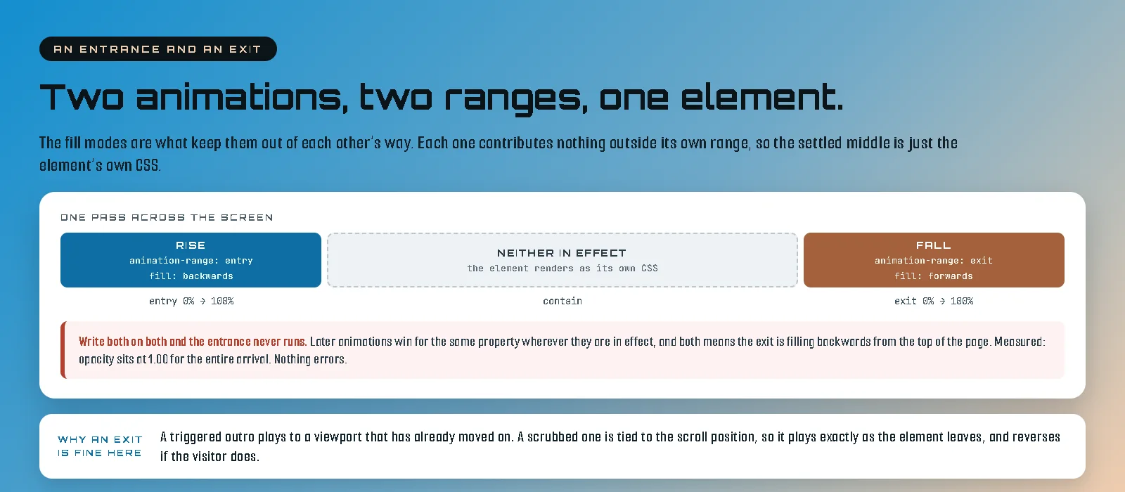
The fill modes are the whole trick, and writing both on both of them is a real
trap. Two animations on one element that touch the same property are resolved in order, and
the later one wins wherever it is in effect. both means the exit is filling
backwards from the top of the page, holding its own from-state over everything the entrance is
trying to do, so the entrance never appears: the element sits there at full opacity until it
leaves. Nothing errors and nothing warns you. You have written a fade-in that does not fade
in.
backwards on the entrance and forwards on the exit fixes it, because
each one then contributes nothing outside its own span. The entrance holds its from-state
before entry and lets go afterwards, the exit stays out of the way until
exit begins, and in between neither is in effect, so the element renders as its
own ordinary CSS. That middle stretch is the settled state, which is what you wanted it to be
anyway.
The second answer is one animation across cover, with the hold written into the
keyframes as a pair of identical stops.
.reveal {
  animation: reveal-both-ways linear both;
  animation-timeline: view();
  animation-range: cover 0% cover 100%;
}

@keyframes reveal-both-ways {
  0%   { opacity: 0; translate: 0 2rem; }
  30%  { opacity: 1; translate: 0 0; }
  70%  { opacity: 1; translate: 0 0; }
  100% { opacity: 0; translate: 0 -2rem; }
}
Fewer moving parts, no fill-mode puzzle, and those two identical keyframes in the middle are
the hold. The cost is that the two halves stop being independently tunable, and the stops are
percentages of cover, so the same four numbers give a tall element a long hold and
a short one a hurried arrival. Reach for this when the whole thing is one gesture, and for the
pair of ranges when the arrival and the departure are two separate ideas.
One note on why an exit is even reasonable here. A triggered outro is usually a mistake, because by the time it plays the viewport has moved on and nobody is looking at it. A scrubbed one cannot have that problem. It is tied to the scroll position, so it plays exactly as the element leaves, at whatever speed the visitor is leaving at, and it runs backwards if they change their mind.
Parallax, since somebody always asks
.hero_photo {
  animation: photo-drift linear both;
  animation-timeline: view();
  animation-range: cover 0% cover 100%;
}

@keyframes photo-drift {
  from { translate: 0 -8%; }
  to   { translate: 0 8%; }
}
This is the one case where cover is obviously right: you want the drift running
the entire time the photo is on screen, including the parts where it is only half visible. Keep
the travel small. Parallax stops reading as depth and starts reading as a bug somewhere around
fifteen percent.
Now the whole document
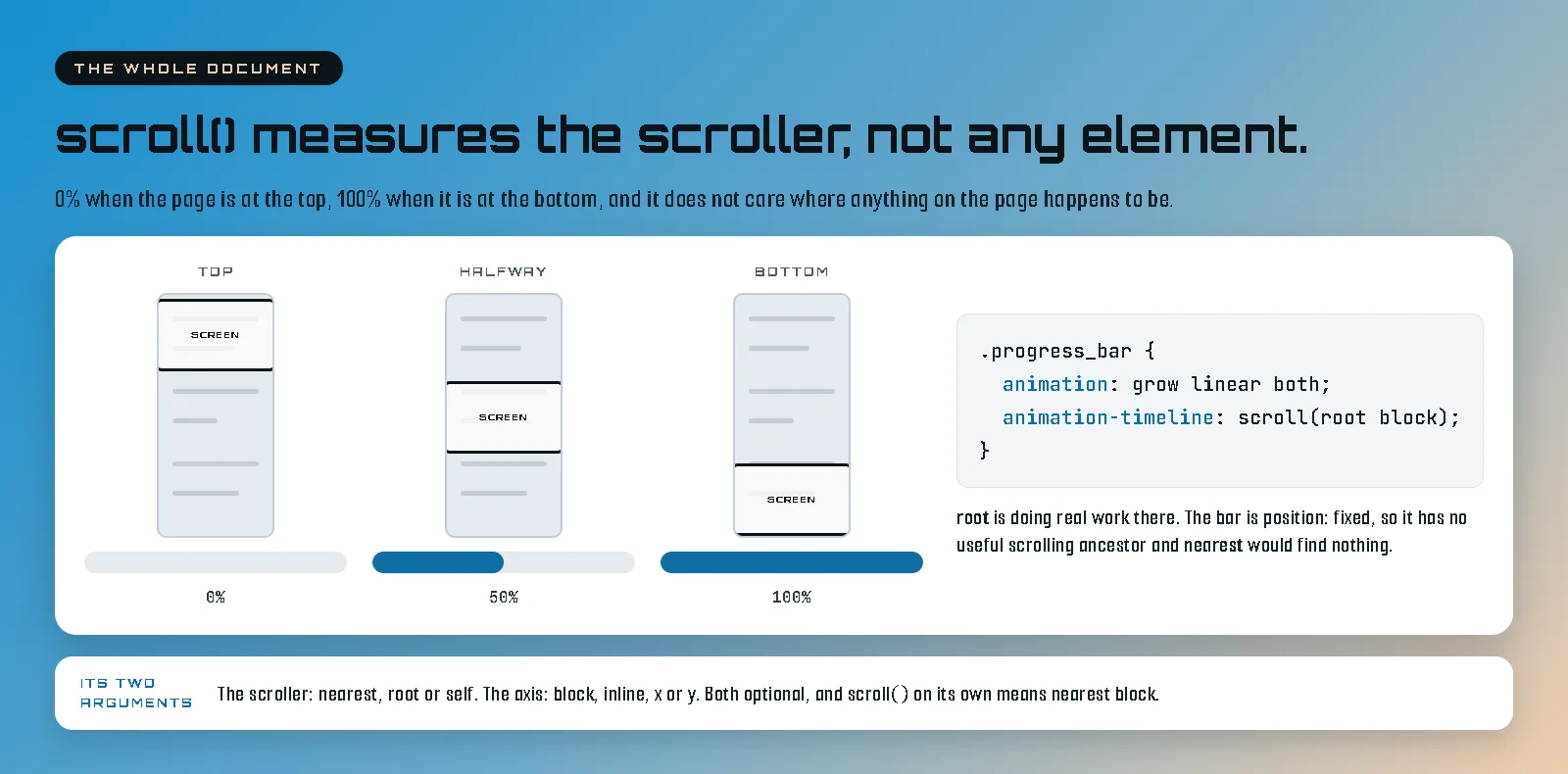
Everything so far has measured one element. The other timeline measures a scroll container instead, and does not care where any particular element is. That is the one you want for anything page-wide: a reading progress bar, a chapter rail, a colour that shifts across a long document.
.progress_bar {
  position: fixed;
  inset: 0 0 auto;
  height: 4px;
  background: #138ECF;
  transform-origin: left;
  animation: progress-grow linear both;
  animation-timeline: scroll(root block);
}

@keyframes progress-grow {
  from { transform: scaleX(0); }
  to   { transform: scaleX(1); }
}
That is a working reading progress bar, and there is no animation-range on it at
all, because the whole document is the range. scroll() takes two arguments, both
optional. The first names the scroller: nearest is the closest scrolling ancestor
and is the default, root is the document itself, and self is the
element the declaration is on, which is how a scroller reports its own progress. The second
names the axis: block, inline, x or y.
root is doing real work in that snippet. The bar is position: fixed,
so it has no useful scrolling ancestor to find and nearest would resolve to
nothing. Naming the document scroller explicitly is what lets a fixed element read a page it is
not really inside.
Naming a timeline, when the animated thing is somewhere else
scroll() and view() are anonymous: the element reads its own passage,
or its own nearest scroller. Often the thing you want to animate is in neither position. The
fix is to name the timeline where it is created and refer to it by name where it is used.
.gallery {
  overflow-x: auto;
  scroll-timeline: --gallery inline;
}

.gallery_frame {
  timeline-scope: --gallery;
}

.gallery_frame .gallery_bar {
  transform-origin: left;
  animation: progress-grow linear both;
  animation-timeline: --gallery;
}
A progress bar for a horizontal gallery, sitting outside the gallery so it does not scroll away
with it. scroll-timeline names the scroller’s own progress.
timeline-scope on a shared ancestor makes that name visible to everything inside
it, rather than only to the scroller’s own descendants. view-timeline is the
same idea for a view timeline, and it is the form
the pinned sections on this site use,
because there the element being measured and the elements being animated are deliberately
different boxes.
Three traps, and the first one is genuinely dangerous
A collapsed timeline holds the from-state for ever
This is the one that ships broken pages, and it is the fill mode from the very first example
coming back to bite. Your animation runs with both, which holds the from-state
before the range begins. Now put that on a browser that does not support scroll timelines, or
on a visitor who has asked for reduced motion and had the whole thing switched off. The
timeline cannot resolve. The animation does not helpfully fall back to its finished state.
It holds the from-state permanently, and if your from-state is opacity: 0,
your content is now present in the HTML, read perfectly by a screen reader, and completely
invisible on screen.
So build it the other way up. The un-animated page is the real page, and the animation is added on top only where it can actually run.
@supports (animation-timeline: view()) {
  @media (prefers-reduced-motion: no-preference) {
    .reveal {
      animation: rise linear both;
      animation-timeline: view();
      animation-range: entry 10% entry 90%;
    }
  }
}
Nothing outside that block hides anything. A browser without scroll timelines, and a visitor who has asked their operating system for less movement, both get an ordinary page with all of its content visible, which is the correct outcome for both of them. This is not an edge case to tidy up later: reduced motion is a real slice of real traffic, and getting it wrong does not give those people a calmer page, it gives them a blank one.
The animation shorthand resets the timeline
animation-timeline is one of the properties the animation shorthand
resets. So this silently does nothing:
.reveal {
  animation-timeline: view();
  animation: rise linear both;   /* resets the line above */
}
Put the shorthand first and the timeline after it, which is how every example in this post is
written. Same for animation-range. Nothing warns you. The animation simply plays
on the clock the moment the page loads and is finished before anybody scrolls.
An overflow on an ancestor kills it, silently
A timeline resolves against the nearest ancestor scroll container, and setting
overflow: hidden on an element makes it one. So if you wrap your animated thing in
a frame with hidden overflow, which is the natural way to build a frame, that frame becomes the
scroll container, it never scrolls, and your animation sits at one end for ever. I have had a
signature effect on a page that had never once run. Check the ancestors before you debug the
keyframes.
The related version, if you need to bound horizontal overflow on a page: use
overflow-x: clip, not hidden. Clip does not create a scroll
container, so timelines keep resolving and position: sticky keeps working. That
one is a five minute fix and a two hour diagnosis.
Keep it cheap
Animate transform, translate, opacity and
filter, and the browser can run the whole thing on the compositor without touching
layout. Animate height, top, margin or anything else that
moves other elements around, and you have signed up for layout and paint work on every frame of
every scroll. It will look fine on your machine and terrible on a four year old phone.
The other saving is the one you already made by getting this far: no library. That first reveal is eight lines of CSS instead of a few dozen kilobytes of JavaScript that has to load, parse and run before anything moves, and the weight you never add is the only weight you never have to optimise.
Support, and the sentence that will age
Chromium browsers have had scroll-driven animations for a while and Safari has them. Firefox is
the holdout at the time of writing, which is exactly the sort of claim that goes stale, so
check rather than trusting a post dated August 2026. What matters more than the current state
of that list is that @supports makes it a non-problem. Build the page so the
un-animated version is the complete one, add the motion inside a feature query, and a browser
that cannot do it renders a page that is not missing anything.
If you want a richer fallback than nothing, that is a decision rather than a requirement. This site feature-detects and loads a small trigger-based script only where scroll timelines are unavailable and motion is still wanted, so nobody who supports the real thing downloads a single byte for it. That is the shape I would recommend if you go looking for one.
When to actually use it
The mechanism is the easy half. The harder question is whether the motion earns its place, and my answer has got stricter the longer I have built with this. The test I use is whether the animation is carrying information the still version cannot: a diagram that assembles while you read it is teaching, a photograph that drifts is giving a flat page some depth, and a heading that flies in because flying in is fun is charging a visitor attention for nothing.
A reveal on every element on the page is not a designed page, it is a default. Pick the three things worth noticing and leave the rest still. Everything I got wrong building this site was some version of that lesson.
When you are ready for the version where a section pins and holds while the animation plays, that post picks up exactly here: same two declarations, same ranges, one extra box. And if you would rather have somebody build the thing properly than spend a fortnight finding out which ancestor has an overflow on it, that is what I do. Tell me what you are trying to make move and I will tell you which timeline it wants.