How Do I Make My Website Faster?
Almost every slow website I have been handed was fast once.
Not fast because somebody optimised it. Fast because on day one there was hardly anything on it. Then a year happened. A form went on, then a chat bubble, then a review widget, then a second font for one heading, then a tracking script for a campaign that ran for a fortnight in March. By the time anyone thought to check, the home page weighed four megabytes and nobody could point at the thing that did it, because no single thing did it...usually.
So this post comes in two halves. First the plain version: what actually moves the number, no matter who built your site or what it is built on. Then the version I run here, which goes further than most sites need to go, and which I am happy to show you the receipts for either way.
Measure first, and measure the right thing
Run your page through Google’s PageSpeed Insights before you touch anything. It is free, it takes a minute, and it will tell you more than an afternoon of guessing.
Two things to know about what it hands back. It gives you lab data, which is a simulated load on a throttled connection, and where available it gives you field data, which is what real visitors actually experienced over the last month. Field data is the truth. Lab data is the diagnosis. You want both, and you want to read the mobile tab, because that is where slow shows up and that is the version Google ranks with.
Underneath the score there are three numbers worth caring about. How long until the biggest thing on the screen finishes painting. How much the layout jumps around while it loads. How quickly the page answers when somebody taps something. Everything else on the report is an input to one of those three, and the score itself is a symptom finder rather than the goal. Nobody has ever bought anything because a website scored 100. They buy because the page was there when they looked at it.
The real cause is that nobody ever says no
Here is the part no tool will fix for you, and it is the reason most sites are slow.
Every site I have watched go slow went slow one reasonable request at a time. Can we add the social feed. Can we add these photos "somewhere". Marketing wants a second analytics tag for this campaign. Can we get a live chat, we will staff it properly this time. Each request is sensible on its own, and not one of them ever comes with the other half of the sentence, which is what we are taking off in exchange.
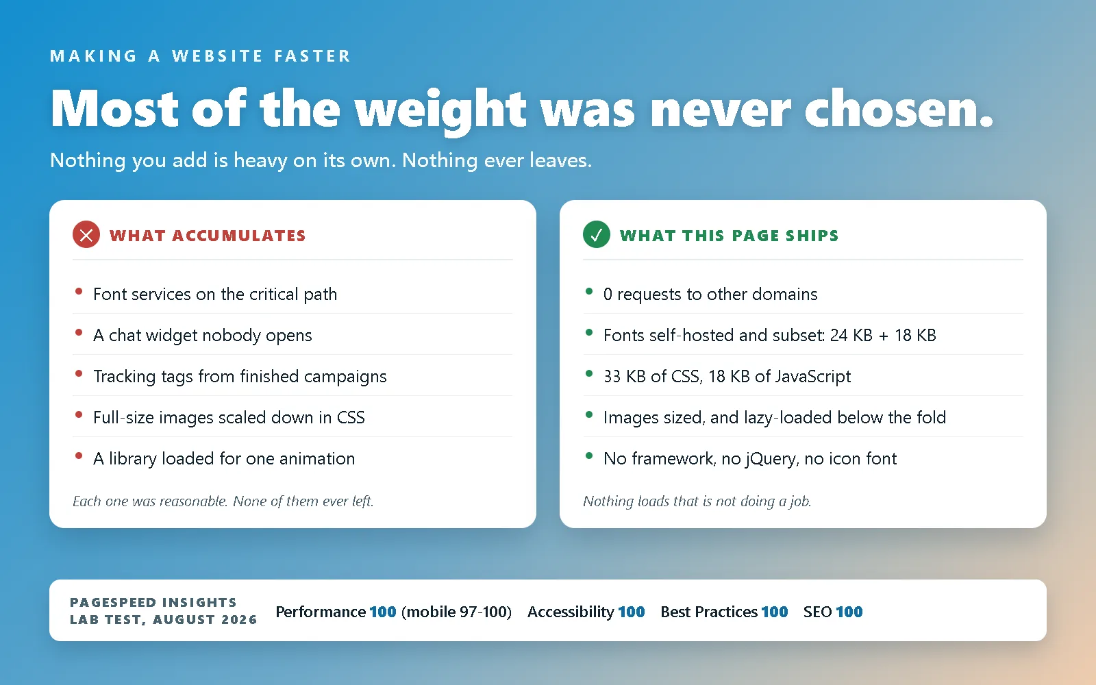
A website is not a document that gets edited. It is a shed that gets things put in it. Normally, nothing you add is ever heavy on its own, but nothing ever leaves, and it adds up.
The fix is a rule rather than a tool. Anything new has to say what it does for a visitor and what breaks if it is not there, and if the honest answer is “somebody asked for it”, it does not go on. Anything added for a reason with an end date comes off when the reason ends, so the campaign script dies with the campaign. Once a year, open the page source and find the things nobody remembers approving, because there will be some. When too many hands are in the pot, there's no room for the soup.
Two extra reasons to be strict, both about third party scripts specifically. When you embed somebody else’s widget you inherit their speed and their outages, so a slow afternoon at a chat company is now a slow afternoon on your website. And a third party stylesheet is render blocking, which means the browser will not paint your text until a server you do not control has answered. That is not a metaphor for slow. That is a visitor looking at nothing.
If the site this is happening to runs on WordPress, the same story usually has a plugin list attached to it, and the question that follows is whether the platform is worth leaving over. That one has no blanket answer, which is why I wrote a whole post on when to move off WordPress: it fits a range, and most of the time the weight came from the build rather than from the platform underneath it.
The worst example I constantly see
A proud client with a photograph of every single job they have ever finished, and a website expected to carry all of them.
I understand the impulse, and it comes from a good place. They are proud of the work, the work is genuinely good, and every one of those photos was a real day with a real result at the end of it. But a portfolio is not an archive, and a website is not where you keep things. Ninety projects do not prove more than nine do. They just take longer.
And this is the bit people assume lazy loading solves. It does not. Lazy loading defers the download, which is worth having, but it does not defer the scrolling, the layout work, the memory, or the eleven seconds of thumb between the top of a gallery and the next thing you wanted somebody to read. Even done perfectly, 143 before and after shots is not a section of a page. On a phone it is the entire website.
So pick your featured projects and cycle through them. Eight or ten, chosen because they are the work you want more of rather than the work you happen to have. Then when a new one comes along that you love, there are exactly two good options: replace something similar that is already up there, or do nothing. If the new one is not better than the one already on the page, it does not go on the page. That is the whole rule, and it holds the site at a constant size for ever.
Here is where this stops being a technical conversation and turns into a conversion one, which is the part that actually costs money. Nobody scrolls to the moon. A visitor who has to travel through 143 photographs to reach “get started” does not reach “get started”. They leave, and they leave bored or frustrated, because you can only see so many examples of the same work before they just blend together. You did not lose that lead to a competitor. You lost it to your own gallery.
I have had this conversation with many, many... many clients, and I have never regretted having it. What the site is for has to outrank what anybody feels about it, and that includes me. If the goal is booked work, then every element on the page either moves somebody toward booking or stands in front of it, and thirty extra photographs of genuinely excellent work are in the way.
The same logic covers everywhere else this shows up. Your testimonial slider does not need to house all 534 of your five star reviews. Not every project deserves its own page, and a page nobody has a reason to visit does not earn its keep by existing (excluding SEO/AEO/GEO purposed pages). It is the same question every time. Does this really add value?
Images are usually the biggest single win
Volume aside, the images you do keep still have to be built properly, and this is the category with the most waste in it by weight. Four rules cover most of that.
Serve them at the size they are displayed. A 4000 pixel photo shrunk to 800 pixels by CSS still downloads all 4000 pixels of it. The browser does the resizing after paying for the whole thing.
Use a modern format. WebP or AVIF, at a sane quality setting. Every hero image on this blog is a WebP that lands under 100 KB at 1600 by 1000, and none of them look like it.
Always state width and height. That is what stops the text jumping down the screen when a picture finally arrives, which is the single most annoying thing a web page can do to somebody who has already started reading.
Lazy load everything below the fold, and nothing above it. Telling the browser to load an image lazily means it waits until that image is nearly in view before fetching it, which is free performance on a long page, and every image on this site below the first screen carries it. But do not put it on the image at the top of the page: that one is usually the biggest thing on the first screen, so lazy loading it delays the exact number you were trying to improve. The hero at the top of this post is the only image here told to hurry, and it is told explicitly.
Then stop asking other people’s servers for things
Fonts, tag managers, analytics, maps, embedded video, chat, icon fonts. Every one of those is a fresh DNS lookup, a fresh connection and a fresh negotiation with a host that has never heard of your visitor, and they queue up in front of your content.
The cheap version of this fix: host your fonts yourself instead of linking to a font service. Replace an embedded video player with a poster image that loads the player when somebody actually clicks it. Replace the interactive map with a static image and a link to directions, becuse the 1 person who won't just click the "get directions" button and head over to Google maps isn't worth the cost/effort of an API build. Count your analytics tags and be honest about how many of them anybody has opened a report from this year.
On this site the answer is zero. No page of the main site fetches anything from another domain, and that was a deliberate hunt rather than a happy accident. A handful of my standalone theme demos still pull their display fonts from Google while I finish porting them across, and that is written down on the privacy page until it stops being true.
Compress, cache, and then leave it alone
Two settings, usually on your host, frequently available already and switched off. Text compression, so your HTML and CSS travel small. Long cache lifetimes on the files that do not change, so a returning visitor downloads nothing at all.
The catch with long caching is that you will eventually want to change one of those files, and a browser that was told to keep it for a year will happily ignore you. The answer is to make the filename or the query string change whenever the file does. Here, the stylesheet and the scripts are cached for a full year and marked immutable, which is only safe because the build step re-stamps every reference to them the moment their bytes change. Mechanical, so nobody has to remember it, which is the only kind of process that survives contact with Monday morning before the coffee kicks in.
That is the general version. Here is what we do on top of it
Everything above will get most sites most of the way, and if you stop reading here you have the useful part. The rest of this is what it looks like when speed is a build decision instead of a cleanup, because this site was hand-coded from an empty file and never had a theme engine deciding what to load on its behalf.
The fonts, which is where most of the gain actually came from
This one surprised me, and it is the biggest single speed change in the site’s history.
The site used to link two stylesheets from Google Fonts, the way nearly everybody does. Those two links were close to 1.8 seconds of render blocking work on a throttled mobile test. Not the fonts themselves: the round trips to go and ask for them. Taking them off and self-hosting the same faces moved mobile performance from the mid eighties into the high nineties, and nothing on the page looked any different afterwards.
Self-hosting is only the first step, though. The files are generated by a small script and cut down to what the site actually uses.
Subsetting. A full font file carries thousands of glyphs for languages this site does not publish in. Ours carry the characters we use, and the two faces that paint above the fold are 24 KB and 18 KB.
A latin and a latin-extended split. The accented characters live in a second file that a browser only fetches if the page actually contains one, declared so that the browser makes that call itself. This is where I learned a genuinely stupid lesson: a single copyright symbol sitting in the footer was enough to trigger that second file on every page of the site, which was 16 KB of body font that nothing on screen needed. One character, quietly turning a clever optimisation into a net loss. The font build now prints which character would pull that file in, every time it runs, because I no longer trust myself to notice.
Display faces cut to the exact words they render. A heading font used for ten words on one page does not need the alphabet, so it ships as a couple of kilobytes.
Exactly two preloads. Preloading tells the browser to start fetching a file before it has finished reading the stylesheet that asks for it. It is genuinely useful, and it is a queue, so everything you add to it competes with everything else in it. I preload the body font and the display font, and nothing else. When I preloaded only the display face, the largest paint on the page sat half a second behind the first one, because the body font is what the main text is set in, and the main text is the thing being measured.
No libraries. Not fewer, none
There is no framework on this site, no jQuery, no animation library, no carousel plugin and no icon font. The entire JavaScript payload is three small files, about 18 KB compressed between them, and the one stylesheet that dresses every page of the site is 33 KB compressed.
That is not restraint for its own sake. It is that the browser already does almost all of it.
The motion is CSS. The sections that pin and animate as you scroll are driven by the browser’s own scroll timelines, not by JavaScript listening to the scroll event and doing arithmetic on every frame, which is the traditional way and the reason so many animated sites feel like treacle on a phone. I wrote up how that is built if you want the mechanics.
The page transitions are the browser too. Moving between pages here animates using the View Transitions API, a native browser feature rather than a single page app pretending pages do not exist. Every page here is a real page at a real URL that loads on its own.
The icons are inline SVG. No icon font, so no extra file to request, no wait for it, and no window of blank squares where the icons will eventually be. They inherit the colour of the text around them and they cost a few hundred bytes each.
Nothing is hydrated. Every word on every page is in the HTML when it arrives. Nothing is assembled by JavaScript after the fact, which is why the text is there immediately for a visitor on a bad connection, and readable by search engines and by the AI assistants people increasingly ask instead of searching.
The receipts
All of that is checkable, so check it. Run this site through PageSpeed Insights yourself. When I last measured, in August 2026, the lab result was 100 for performance on desktop, between 97 and 100 on mobile depending on the run, and 100 for accessibility, best practices and SEO on both. That is with every animation still running, on a site that pins and moves sections around considerably more than most.
The speed is also a large part of why a brand new domain with no history reached the first page for its target term inside a week. I wrote down exactly what that took, including how much of it was the build rather than the writing.
If you are not rebuilding, do these five things
Most people reading this have a site already and no appetite for starting over, which is fair enough. In rough order of return on effort: measure the mobile tab in PageSpeed Insights so you are working from evidence rather than vibes. Find your heaviest image and fix that one first. Open the page source, count the scripts loading from other domains, and delete the dead ones. Self-host your web fonts, or drop one of them. Turn on text compression and long caching if your host is not already doing it.
That will get you most of the way, and it will not stay fixed, because it is a cleanup and the mess was never the problem. The problem is that nothing has ever been told no. Pair the cleanup with the rule and you keep the speed you just bought.
One caveat, because 534 reviews really are credibility
I have spent this whole post telling you to cut things, so let me be clear about what I am not saying. Five hundred and thirty four five star reviews is not clutter. It is proof, it is hard to fake, and it is one of the strongest things a small business can put in front of a stranger. A company that has earned that should absolutely say so, loudly, and I would be doing you a disservice if I pretended the answer was to hide it.
The argument was never about whether to show it. It is about how. Show the number, show a handful of the best ones where people will actually read them, and then lazy load the rest of the carousel slides so the browser only pays for what somebody swipes to. That is safe as long as the text on those slides is not doing a job for search engines or for the AI assistants that quote you, and if it is, it belongs somewhere that loads as real text instead of a slide nobody may ever reach.
Then give the pile a home: a “view all testimonials” link to a page built to be an archive. Archives are completely legitimate, they are just not the front page. On their own page they are fast, they are indexable, they are there for the visitor who wants to check you out properly before they call, and they stop costing anything to the visitor who does not.
The same logic can apply to portfolio pieces, and often it should, though I will admit it applies less cleanly than it does to reviews. Photographs are compared to each other in a way that sentences are not, so twelve strong projects sell harder than a hundred, and past a certain point extra examples stop adding evidence and start diluting the ones that were working. What you want is for somebody to find the two projects that make them pick up the phone, not to be buried in the rest before they get there.
Which is the same answer as everything else here. Build for the market and the goals of that specific site, and evaluate it case by case, every time. A wedding photographer and a structural engineer both have a gallery, and they are not the same gallery.
And if you would rather not make any of those calls on your own, that is the entire argument for building it this way in the first place: a site where nothing loads unless it is doing a job, because nothing was ever invited in that was not. Tell me what your page is doing and I will tell you what is holding it up, even when the answer is that you can fix it yourself in an afternoon without me.