How to Pin a Section and Animate It on Scroll
A single section locks in place, an animation plays while it is locked, and your scroll position is what drives that animation. The user is no longer scrolling a page, they're scrubbing a timeline. This type of animation is called scrolljacking, or scroll hijacking.
Use it carefully. It's generally not what a standard website needs. Always take the target market/brand into consideration. It takes a bold brand and a specific market to turn scrolljacking from a UX penalty to an impactful message or statement.
When done right, it is entirely CSS, and it is genuinely not hard once you can see the shape of it. What makes it feel hard at the start is that the thing you are animating against is invisible. So this is a walkthrough of the invisible part: what actually gets pinned, the timeline your keyframes are reading, how to read and edit that timeline without guessing, and how to stop writing the same forty lines of CSS for every section you build.
If the pin is not what you are after, and you only want something to move as the page scrolls, that is the simpler half of the same feature and it has a walkthrough of its own: how to make scroll-driven CSS animations. Same two declarations, same ranges, no track and no sticky stage. Everything below assumes it.
It is two boxes, and only one of them is sticky
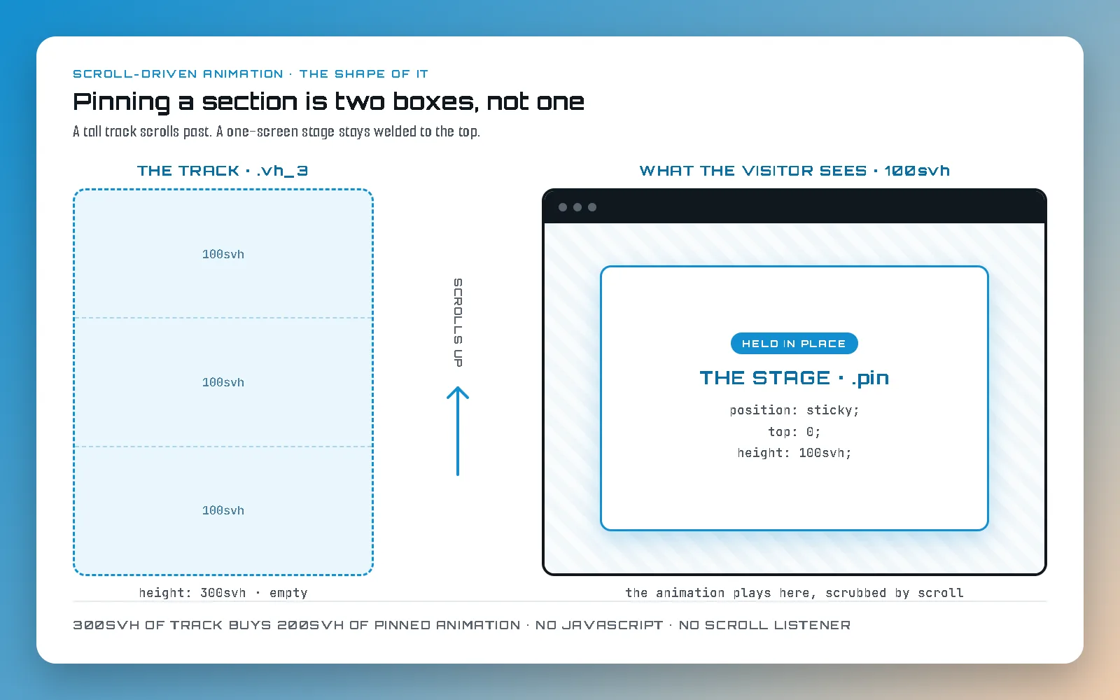
Almost every failed attempt I have seen at this starts by trying to pin the section itself. That cannot work, and the reason is worth understanding rather than memorising: a position: sticky element sticks within its parent. If you make the section sticky, it has nothing to travel through, so it either never sticks or it sticks for the height of the whole page.
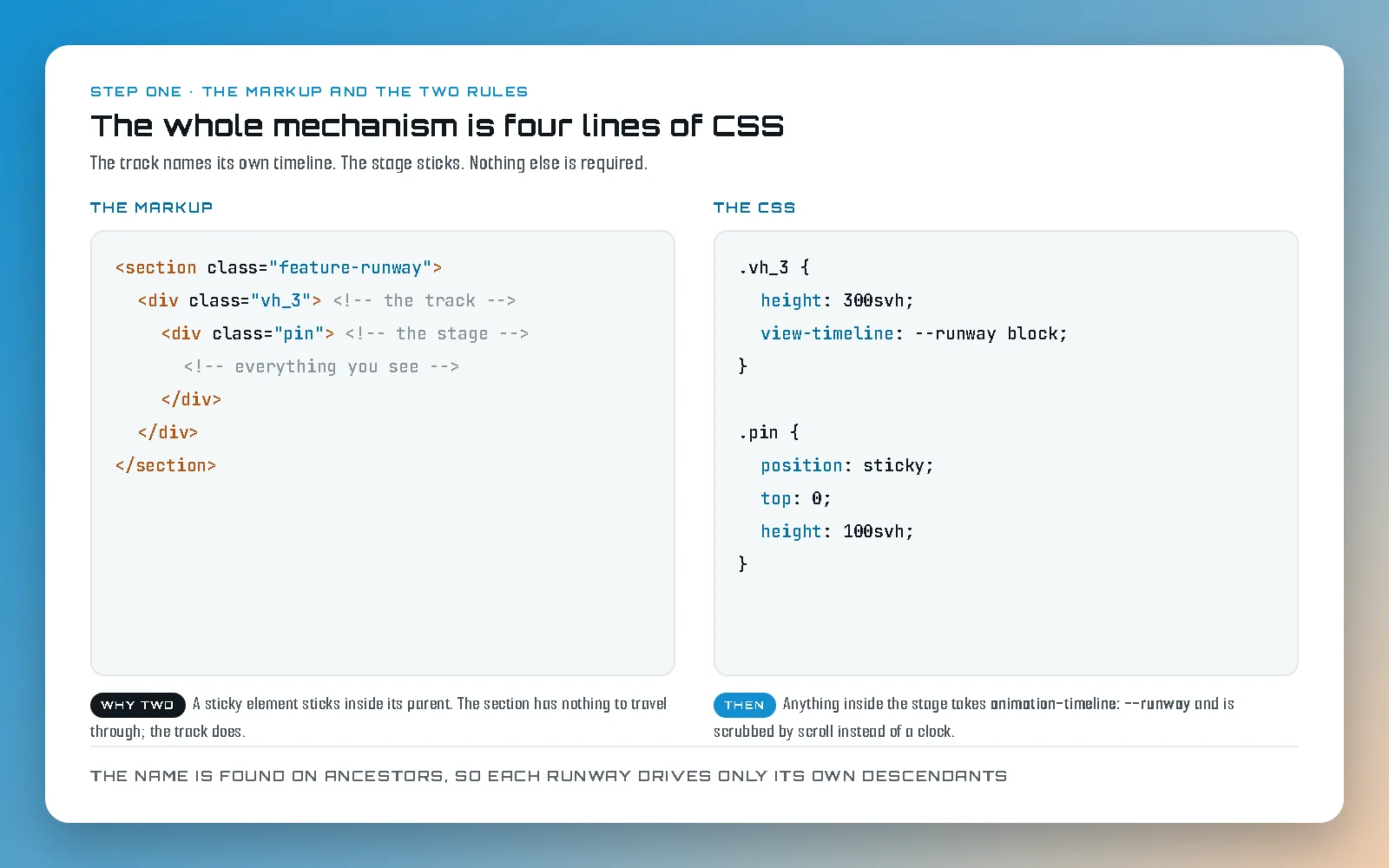
So you build two boxes instead. Inside the section goes a track, which is a tall empty box, three screens tall in most of my sections. Inside the track goes a stage, which is exactly one screen tall and sticky to the top. Everything the visitor actually sees lives in the stage.
Now the behaviour falls out on its own. You scroll, the track moves up past you like any other content, and the stage stays welded to the top of the screen until the track runs out from under it. To the visitor the page has stopped. To the browser nothing unusual is happening at all, which is exactly why this approach does not fight the scroll: there is no listener, no JavaScript, and no interception. The scrollbar is honest the entire time, and if you drag it, the animation goes backwards, because it was never a playback in the first place.
The height of the track is the only thing that decides how much scrolling your animation gets. That is the whole budget, and it is worth saying out loud early: a 300svh track buys you 200svh of pinned animation, because the stage itself is one screen tall and has to travel its own height before the track lets go. Three screens of scroll, two screens of held frame.
The timeline is the thing you cannot see
Here is the part that trips everyone up. A scroll-driven animation has no duration. There is no half a second, no delay, no play. There is a timeline, and the timeline is a distance: the distance your track travels through the viewport. Your keyframes are spread across that distance, and the visitor scrubs them.
Two declarations connect them. The track says view-timeline: --runway block, which means "name my own passage through the viewport, and call it --runway". Anything inside the stage then says animation-timeline: --runway, which means "do not use the clock, use that". Nothing else is required. The name is looked up on ancestors, so a runway only ever drives its own descendants, and you can have twenty of them on a page without any of them knowing about each other.
What confused me for an embarrassingly long time is that the timeline does not start when the section pins. It starts when the track's top edge first touches the bottom of the screen, and it ends when the track's bottom edge leaves the top. The pinned part is only the middle of it. Which is why the phase names exist, and why the whole thing gets easy the moment you learn four words.
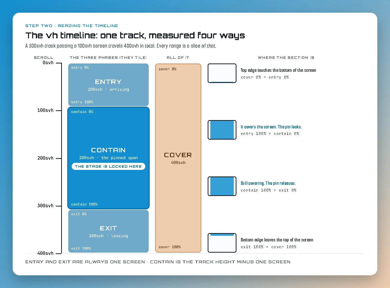
Read from that diagram and you get the four ranges you will actually use:
- entry is the section arriving. It runs from the moment the track's top edge appears at the bottom of the screen to the moment it fills the screen. It is always exactly one screen long, whatever the track height, which makes it the right range for arrivals and the wrong range for anything you want to happen while pinned.
- contain is the pinned part, and this is the important one. It runs from the instant the track completely covers the viewport to the instant it stops covering it, which is precisely the span during which the stage is stuck to the top of the screen. On a 300svh track that is 200svh long. Nearly all my pinned choreography is ranged in contain, because contain 0% and contain 100% are the two moments the visitor experiences as "it stopped" and "it started again".
- exit is the section leaving: another exactly-one-screen range, from the pin releasing to the track disappearing off the top.
- cover is all three of them end to end, the full 400svh. Useful when you want one gesture to span the whole approach and departure, and a trap when you meant contain, because a cover-ranged animation is already a quarter finished before the section pins.
Reading and editing a range
An animation on a runway is five declarations, and once you have seen the shape you can read any of them at a glance. The one that matters, and the only one you will spend real time on, is animation-range.
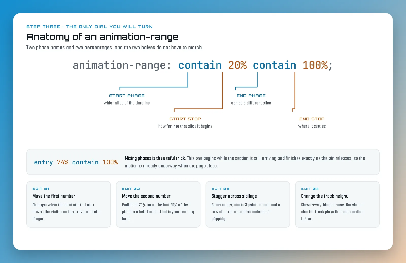
Both halves name a phase and a percentage within that phase, and the two halves do not have to be the same phase, which is the bit nobody explains. contain 20% contain 100% means "start a fifth of the way into the pinned span, finish exactly as the pin releases". entry 74% contain 100% means "begin while the section is still arriving, finish when it lets go". That second form is how you make something appear to be already underway when the section stops, which reads far better than everything politely waiting for the pin.
Editing it is four moves and nothing else:
- Move the first number to change when a beat starts. Later means the visitor sits longer on the previous state.
- Move the second number to change when it finishes. Bringing it in early is how you buy a pause: an animation that ends at contain 70% leaves the last 30% of the pinned span as a held frame, which is a reading beat and is usually the thing a busy section is missing.
- Stagger the same range across siblings to make a group cascade. My card grids start three points apart, contain 0%, 3%, 6%, and so on, and end re-spaced so they leave in sequence too.
- Change the track height to slow everything down at once, and this is the one to be careful with.
That last one has bitten me on this site. Percentages are relative to the track, so shortening the track does not trim your animation, it plays the identical animation faster. I once moved a set of sections from a three-screen track to a two-screen one, which halves the pinned span from 200svh to 100svh, and immediately recognized the importance of planning ahead and visualizing the whole animation before starting on the section or it's previous/next sections . Nothing was wrong with the keyframes. There was simply half as much scroll to spend them over. If a section feels hurried, check the track height before you touch a single percentage.
Four class names instead of a stylesheet
Here is where this stops being a technique and starts being a way to build. The first version of this site had every one of these sections written out longhand: its own height, its own sticky rule, its own timeline name, its own ranges. It worked, and it was unmaintainable, and worse, every section drifted slightly from every other one until the page had no rhythm.
The fix is to notice that the geometry is never the part that varies. The track is always a multiple of the screen. The stage is always one screen, always sticky, always at the top. So those become plain utility classes, used everywhere: vh_2, vh_3 and vh_4 set the track height and name the timeline, and pin makes the stage. Between them they are about a dozen lines of CSS for the entire site, and a new section takes them by name.
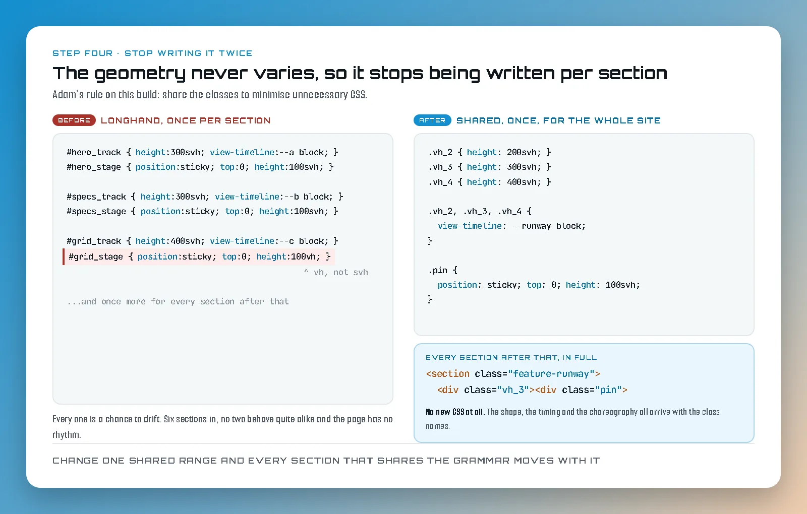
Then the same thinking applies one level up. Once several sections share a shape, an image-and-text split being the obvious one, the whole choreography can be a class as well: copy slides in, the visual arrives a beat later, the pair recedes on the way out. On this site a section opts into all of that by taking four class names and writing no CSS at all, and a variant that mirrors the layout is one extra word. The graphics pages take the same four with three of the inner names swapped, and those two differ by exactly three declarations, because every time I found myself copying a block I turned it into a shared selector instead.
The payoff is not really the saved lines. It is that when I change the timing of one thing, every section that shares its grammar changes with it, so the page keeps moving as one piece. A site where each section was hand-tuned looks hand-tuned, and not in a good way.
The failures that will actually get you
Reduced Motion and opacity:0;
If you don't know about reduced motion, stop right here and check out my web development page to get at least a general idea of how that works. That knowledge is more valuable than any animation type. I'll have a post about that soon! Anyway, these animations run with animation-fill-mode: both, which holds the from-state before the range begins. Let's say you'd like a fade in animation so you start your element with opacity:0; Now consider what happens when the timeline cannot resolve, because you collapsed the track for a visitor who asked for reduced motion, or because the browser does not support scroll timelines at all. The animation does not fall back to the finished state. It holds the from-state forever. Your content is still there, still in the HTML, still read by a screen reader, and completely invisible.
So the rule on this site is that a collapsed runway and a killed scrub always travel together in the same edit. Whenever the track height goes to auto and the pin goes to static, the animation on that element is switched off and its opacity, visibility and transform are reset in the same breath. Never one without the other. This is also the reduced-motion path, so it is not an edge case you can leave for later: it is what a real percentage of your visitors see, and if you get it wrong they do not see a less animated page, they see a blank one.
The same discipline covers browsers without scroll timelines. Firefox does not have them at the time of writing. The answer is not a polyfill, it is to put the entire runway inside a feature query, so a browser that cannot scrub never gets the tall track or the sticky stage either. It gets an ordinary section that lays out in document order and reads perfectly. That is the honest fallback, and building the page so the un-animated version is the complete one is what makes all of this safe to ship.
Two more things that'll cause you headaches.
.ancestor {
overflow:
}
.stick_me {
position:sticky:
}
An overflow on any ancestor kills the animation silently. A view timeline resolves
against the nearest ancestor scroll container, and setting overflow to hidden on an element
makes it one. If you wrap your animated thing in a frame with overflow hidden, which is the
natural way to build a frame, that frame becomes the scroll container, it never scrolls, and
your animation quietly sits at its finished state forever. I had a signature effect on one
page that had never run once. Check the ancestors before you debug the keyframes.
The related version: if you need to bound horizontal overflow on a page full of pinned sections, use overflow-x: clip and not hidden. Hidden makes the element a scroll container, and a scroll container breaks every position: sticky inside it. That one is a five-minute fix and a two-hour diagnosis.
Be careful with hover animations. Running a filter or a transform over a
container flattens 3D on its children and creates a new backdrop root, so hover effects, so many nice hover effects break. Animate the heading, or the cards individually, or a
wrapper that holds neither. A plain sticky stage with no animation on it is completely fine,
and is what my card sections use. The rule is about the scrub, not the pin.
The real reasons to keep it all CSS
There's some real drawbacks and penalties to relying on JS injected content for your animations. I'll start with the big one:
Search engines can't read JS injected content.
So, if you're going to use JS injected content, you better be sure that the client doesn't need any SEO. Google will not. like. your. site. Search engines don't run JavaScript when they visit your page, so that content that you spent hours animation means nothing. For the sake of internal linking, here's a link to my post How Fast Can a New Website Rank? Ours Took a Week. It's not a guideline, but I'll tell you what I did to start getting clicks before this site was officially launched. (You like that full blog title in the link, don't you Google?)
This leads us to another issue I see spreading much further out than just injected content:
JavaScript-injected content is an accessibility nightmare.
Do me a favor and put your mouse down. Go to some random sites (maybe even your own?) and try to navigate using the keyboard only. Use tab and arrows to get around. Can you do it? Does the site make sense? Now imagine you didn't have the physical ability to use a mouse. Every single day you're met with inaccessible sites with regularly, and JS-driven sites essentially exist to you the same way it exists to search engines. Inaccessible. Pointless. All for an animation style.
What it is actually for
All of the above is mechanism, and mechanism is the easy half. The harder question is whether a section deserves to hold somebody in place at all, and my answer has got stricter the longer I have run this. Pinning is a way of saying "this next part is worth stopping for". Do it twice on a page and it means something. Do it six times and it means nothing, and the page just feels long. And remember my warning at the start of this. It is NOT for most site builds.
The test I use now is whether the animation is carrying information the static version cannot. A drawing that assembles while you scroll is teaching you how the thing is put together. A garden that grows twenty years as you scroll is showing you elapsed time, which no still image can do and gifs are just boring. A heading that flies in because flying in is fun is costing a visitor two screens of their attention for nothing, and the fix is nearly always removal rather than tuning.
If you want to see all of this running, the web development page is built out of it end to end, and the scrolljacking page is the full argument for when this technique is the right call and when it very much is not. And if you would rather have somebody build it properly than spend a fortnight learning where the traps are, that is a conversation.