Should My Website Be Minimalist?
A lot of people who come to me for a new website already have a picture of it in their head, and more and more often that picture is minimal. Big type, a lot of space, one strong photo, almost nothing else. They want to know if their business can look like that.
Usually it can. Whether it should is a different question, and it is one I would rather answer honestly before anybody spends money on it.
The short answer
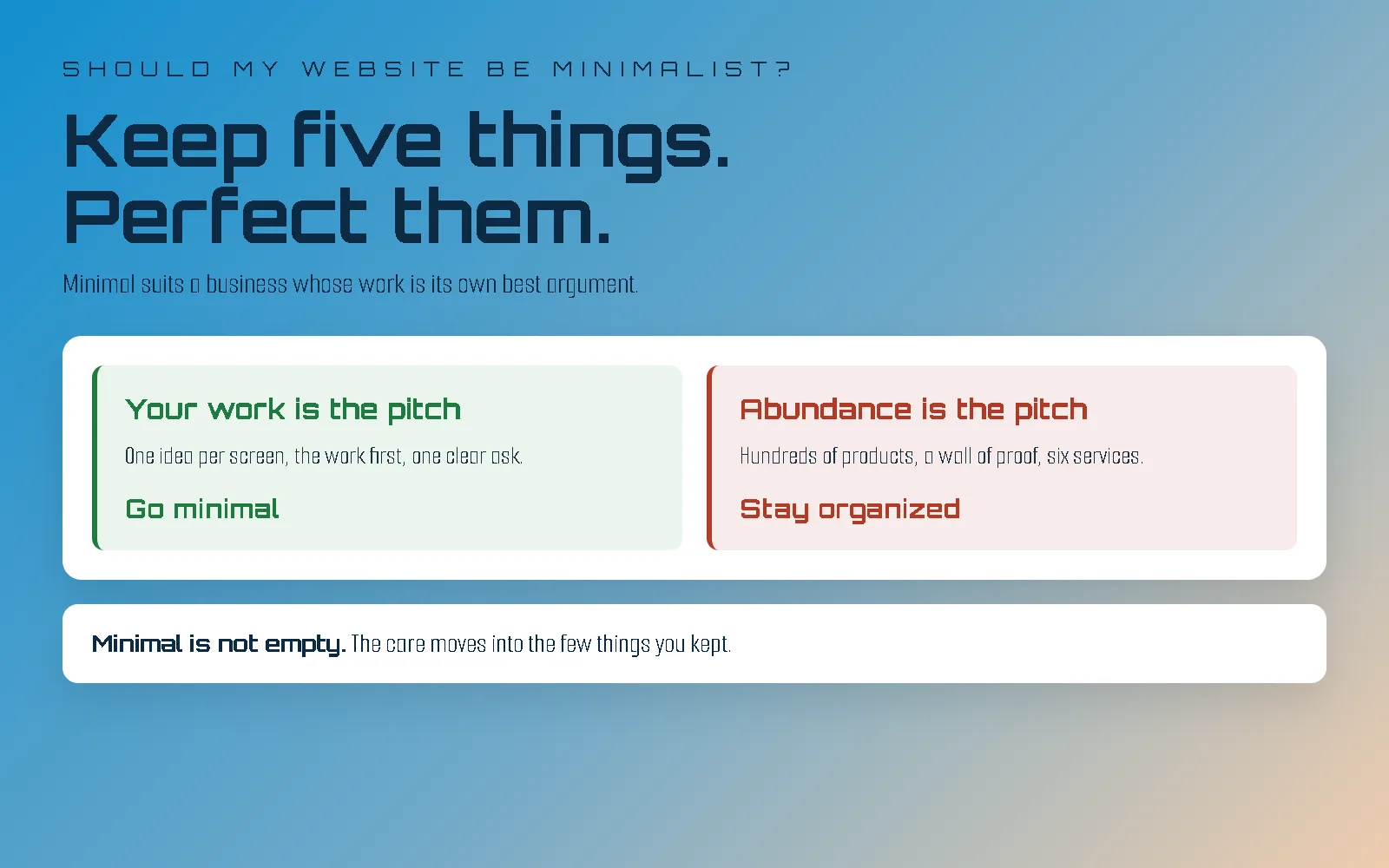
Your website should be minimalist if your work is the most convincing thing you have. If a client who sees your work does not need much else to say yes, a minimal site gets everything else out of the way and lets the work make the case. If what sells you is range, volume or proof, a minimal site takes away the thing that was doing the selling.
Everything below is how to tell which one you are, and what living with a minimal site is actually like once you have one.
Why so many websites look minimal now
Mostly because the screen got smaller. Most visits to most small business sites now happen on a phone, and a phone holds about one idea at a time. A design built for that screen ends up sparse whether anybody set out to be minimalist or not.
Speed pushes the same way. A page with less on it has less to load, and loading speed is one of the few things about a website that Google measures directly. I wrote about why a faster website matters more than most owners think.
And then there is the less flattering reason: minimal is the easiest look in the world to imitate. Every website builder has a gallery full of templates with a big photo, a thin font and plenty of white. They look calm, and they look like each other. That is why so many minimal sites read as generic: they have the look without any of the decisions behind it. I went into that problem in should I move off Squarespace, and it applies to every builder.
When minimal is the wrong call
Minimal is wrong for a business that sells by abundance, and there are more of those than the design galleries suggest.
A shop with hundreds of products needs its customers to browse, compare and filter, and a page with one product on it is a slower shop, not a classier one. A business that wins on proof (reviews, certifications, before and after photos, a long client list) needs that proof on the page, and hiding it for the sake of white space throws away the argument. A company with six services for six different kinds of customer needs a site that sends each of them somewhere quickly. And some brands are loud on purpose. Turn the volume down and they stop sounding like themselves.
There is one more case, and it is the uncomfortable one. Minimal shows your best work, so it only works if you know what your best work is. If you are not sure yet, a busy site hides that. A minimal one puts it on display.
None of these mean your site should be cluttered. They mean the right answer is a site that is organized, not a site that is empty.
Check your own site in ten minutes
You can find out a lot about whether minimal suits you from your own website, on your own phone, with no tools at all.
One. The first screen. Open your home page on your phone and do not scroll. Count everything you can see: the logo, the menu, the headline, every button, every badge, any pop-up asking for your email. Then ask what that screen actually says about your business. If the count is high and the answer is vague, the page is doing a lot of talking and not much saying.
Two. The asks. Scroll the whole home page and count the things asking you to click: book now, learn more, sign up, follow us, call today. A minimal page usually has one main ask. If yours has eight, they are competing with each other, and the visitor picks none of them.
Three. Where the work appears. Scroll from the top and stop at the first photo or example of your actual work, not a stock photo and not your logo. How far down is it? If your work is your best argument and it shows up on the fourth screen, the page is in its own way.
Four. The five things. This one is a piece of paper, not a screen. If your home page could only keep five things, which five? If you can write them down in a minute, you are a good candidate for minimal, and you have just done the hardest part of designing it. If every item is a fight, either minimal is wrong for you or the business has not decided what it is leading with yet, and that is worth knowing either way.
Read the four together. A crowded first screen, a pile of asks and work buried halfway down, on a business that can name its five things quickly, is the clearest case for going minimal.
What owning a minimalist website is actually like
Owning a minimal site is quieter than owning a busy one, and stricter. Most of what people do not expect is the stricter part.
Every addition has to earn its place. On a busy site, a new widget or a new banner disappears into everything else. On a minimal site you see it immediately, because there is nothing to hide it behind. The slow drift that wears out most sites in their first year (a booking box here, a pop-up there, each added the quickest way possible) is far more visible on a minimal design. Adding a new page or a new service is a small design decision, not just a paste, and it is worth having somebody who can make it.
Your photos and your words carry more weight. With less on the page, each thing on it is doing more of the work. Good photography looks better on a minimal site than anywhere else, and weak photography looks worse. If you are choosing between more pages and a day with a good photographer, take the photographer.
It still needs real words to be found. Search engines and AI answer tools read text. A minimal site with three words on every page has very little for either of them to work with. Minimal does not mean saying less, it means saying it in the right place: one clear idea per screen, with the detail on the pages built to hold it.
It ages well. Busy designs date quickly, because they lean on whatever was fashionable the year they were built. A minimal site leans on spacing, type and good photos, and those go out of fashion slowly. There are also fewer moving parts to go out of date underneath it.
Minimal is not empty, and it is not cheap
A minimal site is not a normal site with things taken away. The care that would have gone into thirty things on the page goes into the five you kept: the spacing around them, the width of a line of text, the weight of a heading, the way something moves when you scroll to it.
That is also why it is easy to get wrong. A busy page can hide its mistakes. A minimal page has nowhere to put them. One loose alignment or one clumsy animation and the whole thing looks like an attempt rather than a choice. It does not take less work to build than a busy site. The work just goes somewhere else.
How to get a minimalist website
If you edit your own site and it is simple, you can get a long way with a clean template on a builder, and for that job I would not talk you out of it. The limits are the ones I covered in the Squarespace post, and if you are on WordPress instead, the WordPress one.
If your work is the pitch and you want the site to look made rather than chosen, I build minimalist website design two ways: starting from one of my premium themes, fitted to your brand and grown into a full site, or starting from an empty file. That page is itself one of the themes, running live, so you can judge the style by using it. What a theme settles is the design phase; the build is the same either way. The theme it was grown from, Paper, is still up on its own if you want to see where it started.
The honest answer
Most businesses would be better off with a calmer website than the one they have. Fewer of them should go all the way to minimal. The ones that should are the ones whose work can carry the page on its own.
If you are not sure which one you are, send me a message with your address. I will look at it and tell you what I actually see, including the fairly common case where the answer is to take a few things away, not to start again.