Diagram 01
Your drawing is a promise about time.
Year one is a concept
Year twenty is fruition
01 · Definition
What a landscape architect's website actually has to do
A landscape architecture practice sells two things that a normal website is bad at holding: photography that deserves the whole screen, and work that commands a physical space long after the crews have left. Most practices end up on a template built for a service business, where the photographs are recompressed into mush, the projects become a grid of thumbnails, and the copy quietly makes you sound like a maintenance company. This is a site built the other way round: the work is the interface, the pages are hand-written for it, and the long view the profession is actually about is the thing the page is designed to show.
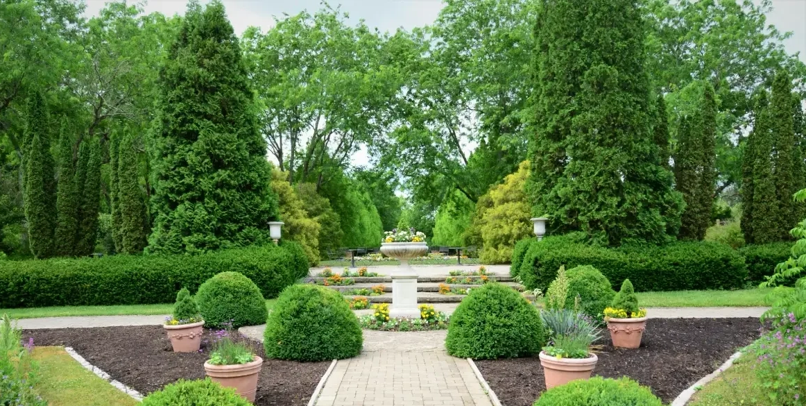
A landscape architect's website has three jobs: show the work at the size it was photographed, make it obvious that this is a design practice and not a maintenance company, and give a referred client enough to say yes. Almost every practice site fails at least one of them, and usually the same one. The photographs get resized twice by a plugin and served at a quality nobody would sign off on. The projects get flattened into a grid of identical thumbnails, so a courtyard and a forty-acre campus look like the same job. And the copy, written to a template's headings, ends up describing services instead of a practice.
Most of your work arrives by referral, from architects, from builders, from a previous client's neighbour. That changes what the site is for. It is not there to win a stranger over from nothing; it is there for someone who has already heard your name and wants to know whether you are the real thing before they call. That reader is doing one job: looking for a reason to stop looking. Give them the photographs, the scope, the credentials and a way to reach you, and get out of the way.
The second job is the one practices underrate. Search does not know the difference between landscape architecture and lawn care unless your pages say so plainly. If your site never uses the words that describe your actual discipline, you will be sorted in with the mowing companies, and so will the enquiries you get. Grading, drainage, planting design, site planning, stormwater, hardscape detailing, construction documents, licensure: these are the words that separate you, and they belong in your prose, not only in a services dropdown.
Not a gallery. A portfolio.
A gallery is a pile of images. A portfolio is a set of arguments, each of which happens to be illustrated. The difference is a paragraph: what the site was, what the constraint was, and what you did about it. Two sentences per project turns a photograph into evidence, and it is the part that gets read by the person deciding whether to call you.
The words are half the work
Nothing on this page is going to pretend that a beautiful site ranks by itself. What a hand-built one does is stop getting in the way: real headings, real text instead of words baked into images, fast pages, and a structure that says what discipline you are in on every page rather than only on the one called About.
Where a build starts, and what gets added to it
02 · The work
The photography is the product. Everything else is packaging.
You commissioned a photographer, waited for the right light, and probably waited a season or two for the planting to be worth photographing. Then the site resized it to 1200 pixels, ran it through a generic compressor, and put it in a carousel that autoplays past it in four seconds. That is the normal outcome, and it is not a small loss: the photograph is the single most expensive asset the practice owns.
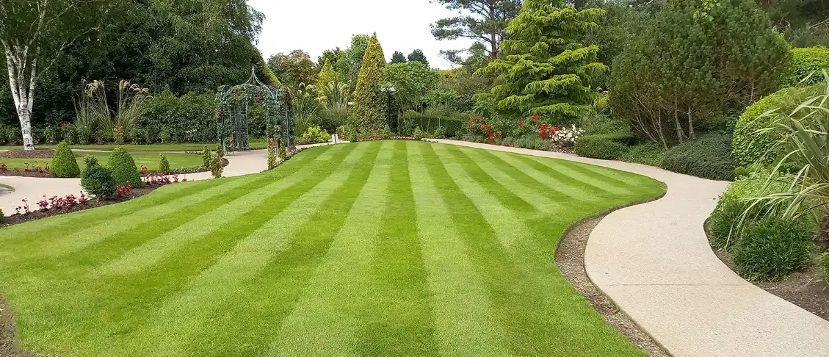
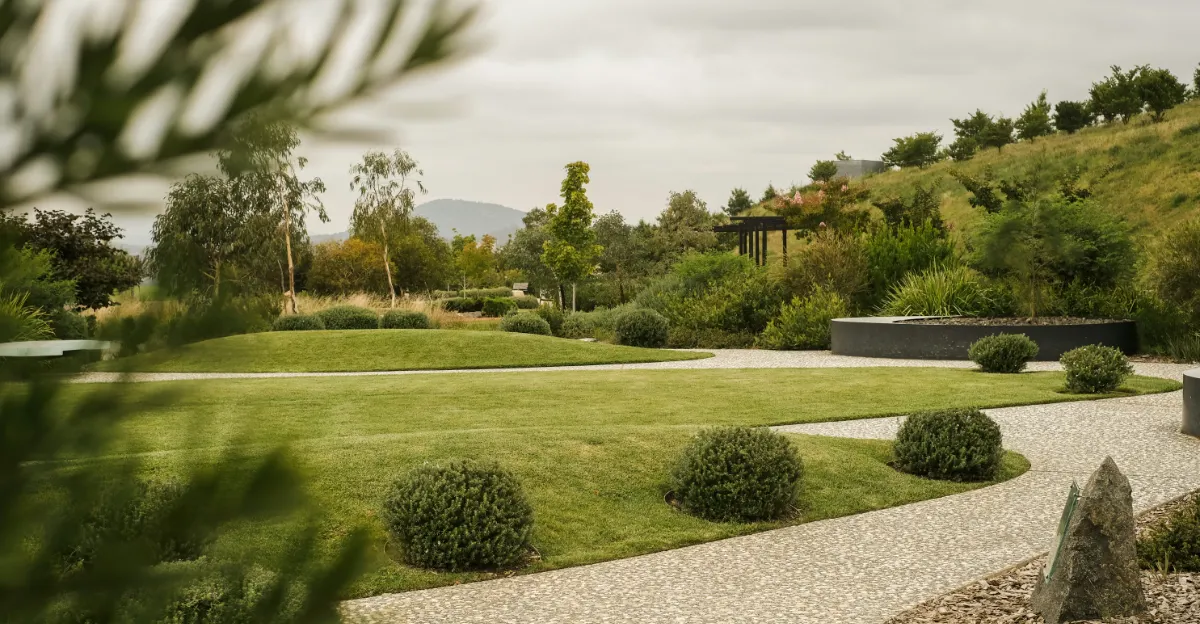
Handled properly, a photograph on the web is a set of decisions, not a default: what dimensions this layout genuinely uses, what format the visitor's browser can take, what gets loaded now and what waits until it is nearly on screen, and what the page does in the moment before the image arrives. None of that is exotic. It is just work that a template cannot do for you, because a template does not know what your layout is going to be.
The same is true of how a project is presented. A landscape project is not one hero image; it is a sequence, and often a sequence in time. Plan, detail, the thing built, the thing grown in. A site built by hand can carry that sequence, and a grid of equal thumbnails cannot, because the grid has already decided that every project is the same shape and the same importance.
And the season problem, which every practice has:
A portfolio shot entirely in June looks like a lie in January, and a portfolio shot entirely at installation looks like a nursery yard. The fix is structural rather than photographic: build the project pages so that a second and third visit to the same site, years apart, has somewhere to go. Then the archive gets better every year instead of older.
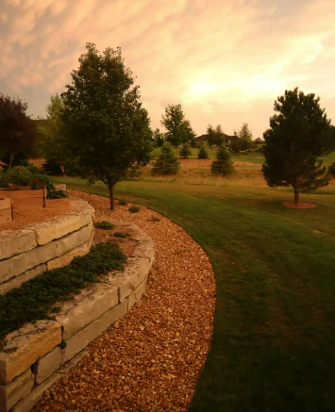
Every theme is a complete, hand-coded design
03 · Performance
Big photography and a fast page are not opposites.
They only become opposites on a platform where every image passes through the same machinery as everything else. The technical version of this argument lives on the hand-coded page; here is the short one, plus what this page itself ships, which you can check line by line.
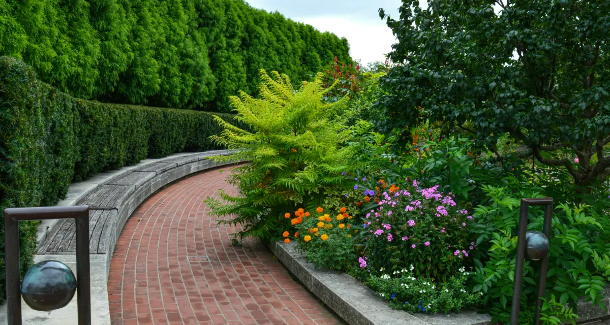
A practice site is usually slow for reasons that have nothing to do with the photographs: a page builder's runtime, a slider plugin, a font service on someone else's domain, an analytics tag that loads before anyone has agreed to it, and four stylesheets where one would do. Strip those and the photographs stop being the problem. They become the only weight on the page, which is exactly where you want the weight to be.
Speed matters commercially here and not just aesthetically. Loading time is one of the few design decisions Google measures directly, and a referred visitor on a phone, standing in someone's garden, judges you on it long before they read a word. More on how the whole system is put together on the web development page.
What this page ships:
- FrameworkNone. No React, no jQuery, no page builder runtime.
- StylesheetsOne, written for this page.
- Third-party scripts on loadNone. Analytics loads only if you accept cookies.
- Cross-origin requestsNone. Every asset is served from this domain.
- WebfontsOne, for headings. Self-hosted, subset to 37 KB, preloaded. Body copy uses type your device already has.
- Images above the foldOne, the banner photograph, preloaded at high priority so it is the first thing on the wire. An image in view when the page loads should be optimised and used sparingly; everything else here waits for your first scroll.
- PhotographsWebP, sized to the layout, lazy-loaded and decoded off the main thread.
- PlatformPlain HTML, CSS and JavaScript, not built on WordPress, a page builder or a CMS. The same approach still pays off inside a CMS when a job calls for one.
The compounding part
A light page stays light. There is no plugin set drifting out of date, no theme update that quietly adds a script, no builder version that changes how your layout renders. The thing that shipped is the thing still running in three years, and it is the same handful of files. For a practice whose portfolio is meant to outlive its projects, that is the whole point.
It is an accessibility argument too
Fewer elements means fewer things in the tab order and a clearer reading order for a screen reader, and every photograph on a site like this gets alternative text that describes what is actually in the picture. The scroll-locked diagram above collapses to a still, readable layout if your device asks for reduced motion. The basics, for developers.
What gets built, and what it is built out of
17 requests to load this whole page
1,001KB of page weight, nine tenths of it photographs
37KB the whole type budget: one self-hosted face, subset
100% served from this domain: no third-party script, font or tracker on load
04 · Our proof
By the numbers
Every practice site claims to be fast. This one hands you the receipt. Those are not benchmarks from a case study or a score from a tool; they are what this page costs to read end to end, photographs and all, and you can put a network panel next to them right now and check every one.
Note what the second figure is not. Exactly one photograph loads before you scroll; nothing else is fetched until you start. So that number is the ceiling for a reader who goes all the way to the bottom, not the price of arriving, and almost all of it is the pictures you came to look at. On a page like this one that is the right trade: the photography is the work, so it should be the weight.
Measured on a cold load, 6 August 2026
Start a conversation05 · Fit
Where this is the obvious answer, and where it is not
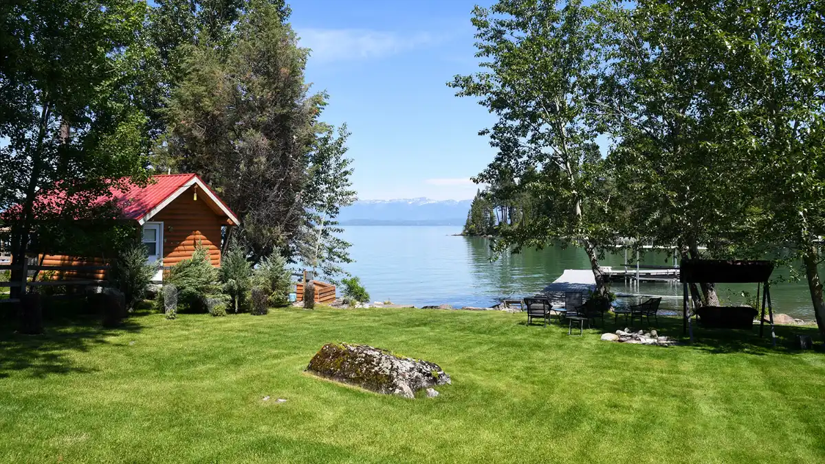
Best fit
Practices whose work should be the loudest thing on the page
Landscape architecture practices, garden designers, site and civil design studios, estate and campus work. When the photographs and the drawings are the product, a decorated shell is not a frame around them, it is competition. The site's job is to get out of the way and be excellent at it.
How it starts
A premium theme, or a full custom build
You can start from one of the premium themes (this page is one of them, running live) and have it fitted to your practice and grown into your full site. Or we start from an empty file. What a theme settles is the design phase; the build is the same either way, and it is the same person doing it. See the collection.
Honest answer
When it is the wrong call
If your enquiries come almost entirely from a municipal or institutional bid list, your website is a credential check and very little else, and a considered one is a smaller lever than it looks. Same if the practice is genuinely at capacity and taking work by invitation only. And if you do not have the photography yet, that is the thing to spend on first; no amount of building can make a page carry pictures that do not exist. Say so early and I will tell you plainly rather than sell you a build.
One person, start to finish
06 · Questions
Questions practices actually ask
What should a landscape architect's website include?
A portfolio organised by project rather than by service, with a short written account of each one; photography served at full quality; a clear statement of the disciplines you practise, in prose, using the words your profession actually uses; your licensure and registrations; the scale and type of work you take; and one obvious way to make contact. Almost everything else is optional, and a service list on its own is the most common way to look like a maintenance company.
How do I stop ranking against lawn care companies?
By writing like a design practice and structuring the site like one. Search engines infer what you do from the language on your pages, so the terms that describe design work (site planning, grading and drainage, planting design, construction documents, stormwater, hardscape detailing) have to appear in real sentences rather than in a dropdown. Project pages help more than a services page does, because they carry that language naturally, and they are what earn links.
How do I show work that is not finished yet?
Structurally. Build project pages that expect to be revisited: plan and intent first, then installation, then the same views again a few years later. That turns the awkward part of the profession into the most convincing thing on the site, because almost nobody else can show it. The scroll-locked diagram near the top of this page is one way to do it; a simple dated set of photographs of the same view is another, and it costs nothing but discipline.
Will heavy photography make my site slow?
Only if nothing else is done about it. Modern formats, sizes chosen for the layout rather than for the camera, lazy loading below the fold and a page with no framework runtime under it will carry a lot of imagery comfortably. What makes a portfolio site slow is almost never the photographs on their own; it is the plugin stack, the slider library and the third-party fonts sitting in front of them.
What does it cost to start from one of your themes?
A theme is licensed once and then fitted to you. It costs roughly what starting from scratch costs, and the honest reason is that fitting and expanding it into a full site is the actual work. What a theme settles is the design phase, not the build. Tell me the scope and you will get a real number rather than a range.
Do I edit the site myself once it is live?
Only if you want to. Every build is custom, so this gets settled with the scope. Some practices want to post their own project updates; others would rather send them over and have it handled, which for work that gets rephotographed every few years is often the saner answer. We settle that together, early. Either way the domain and the content are yours, and if you ever leave you get a copy of the files any developer can host.
Something not covered here? Ask in the form below
07 · Contact
Tell me about the work you want people to see.
What the practice is, roughly how many projects you would want to show, whether the photography exists yet, and your timeline. You will get a considered reply within two working days, from the person who would design and build it, because there is only one.
The Better Website is a one-person studio in Raleigh, North Carolina, serving the Triangle and clients nationwide. Every site is hand-coded in plain HTML, CSS and JavaScript.
PS · This theme is for sale
You are reading it. Long View is one of our premium themes: a drafting sheet, one ink, and not a single colour on the page that did not come out of a photograph. The diagram near the top is the part that is genuinely difficult, and it is the part that would be rebuilt around your work rather than around a stock garden. Yours would be fitted to your practice, not to ours. Say so when you write and we will start there.
The collection
Like this theme? You might also like:
Every theme in the collection is a complete, hand-coded design, licensed once and then fitted to your brand and grown into your full site. Same standards as everything above: written by hand, not built on WordPress, a page builder or a CMS. What a theme settles is the design phase; the work is fitting it to you.
A set of drawing sheets pinned to a wall where scroll position is the time of day: the wall shifts colour and every shadow swings with the sun.
One flat sheet of grey and a set of soft shadows, with no border anywhere in it. Restraint used as a statement rather than as an economy.

Silver Plate
Cursor-lit silver, engraved & sold
Realistic 3D silver type under a light that follows the cursor, with every shadow on the page answering to it. Sold, and shown as built.
See the full collection of premium themes, or tell me which one fits your practice.